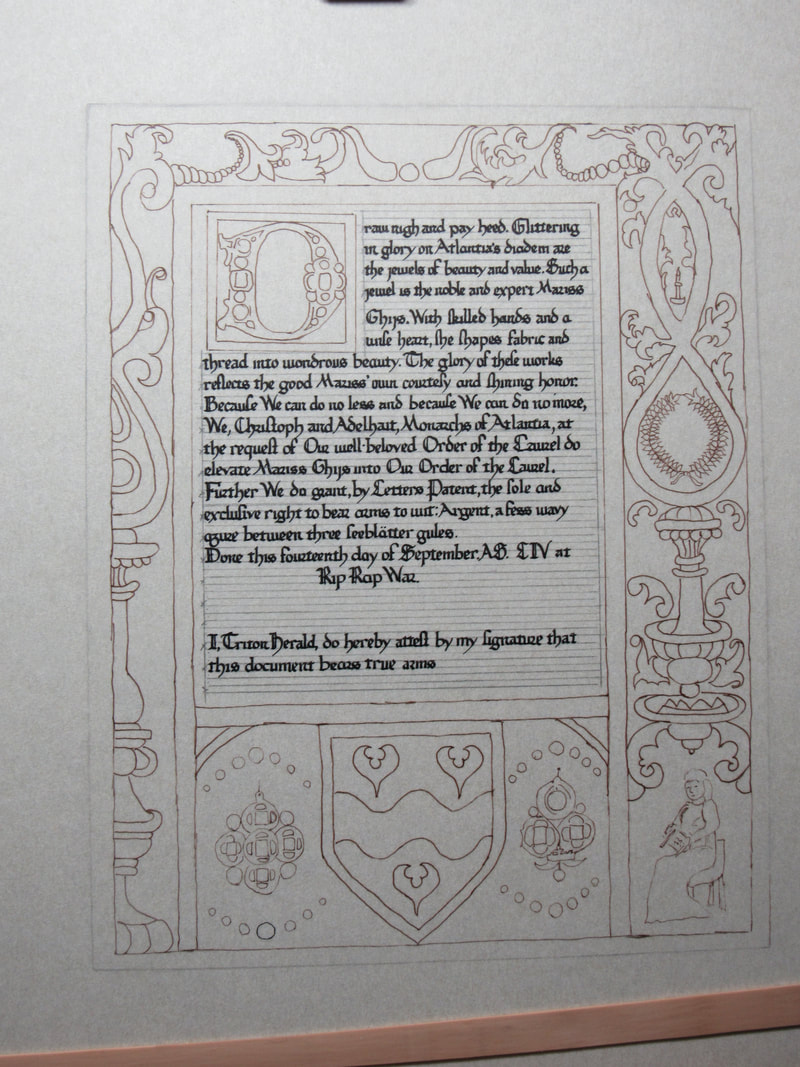
|
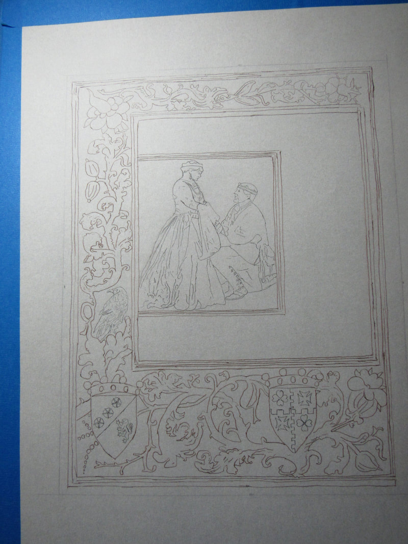
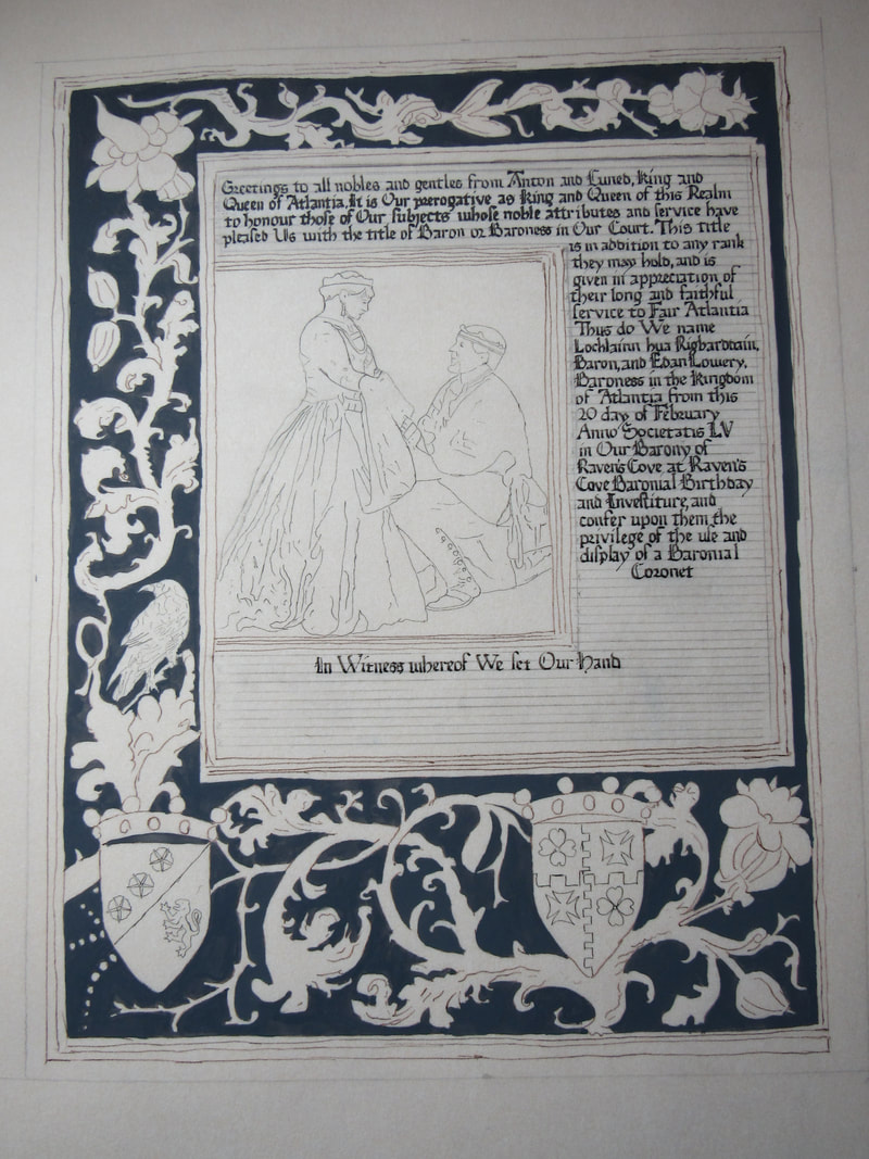
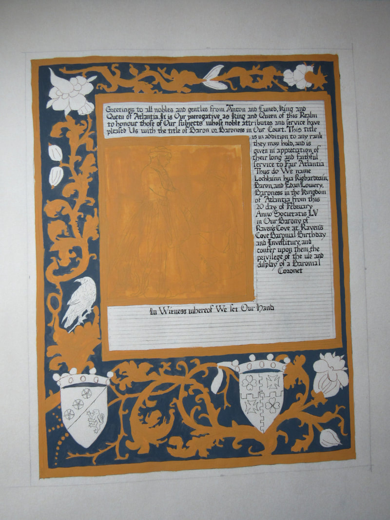
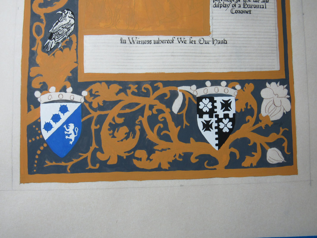
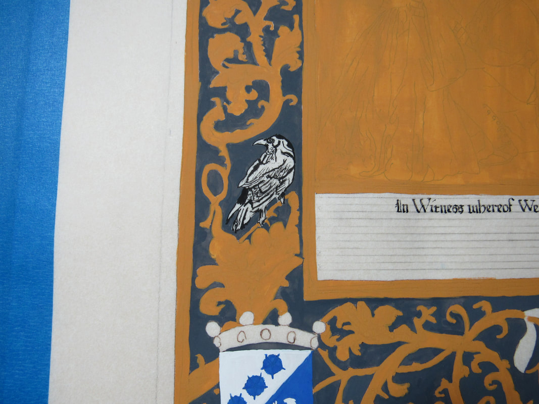
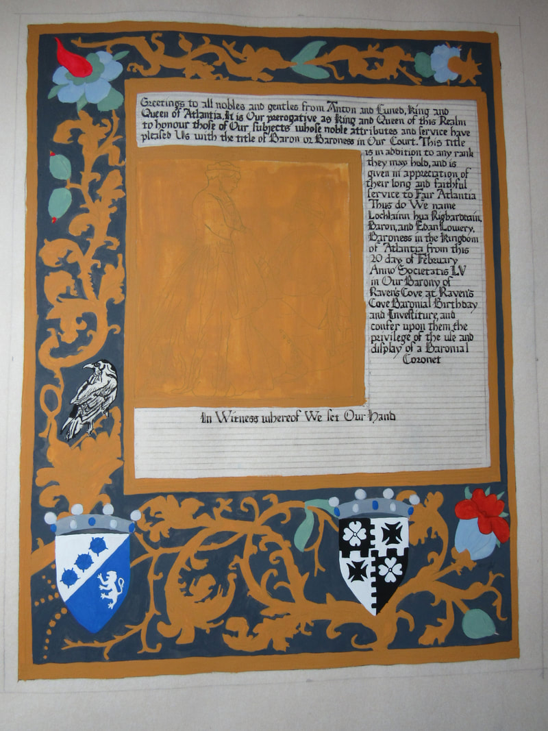
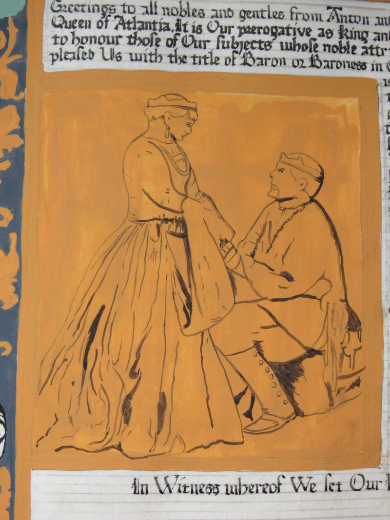
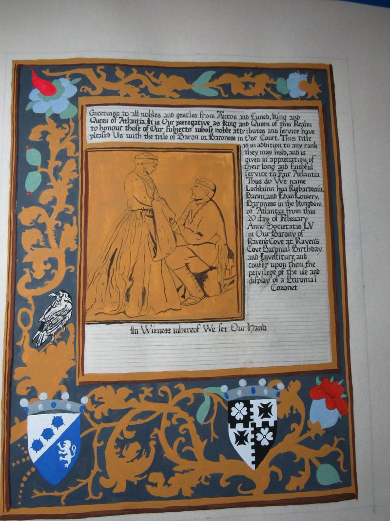
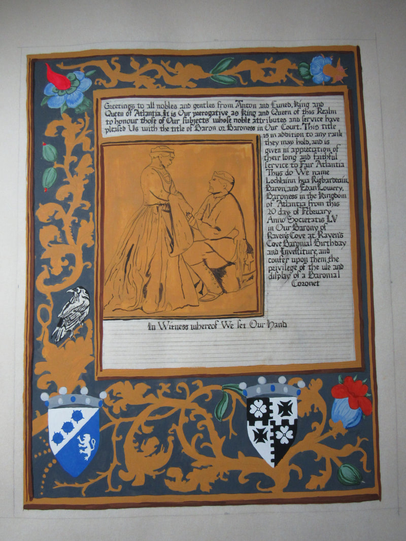
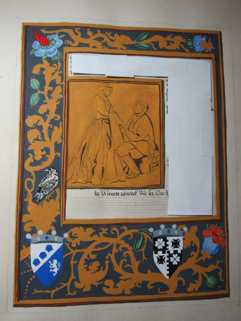
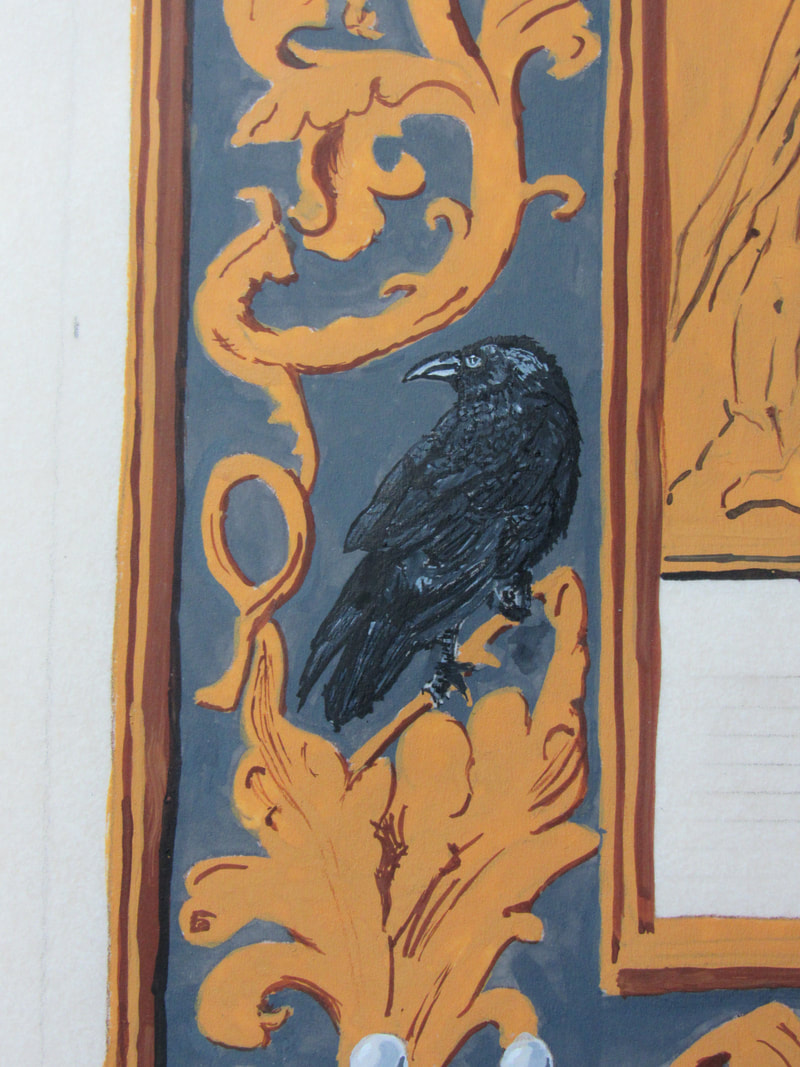
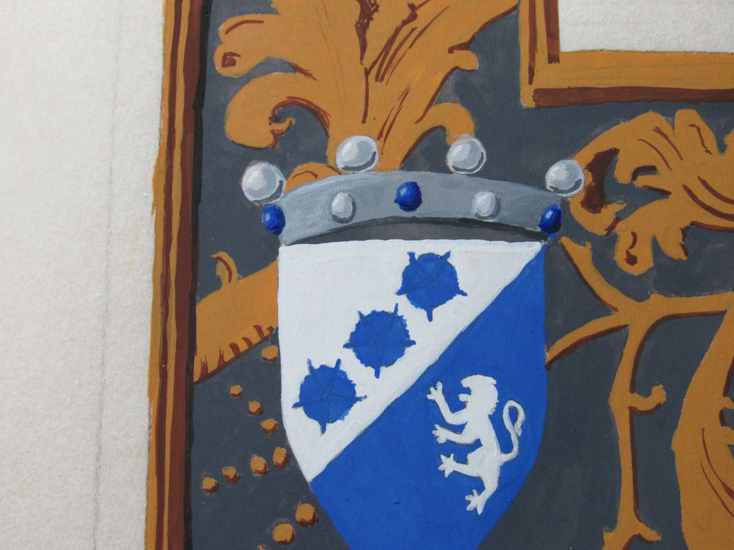
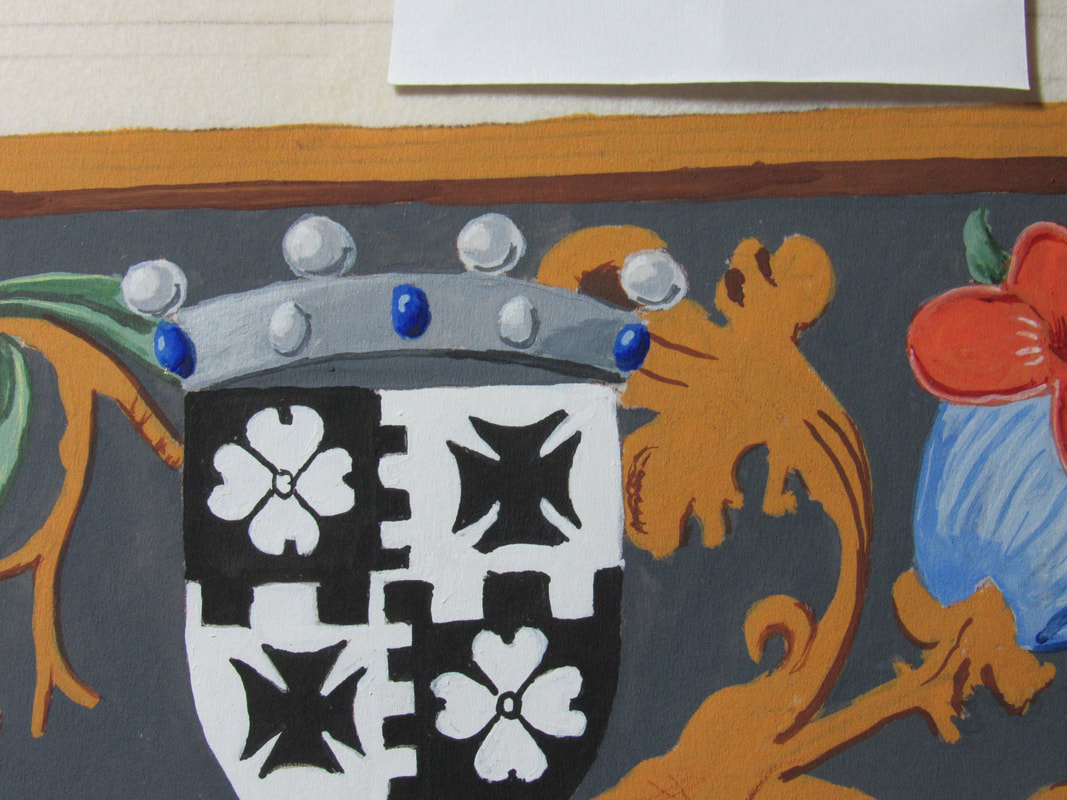
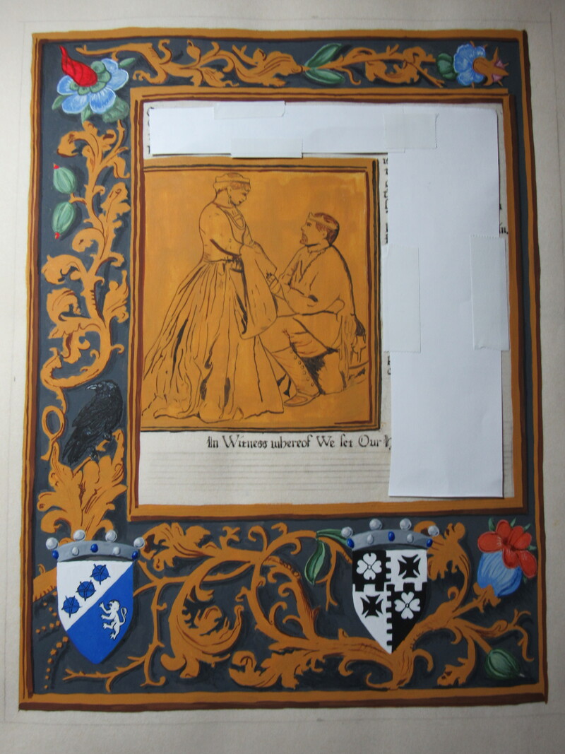
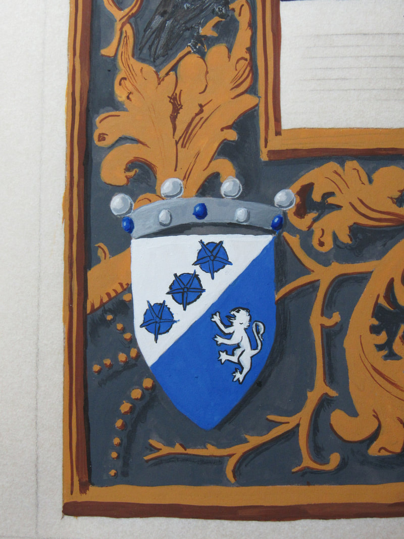
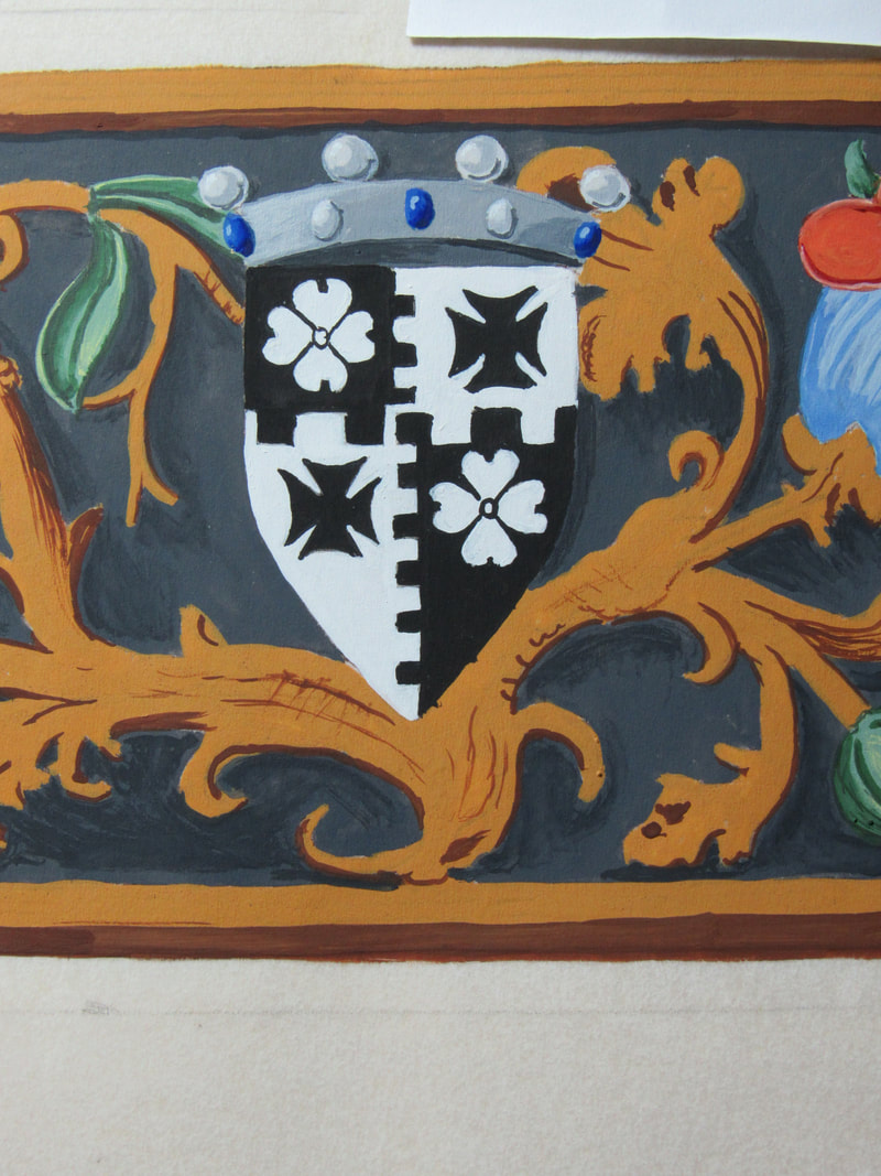
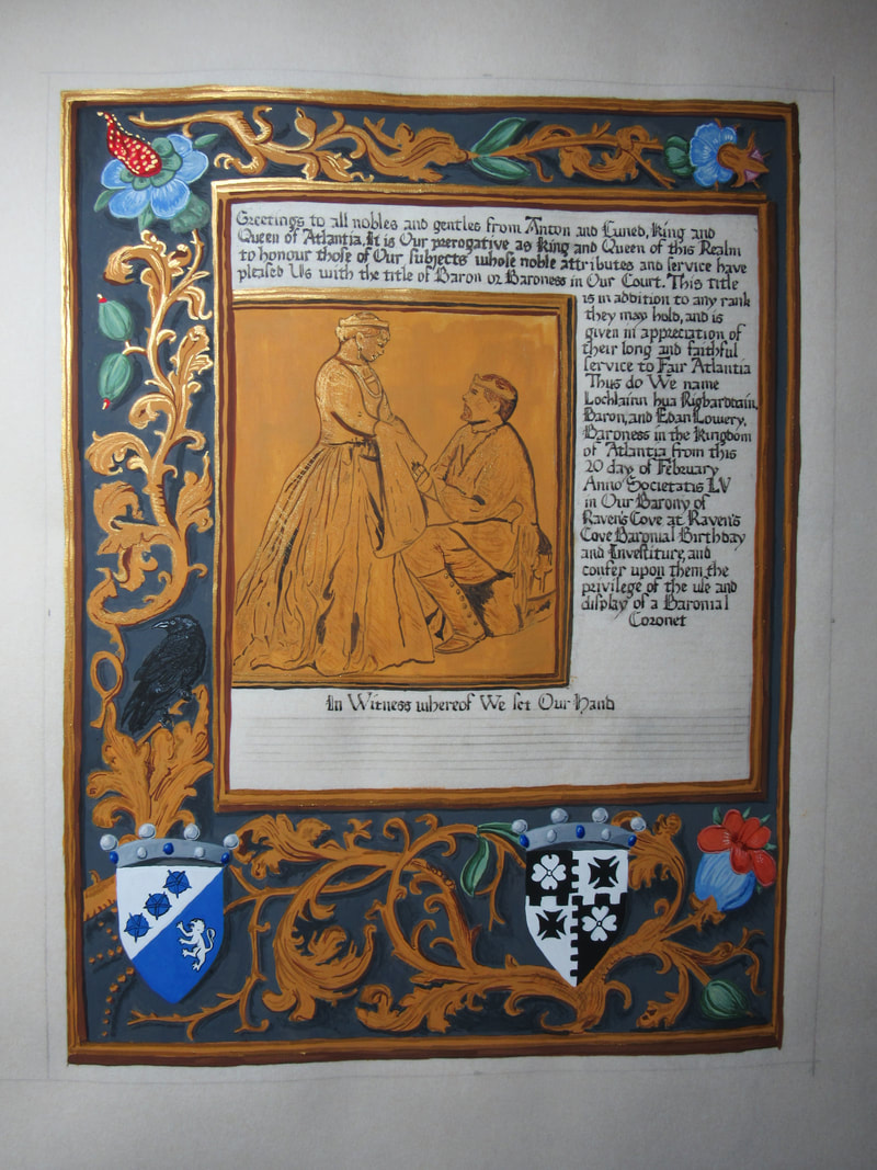
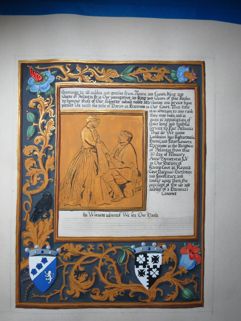
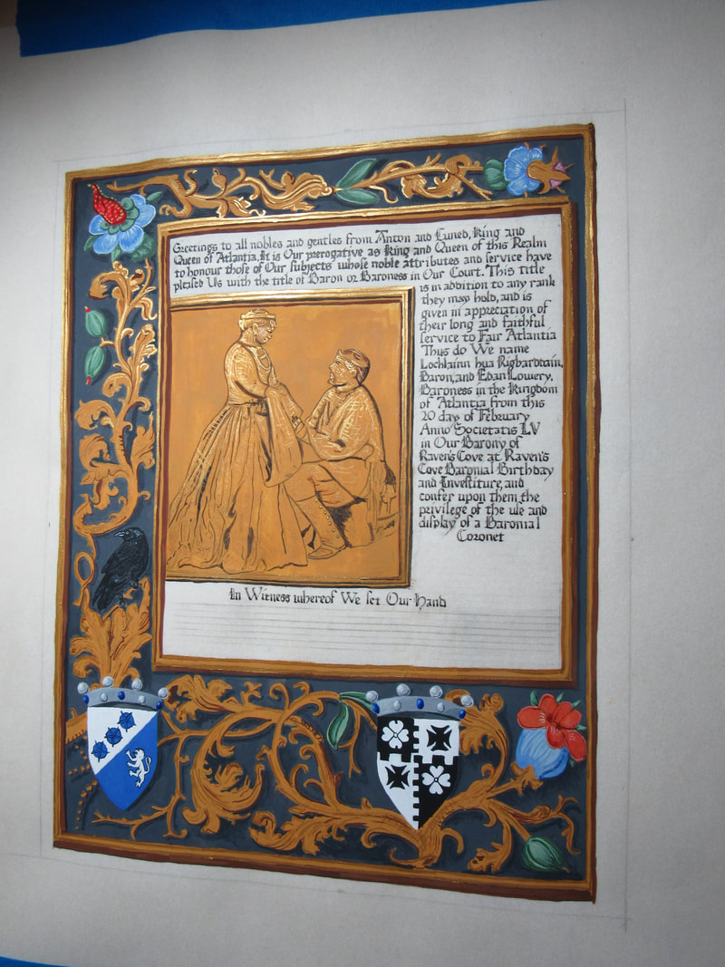
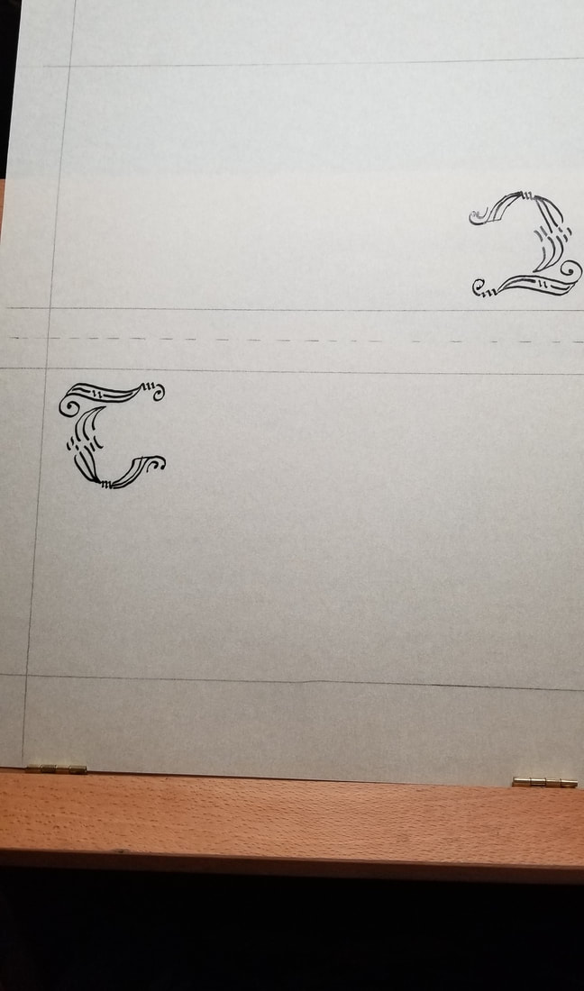
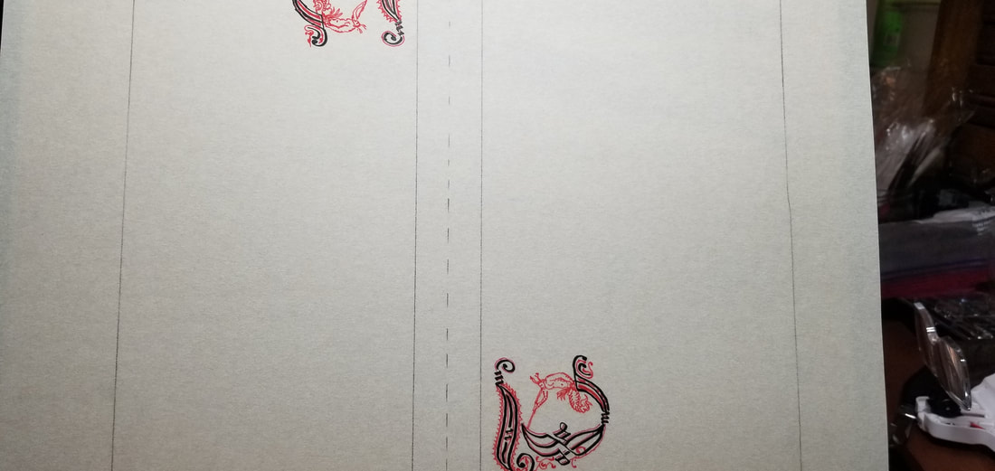
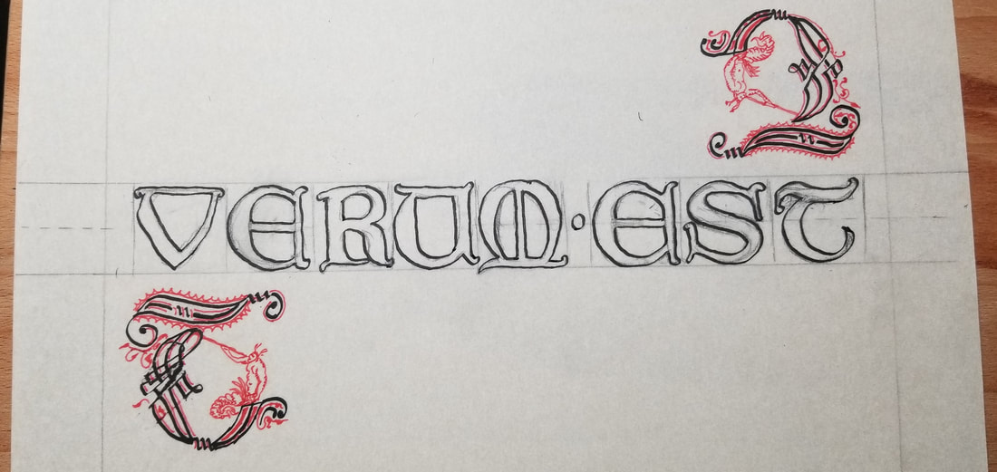
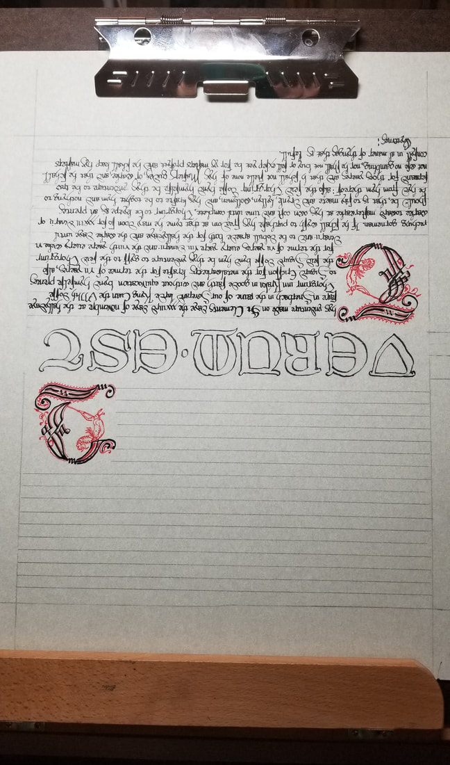
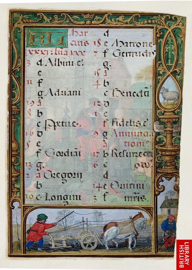
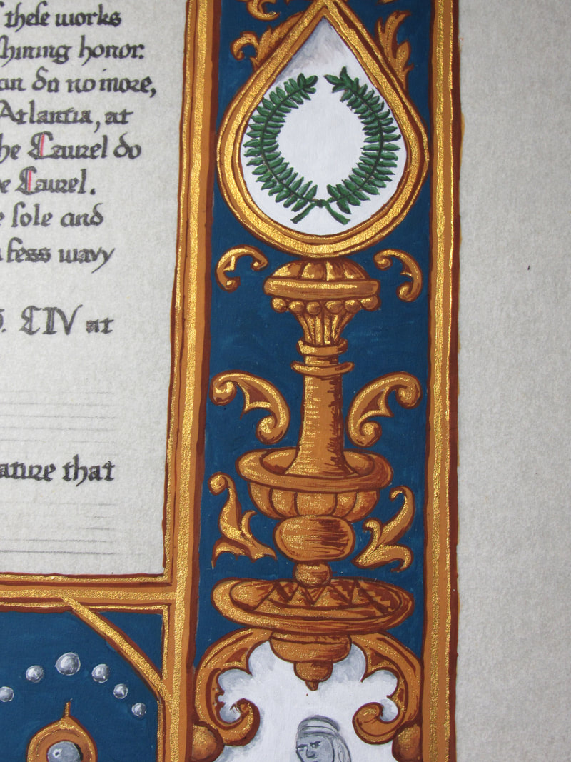
It's not every day you get asked to do a scroll for two people. Especially two people you adore and respect. I was given the great honor and privilege to do the Court Barony scroll for Baroness Edan Lowery and Baron Lochlainn hua Rigbarddain. I wanted something that would capture the two of them perfectly and I found a picture of the two of them from 12th night 2020, that was posted one year earlier to the day that I received the assignment. It was perfect. It showed the two of them, together, and you could just see how much they love one another in it. I turned it into a grayscale so that I could more easily see the lines I needed to follow. 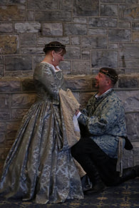 The next task was finding an exemplar that would frame that image and make it front and center. I found what I was looking for in the Da Costa Hours which were illuminated by Simon Bening (1483/84-1561) about 1515 in Ghent, Belgium.  There were some elements I wanted to take out and/or replace because they did not seem to fit my purpose. So the lady was replaced with a raven to signify Raven's Cove, and two of the flowers were replace with their heraldry topped with coronets to signify Court Baronies. The final piece was on a 16x20" piece of pergamenata, with a 12x16" area for the scroll. the original was 172 x 125 mm so I enlarged quite a bit. I used gouache, finetec gold, and Noodler's Bulletproof Eel black ink. Close ups and in progress pics below, please click to enlarge. Again, remember that gold is finicky to photo without the proper light set up so it tends to look dead flat when you shoot it straight on, so many of my photos are at angles to get the magic of the gold.
0 Comments
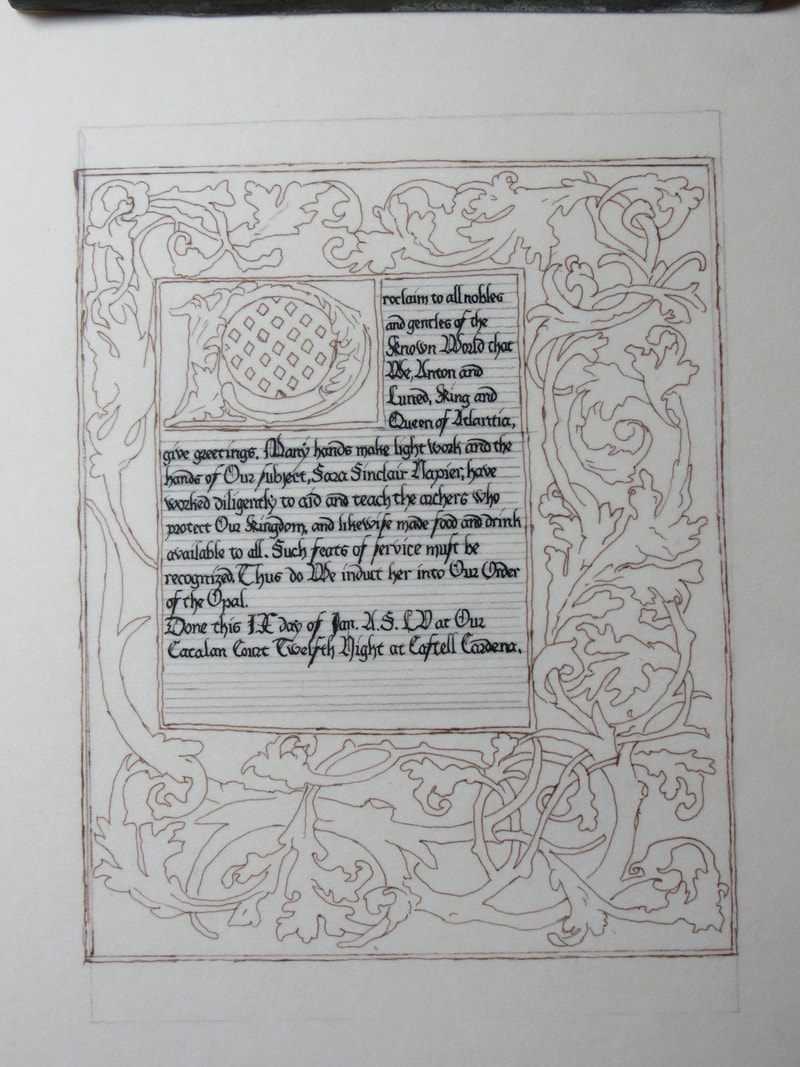
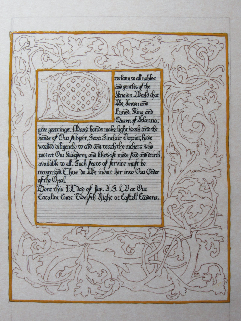
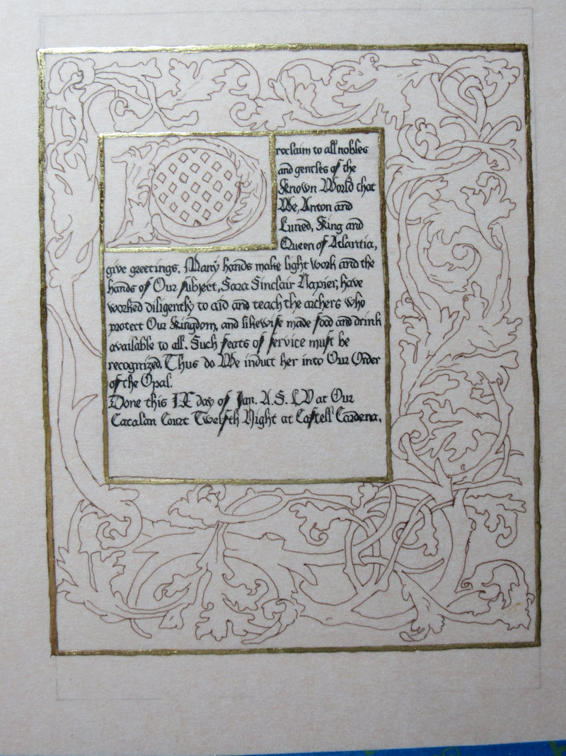
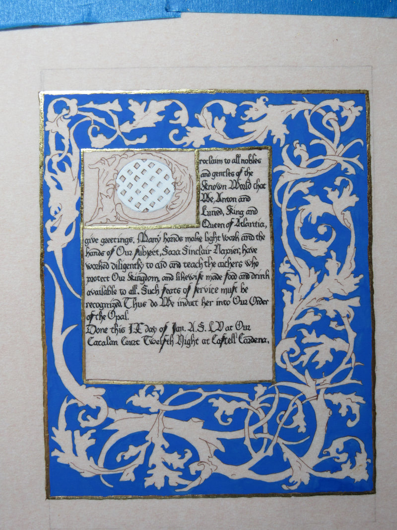
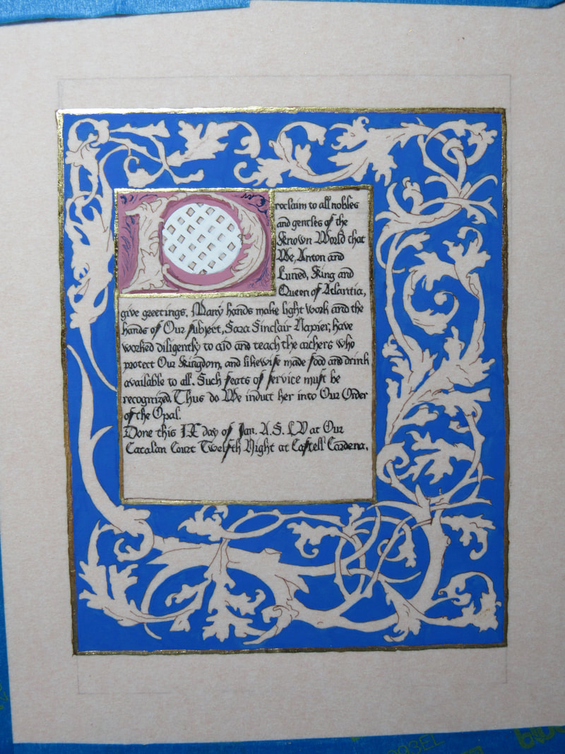
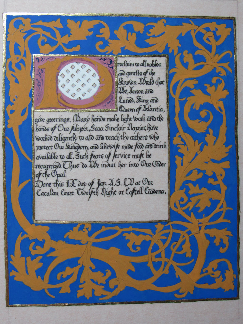
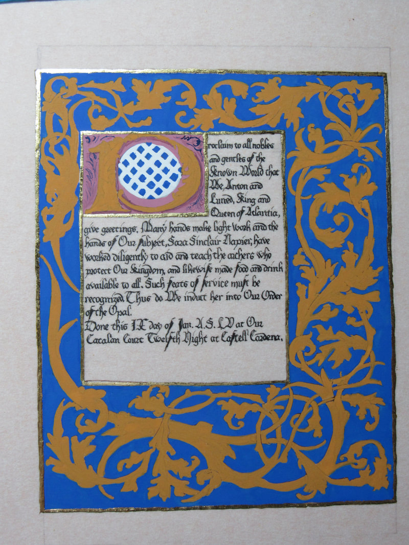
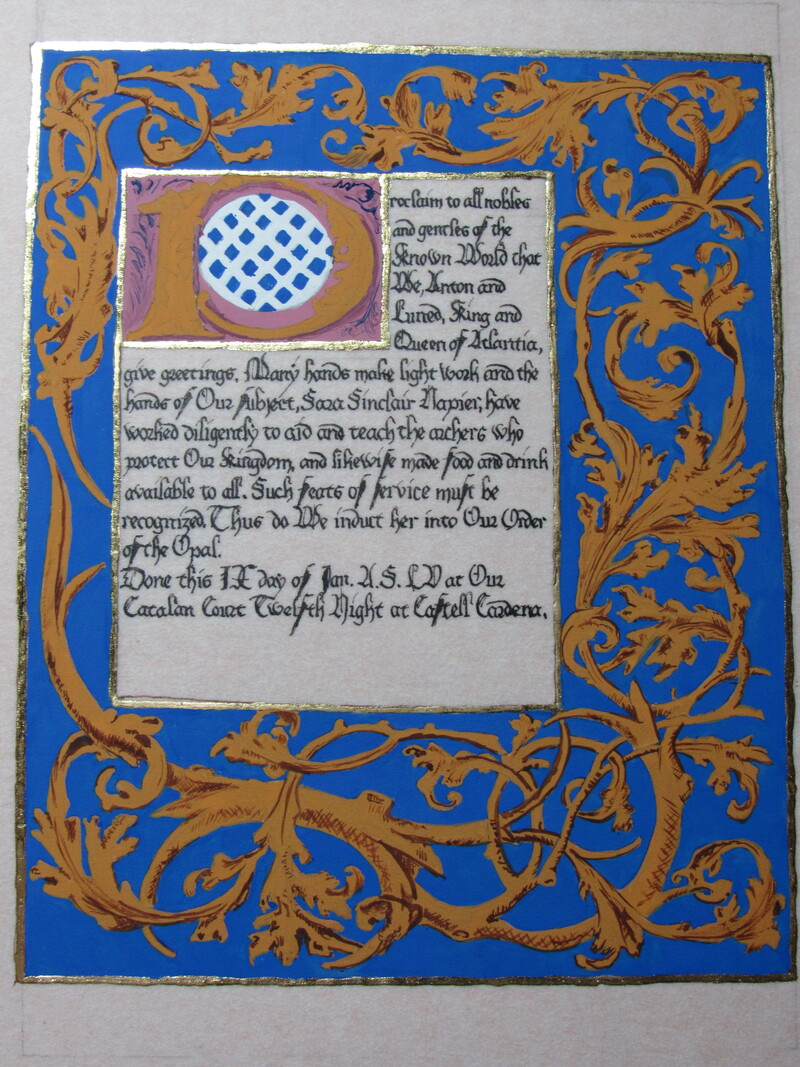
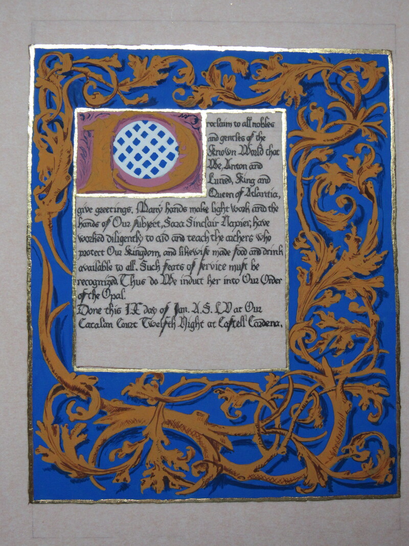
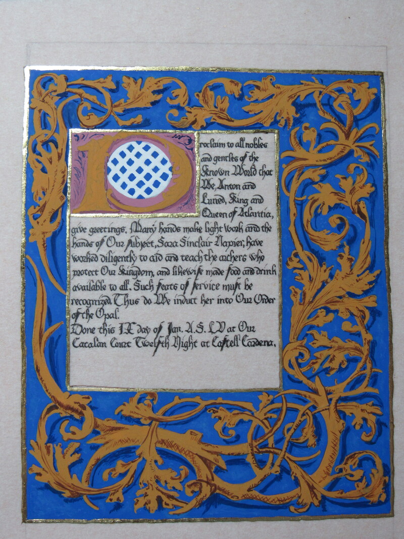
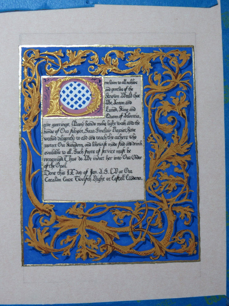
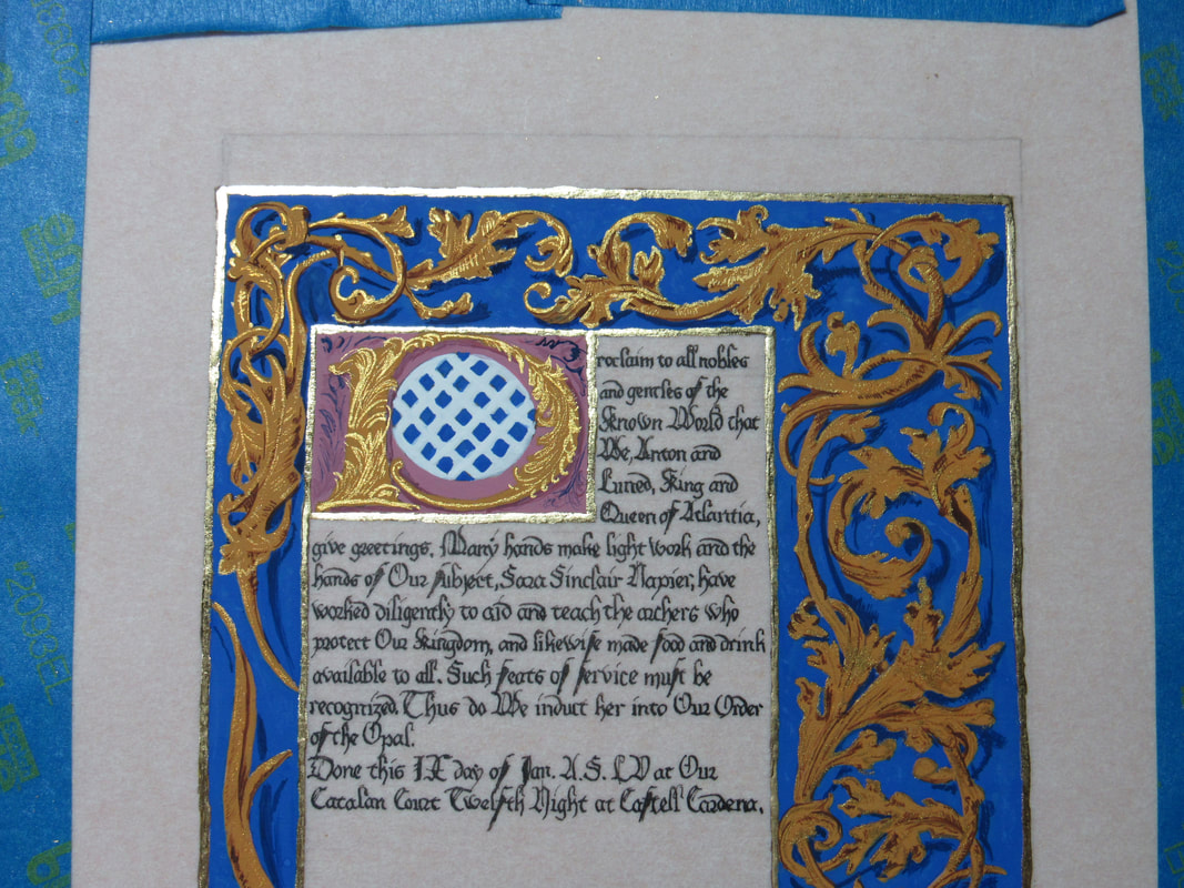
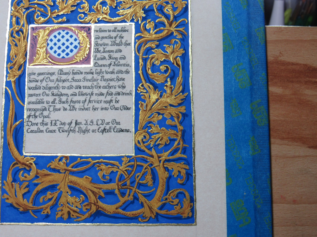
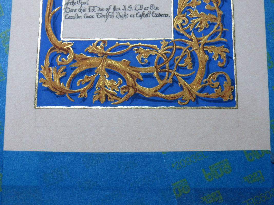
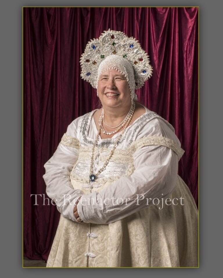
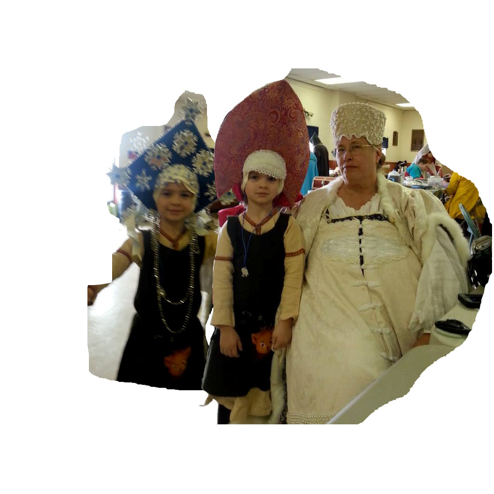
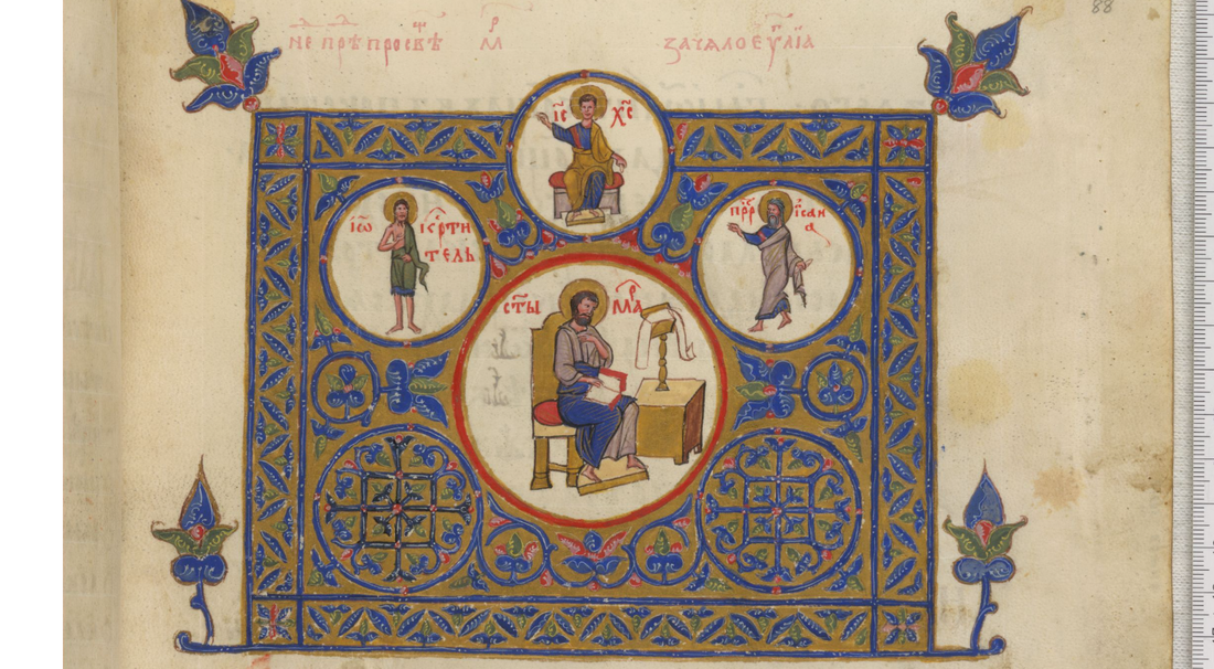
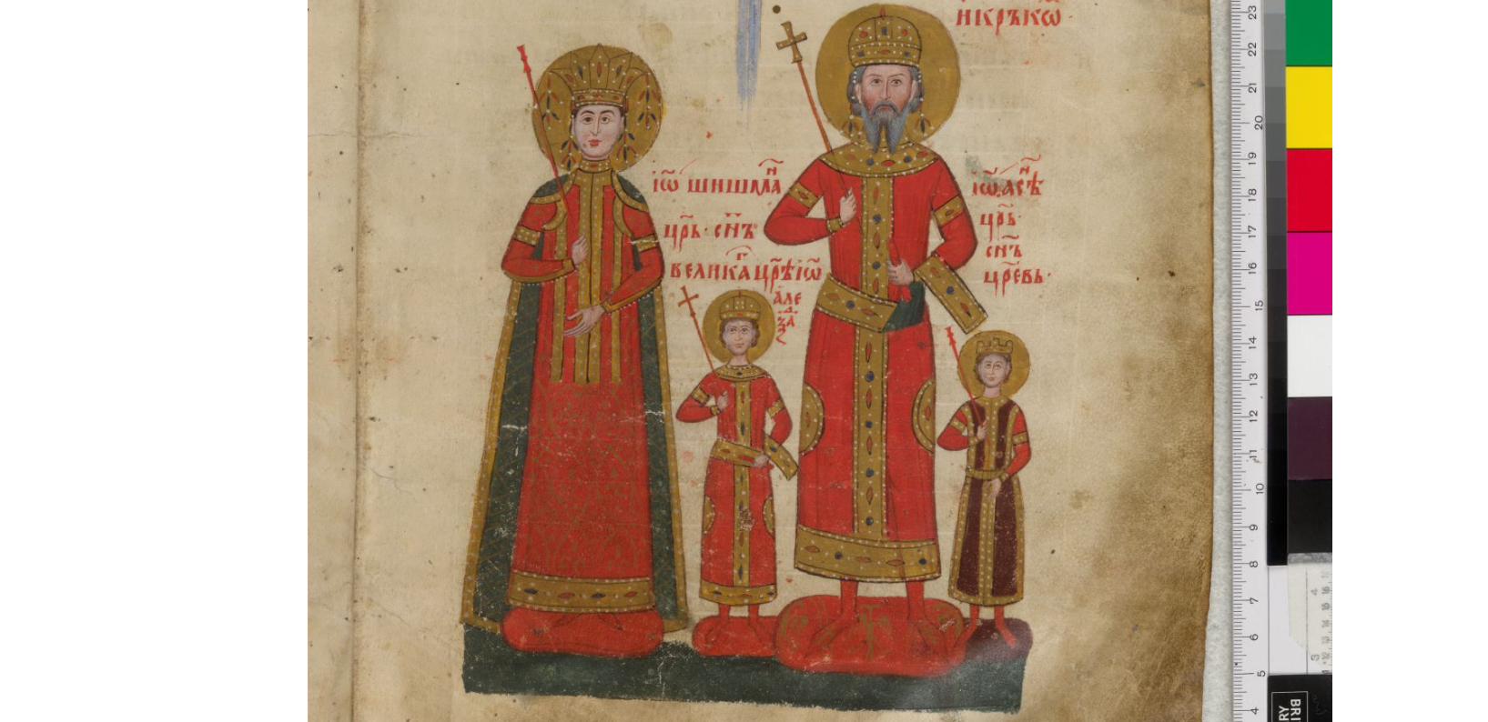
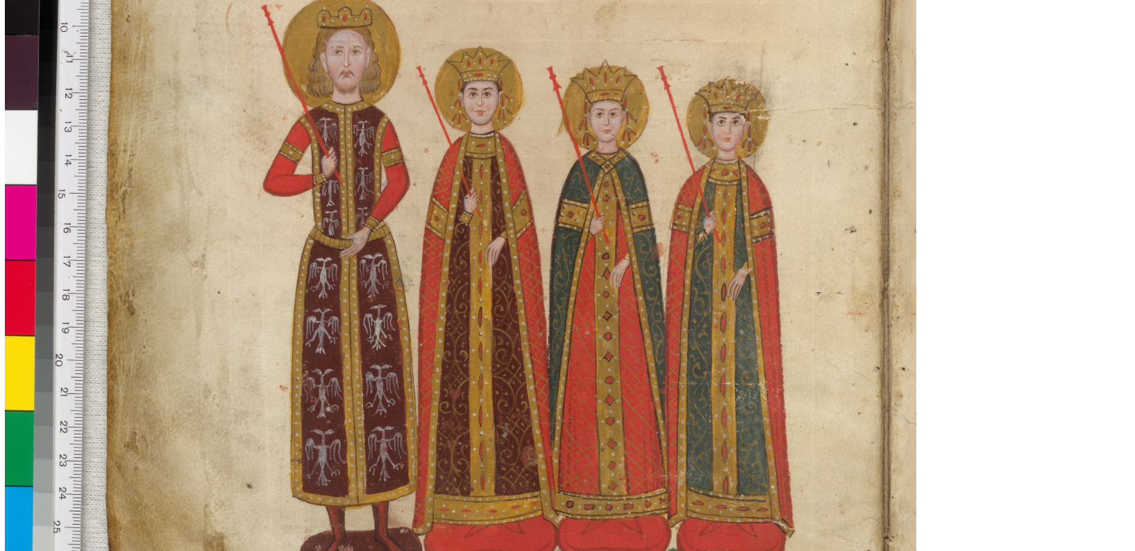
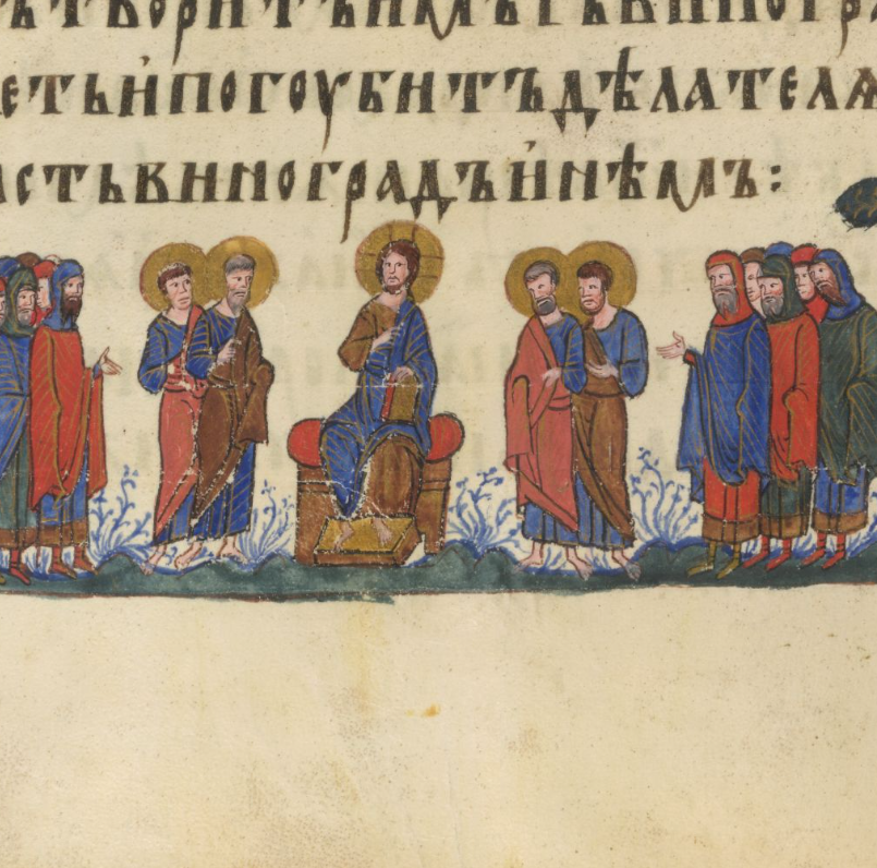
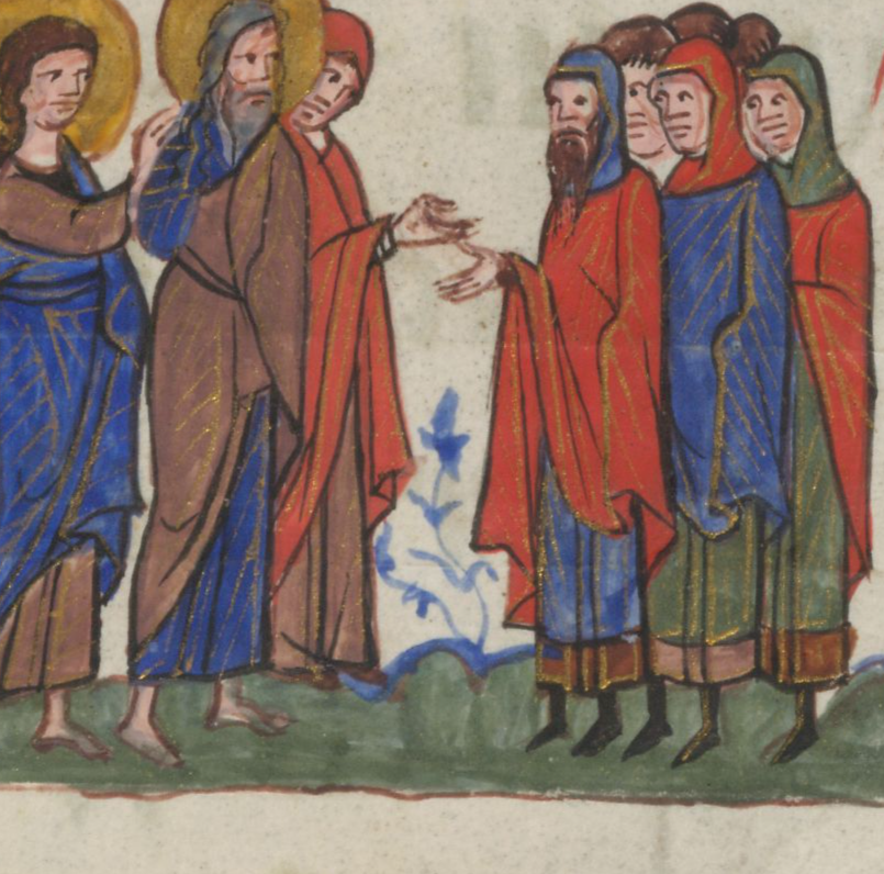
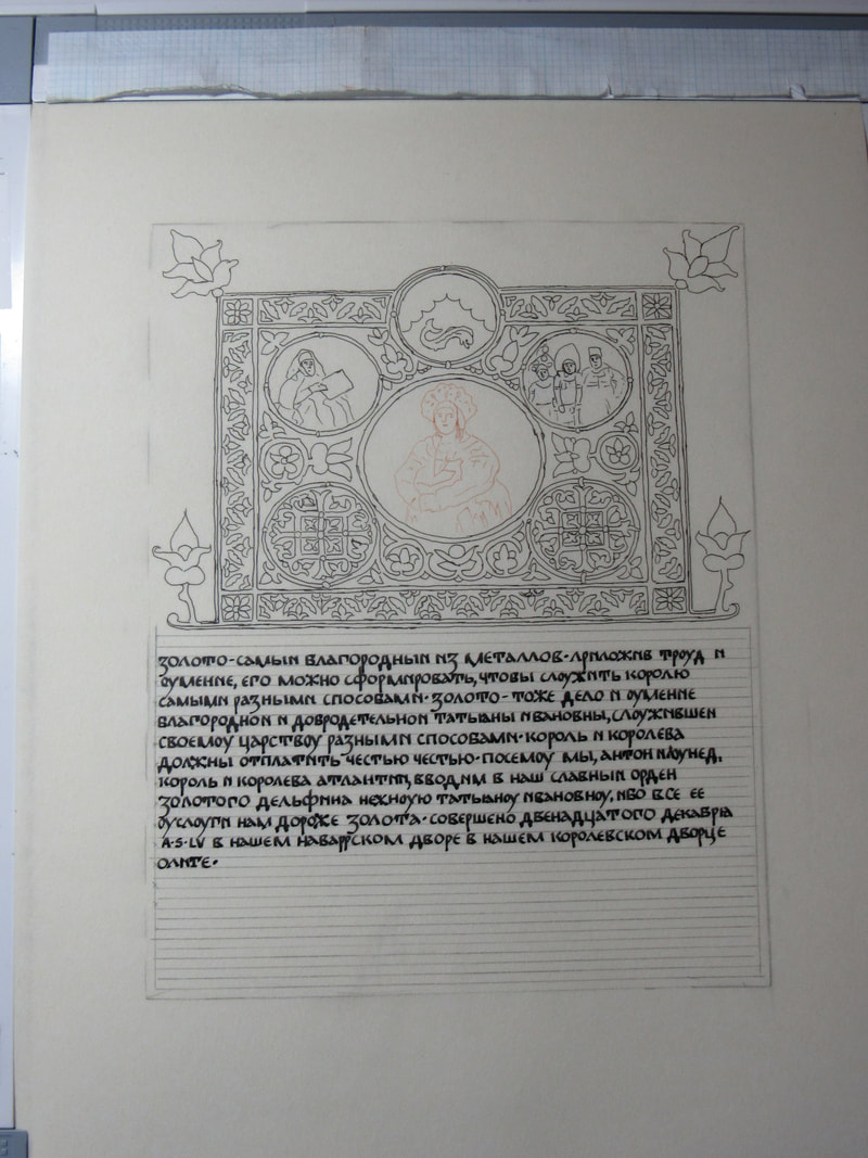
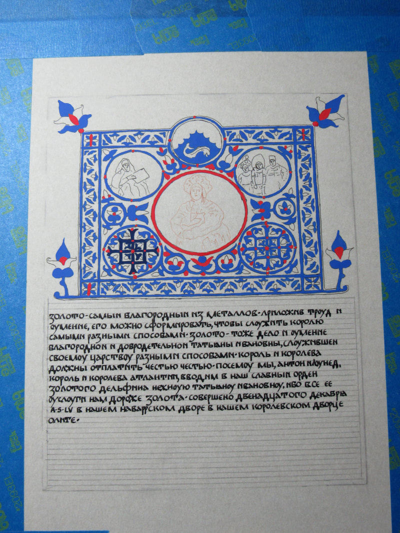
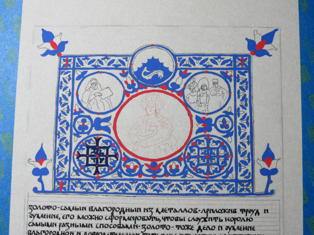
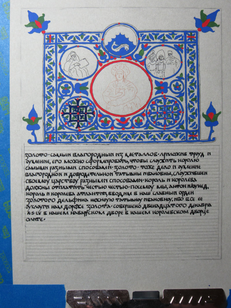
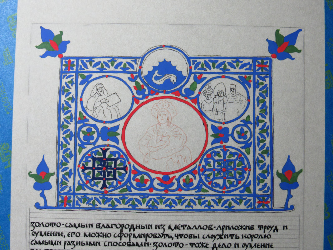
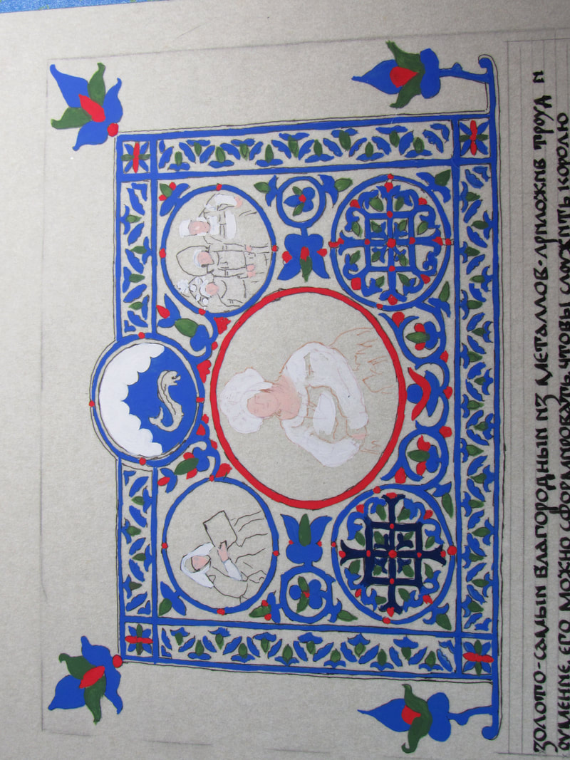
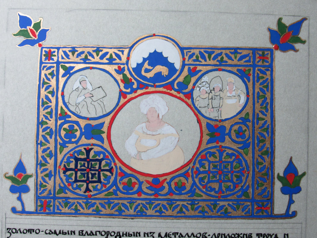
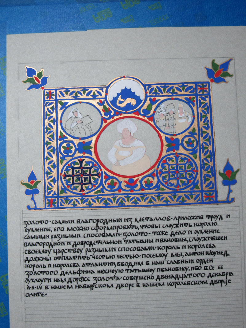
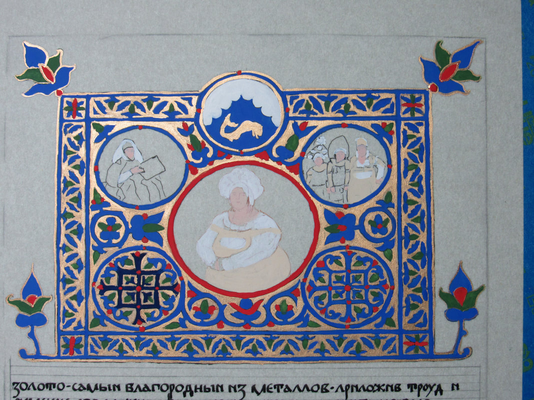
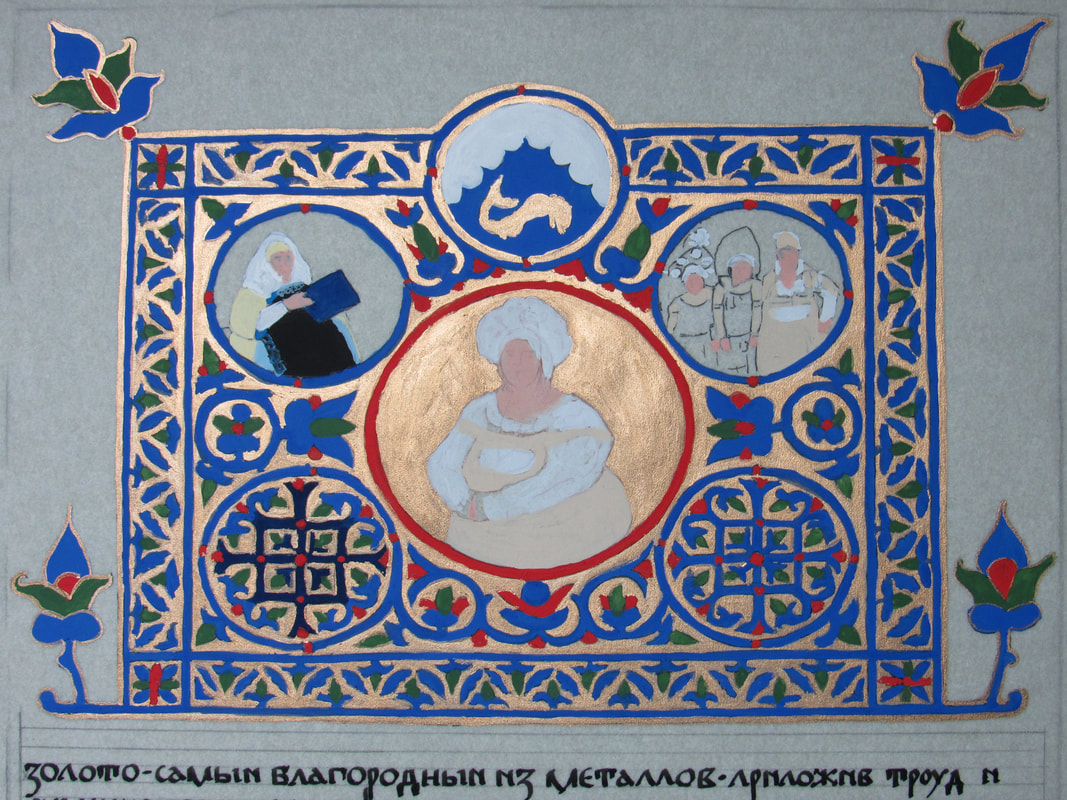
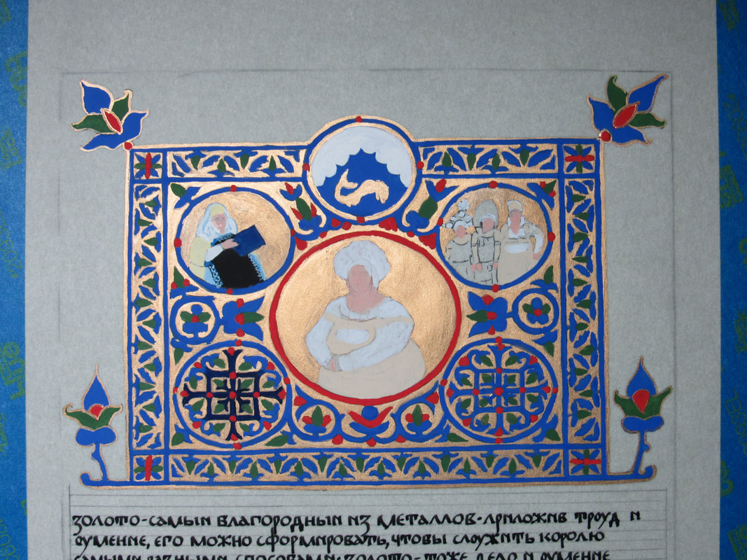
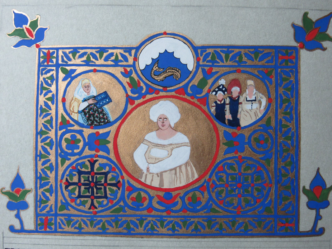
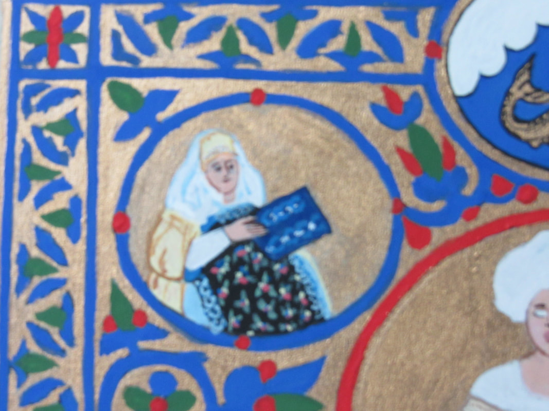
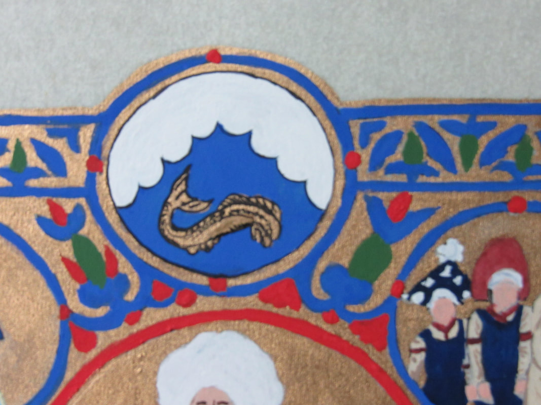
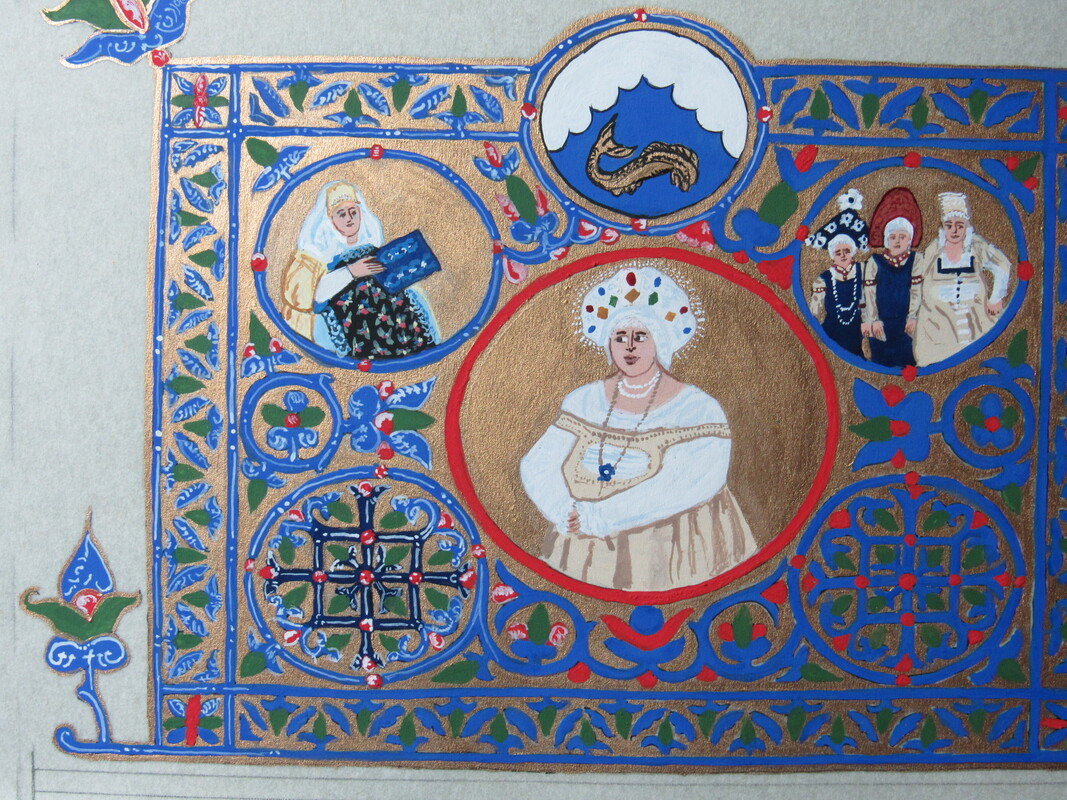
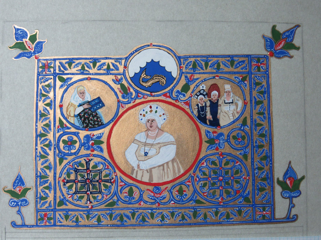
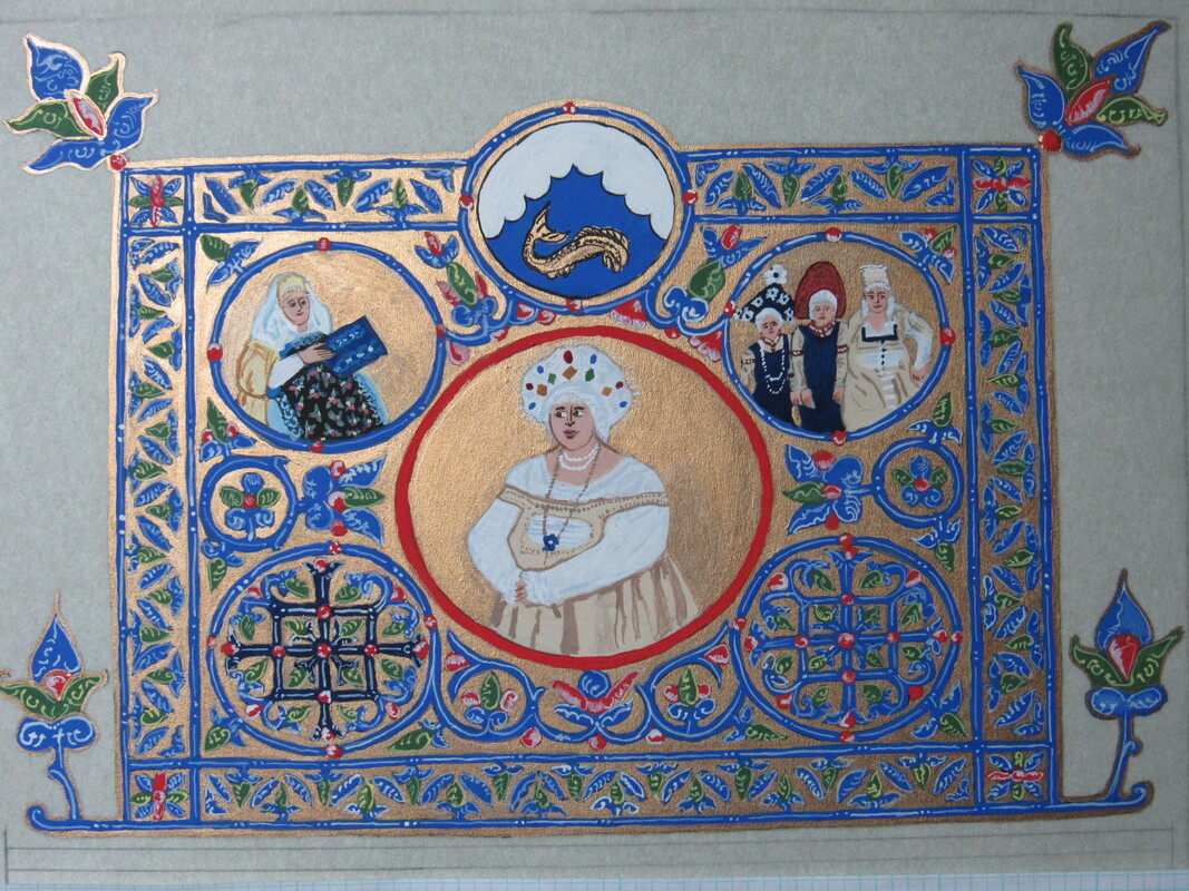
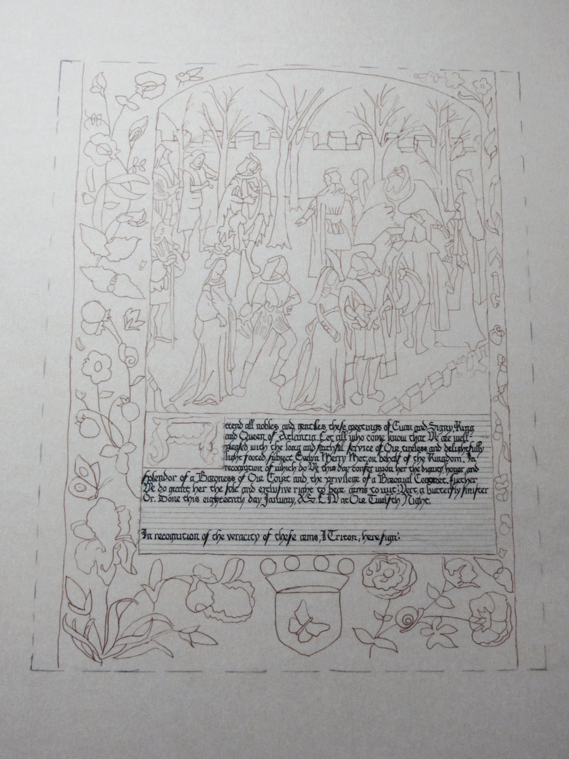
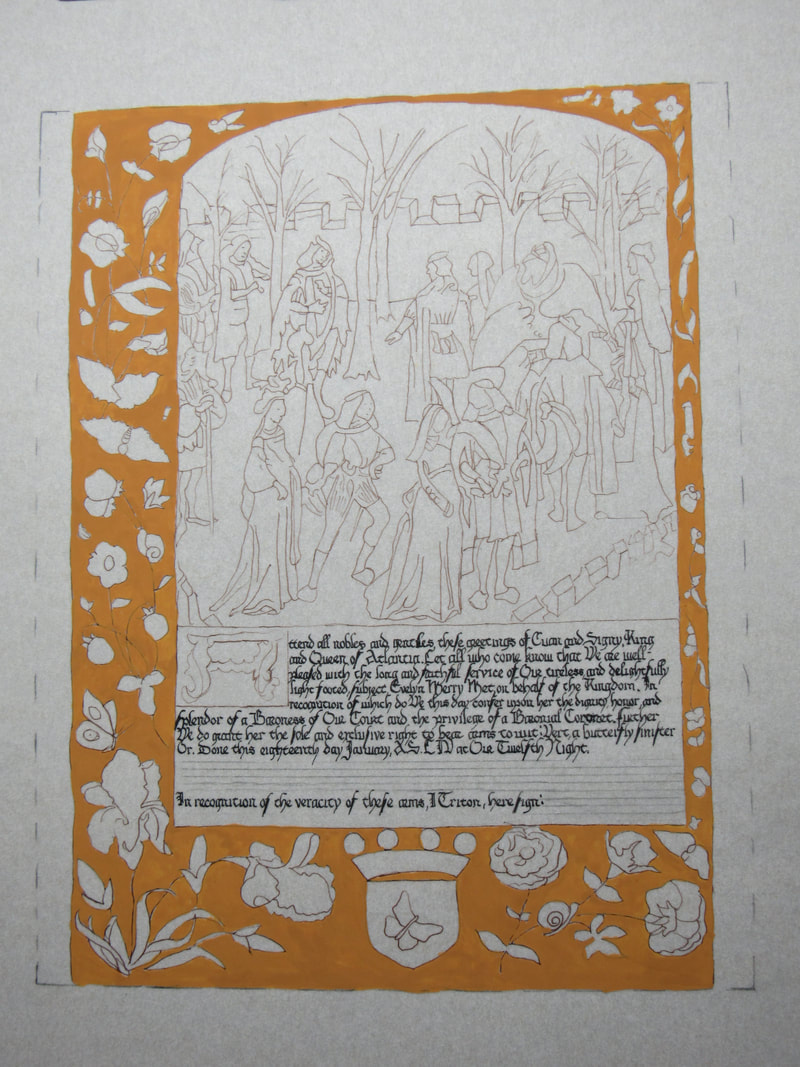
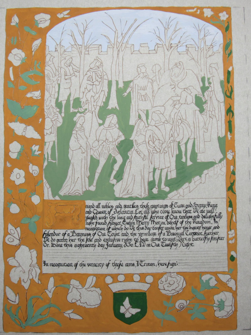
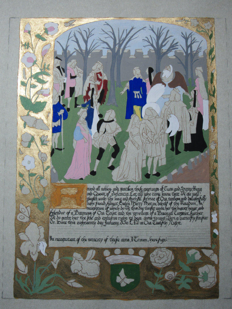
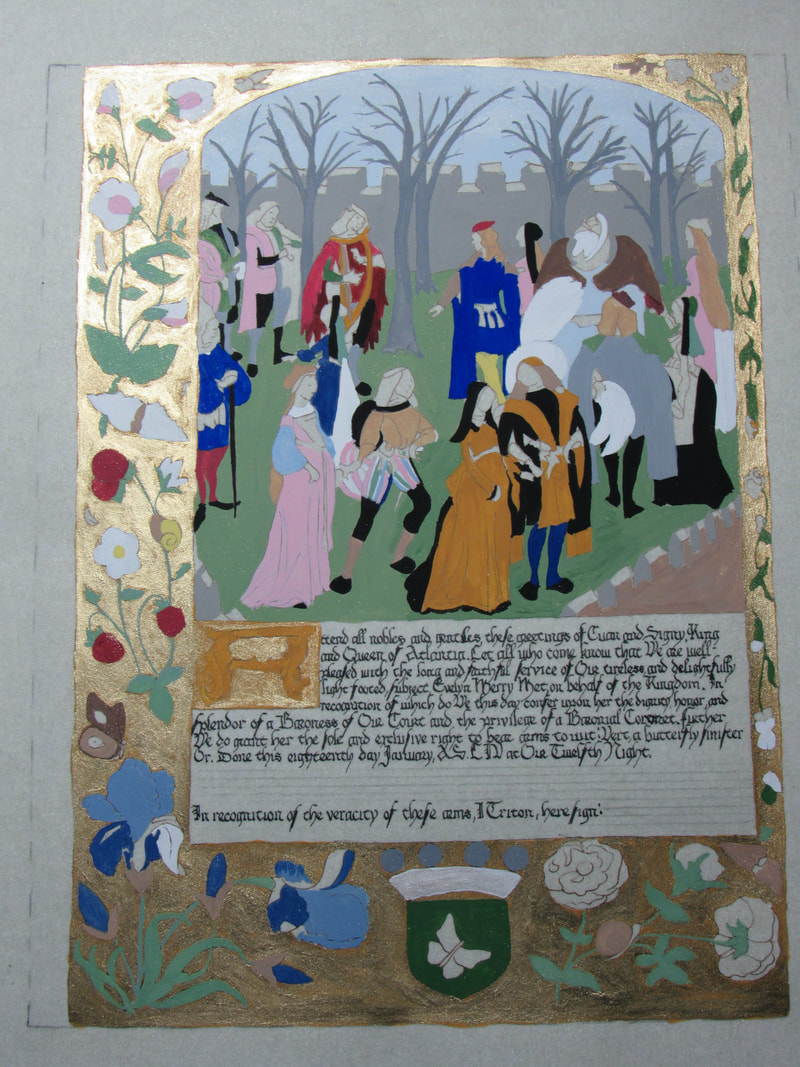
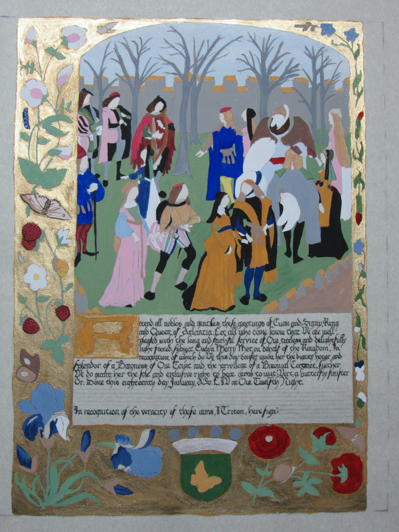
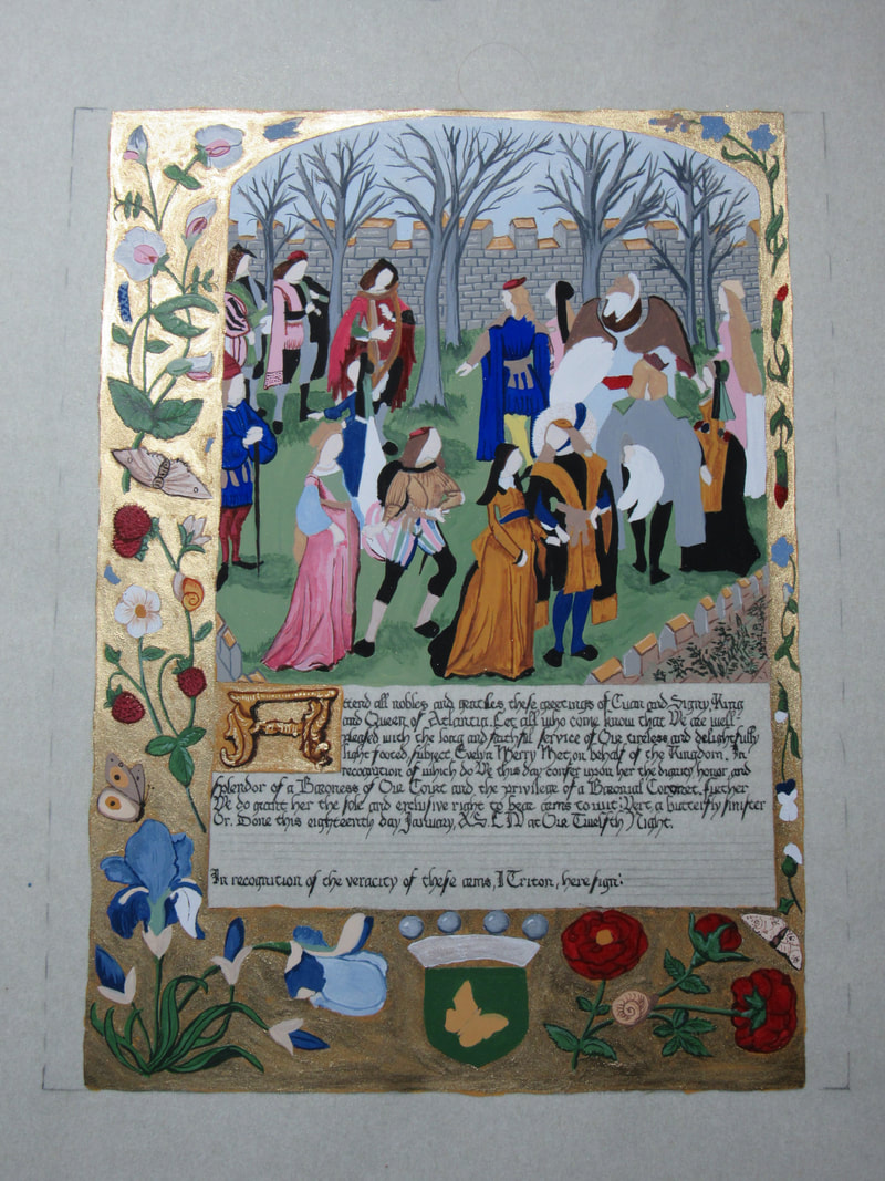
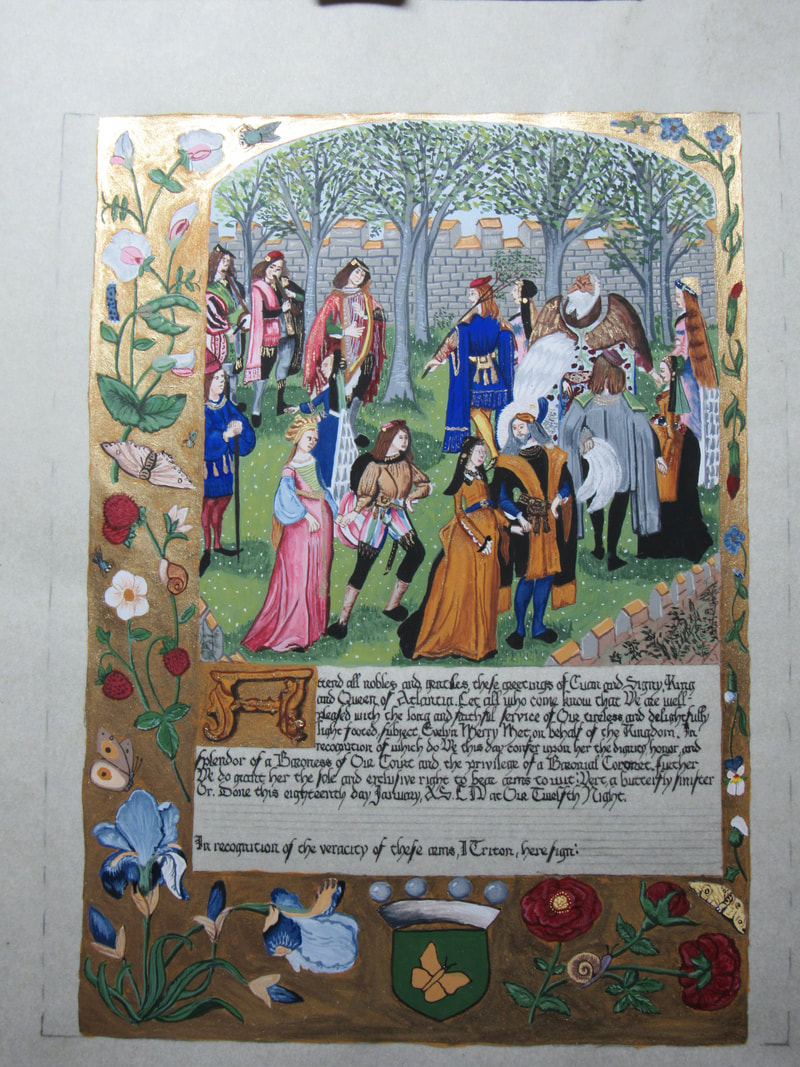
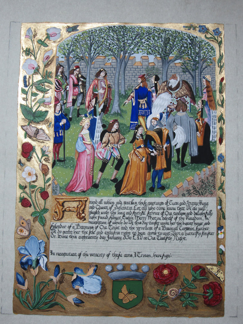
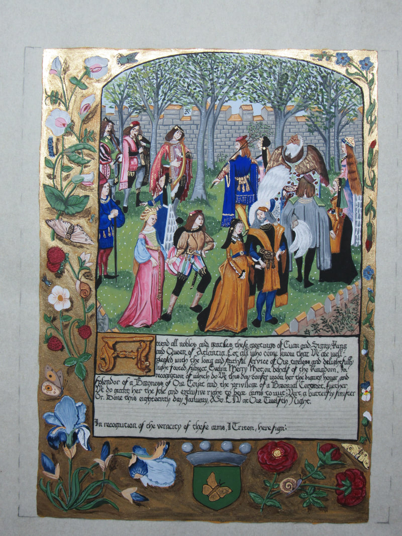
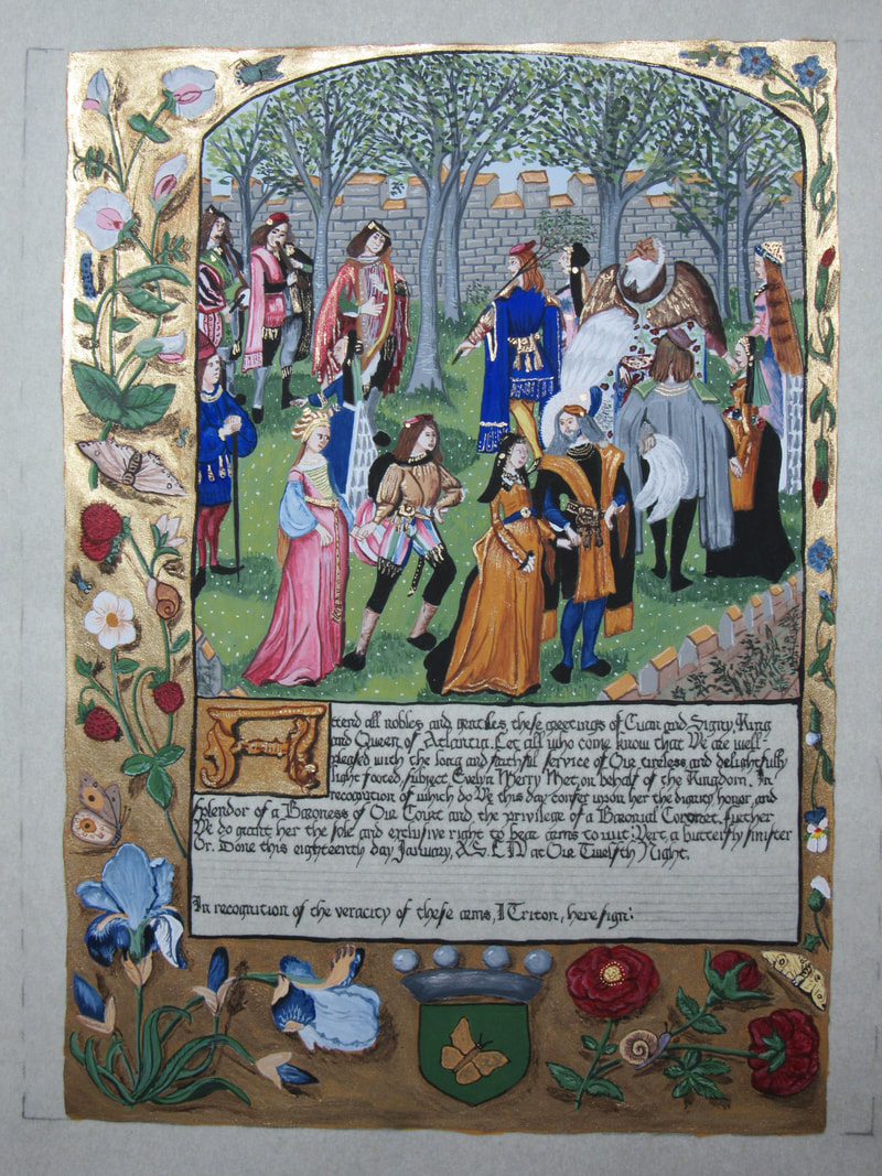
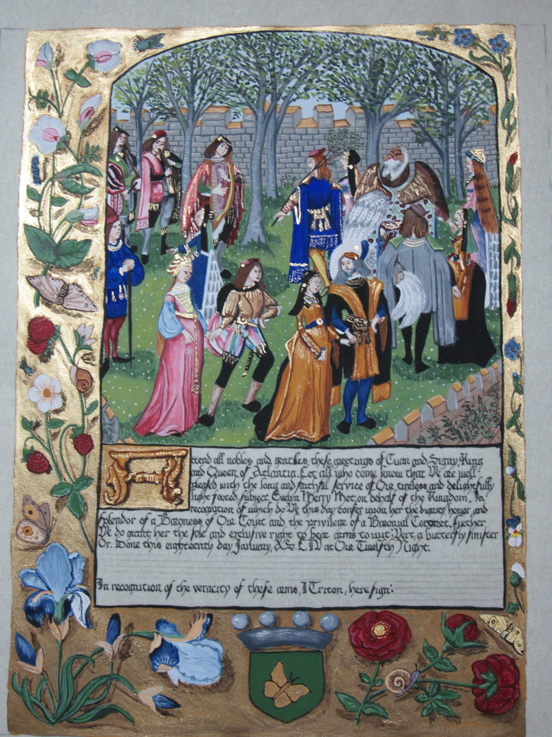
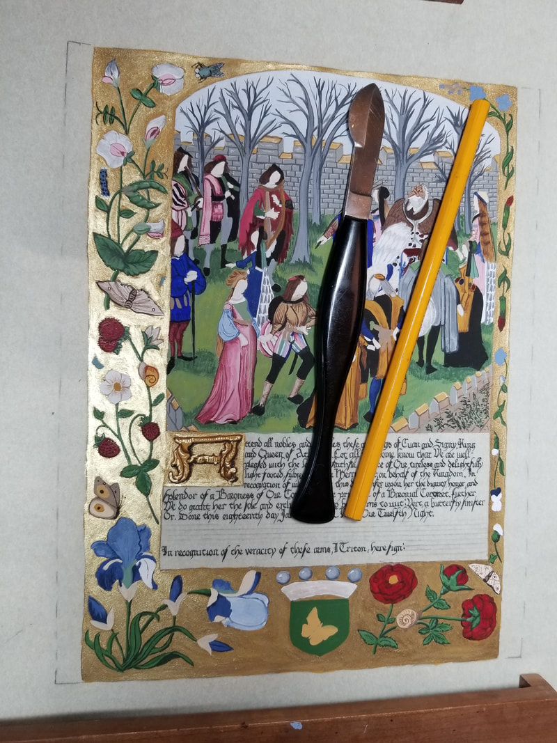
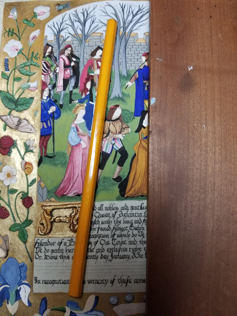
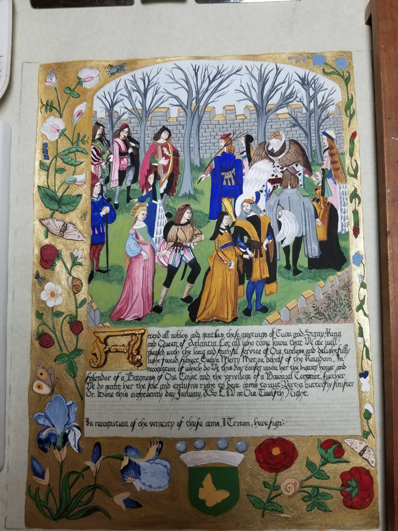
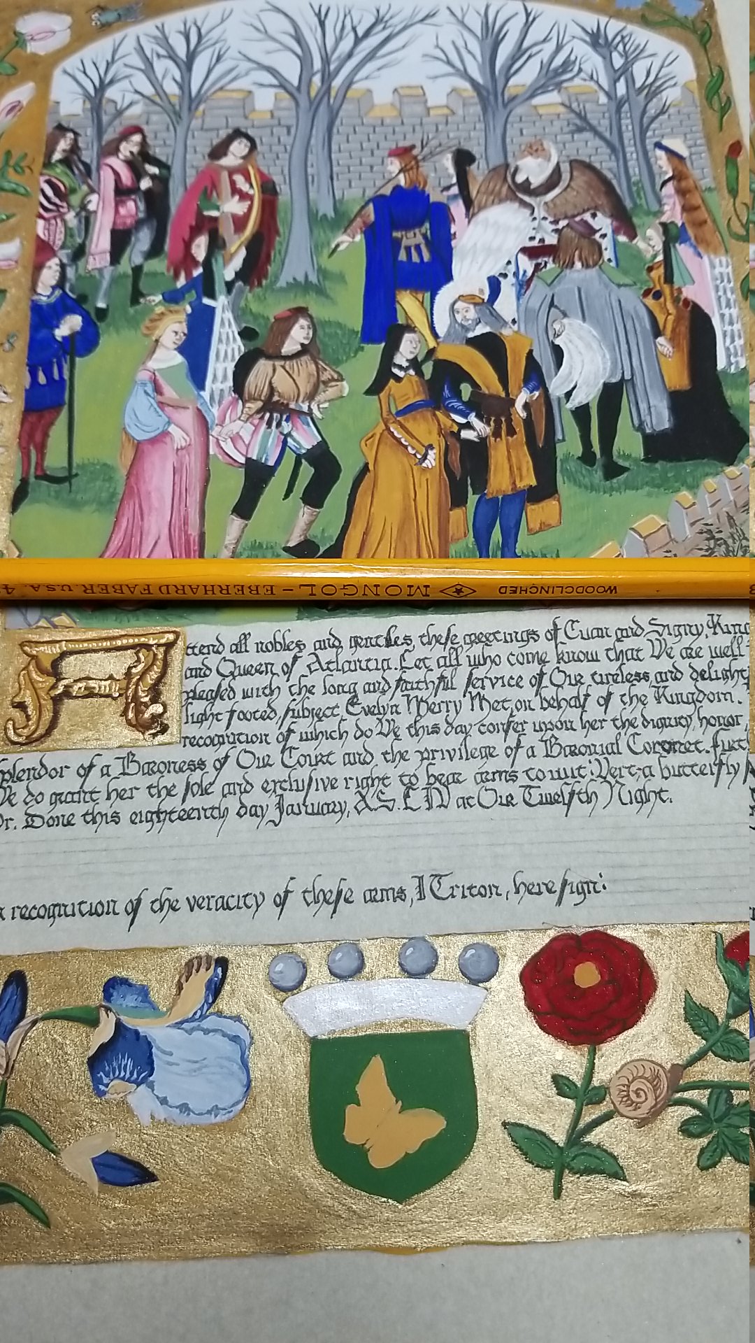
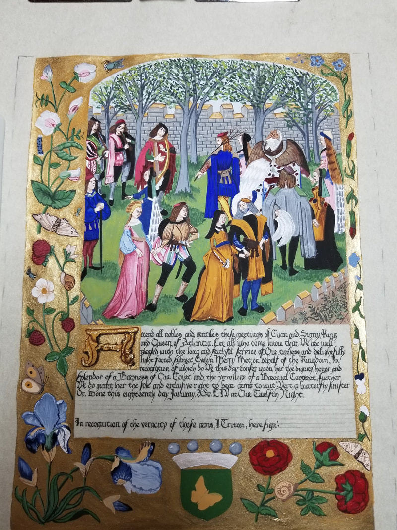
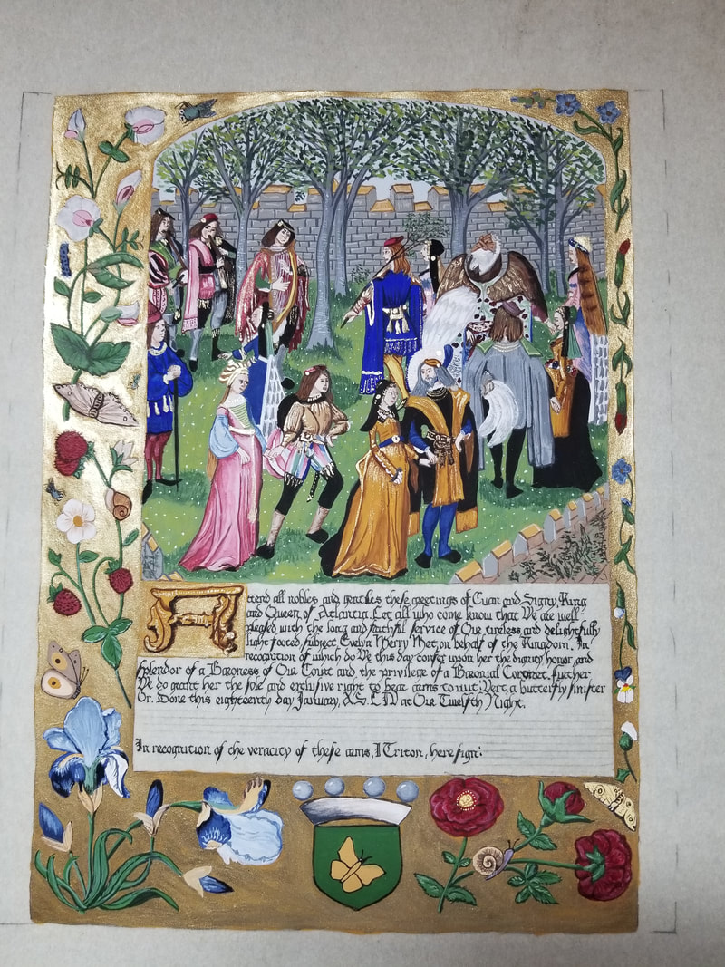
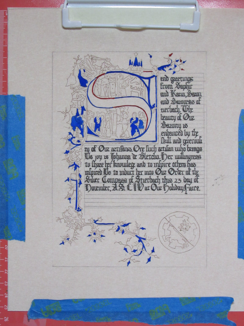
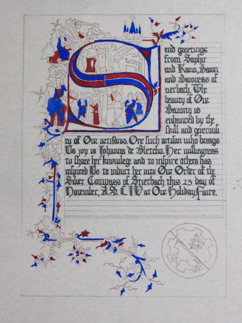
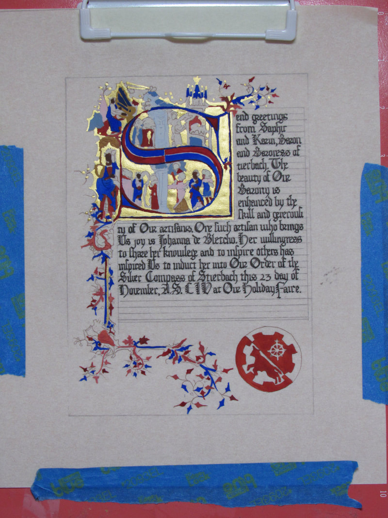
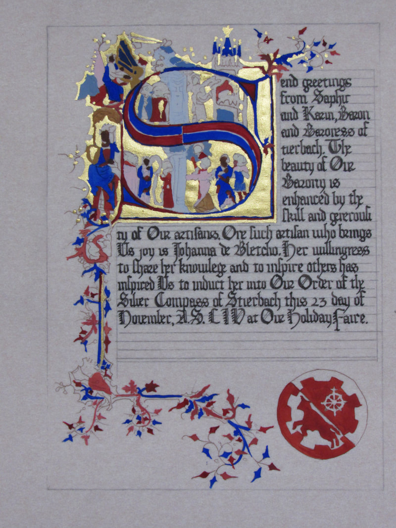
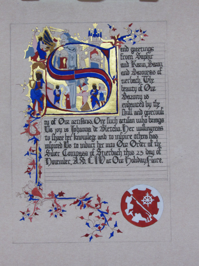
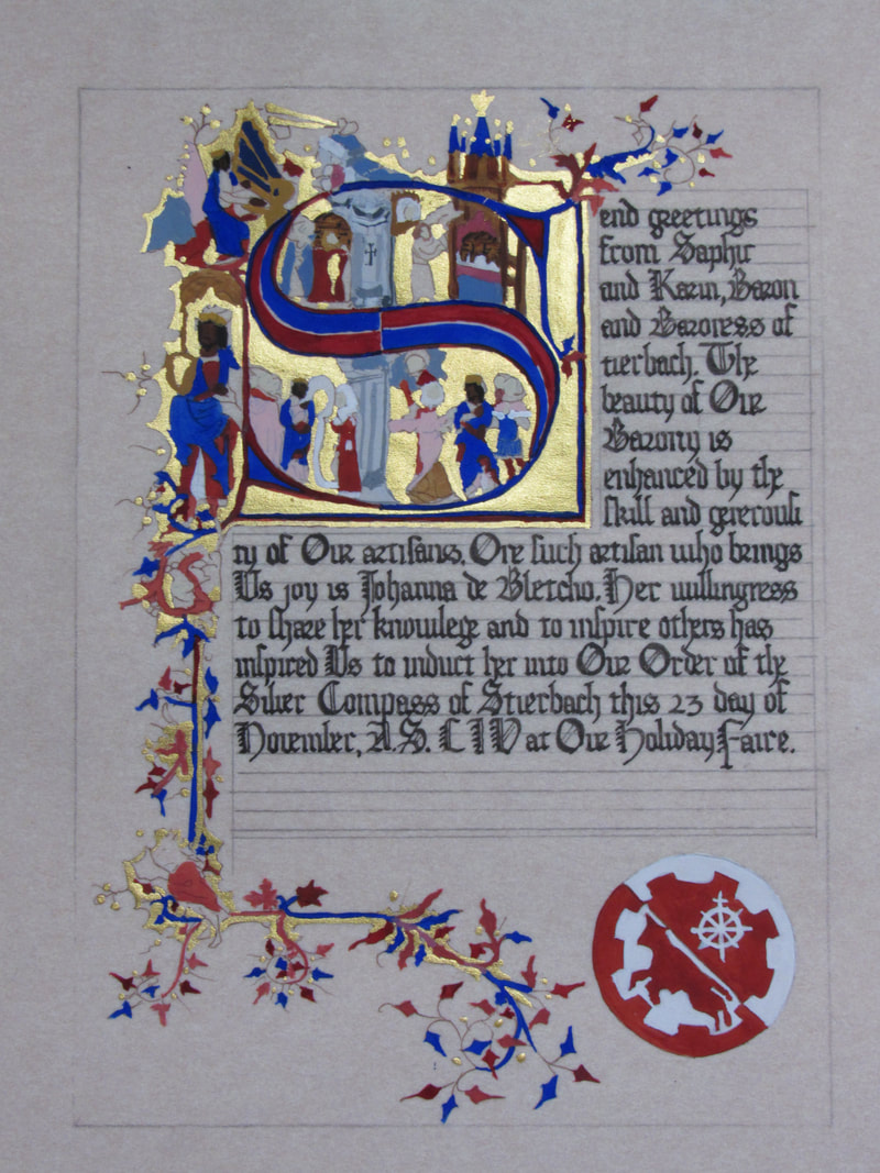
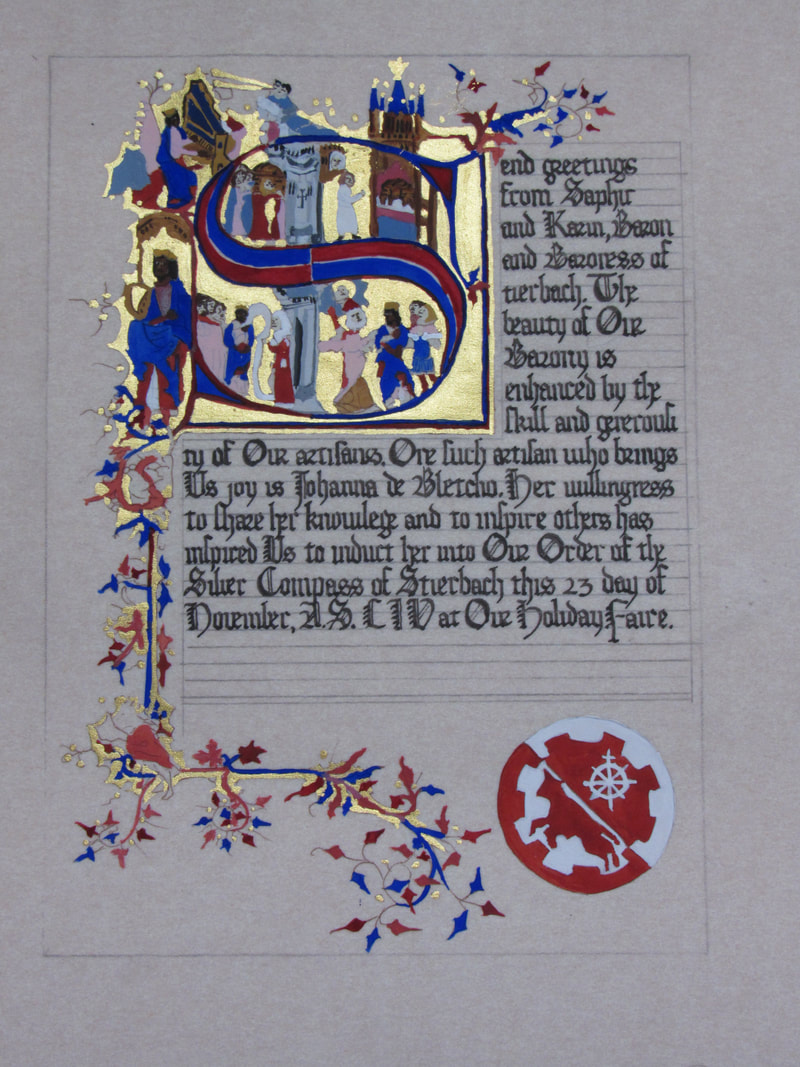
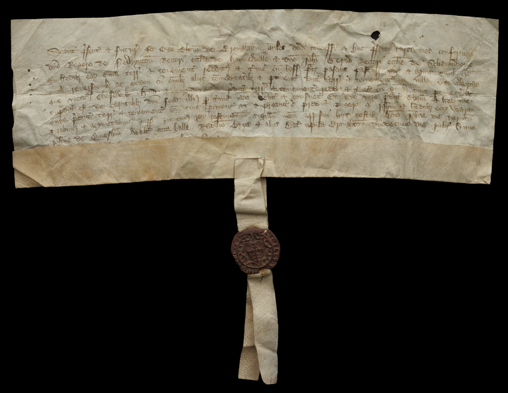
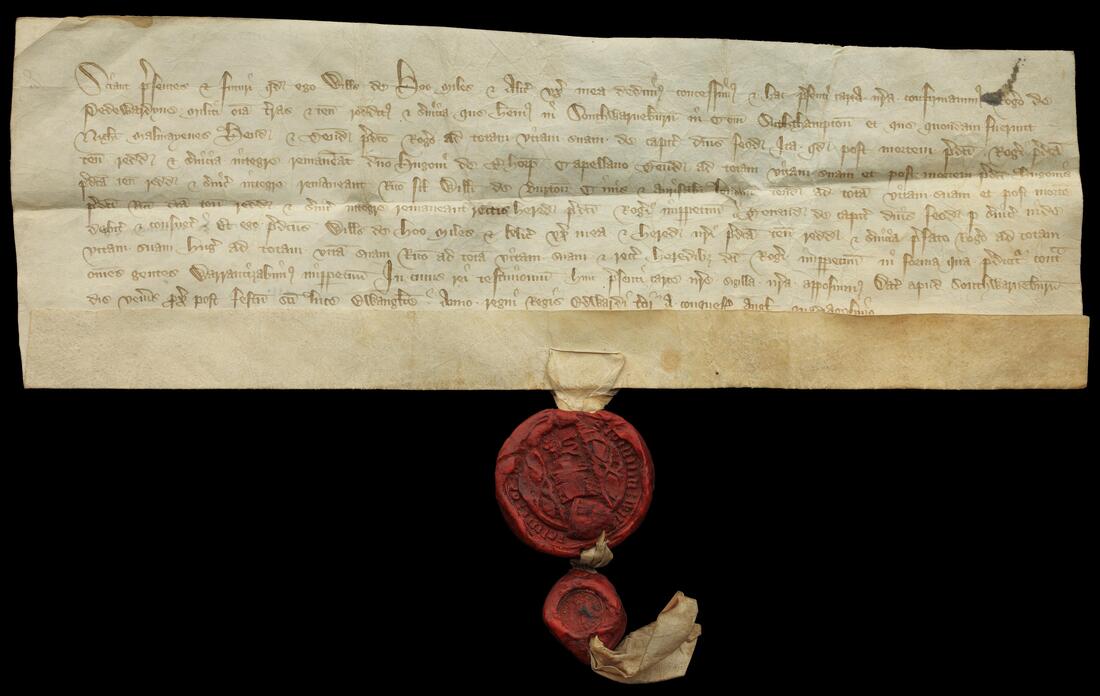
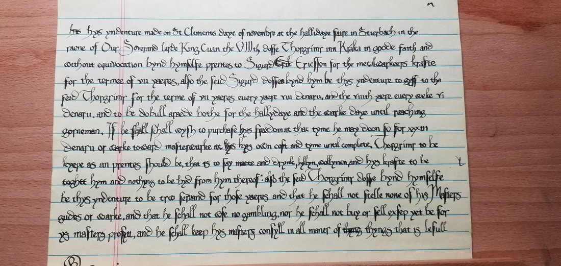
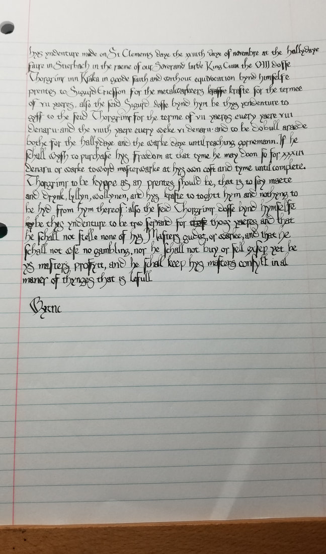
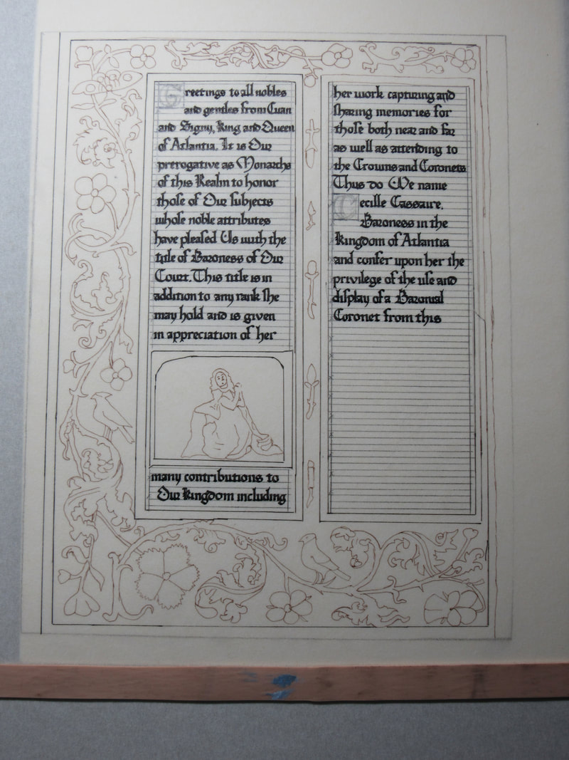
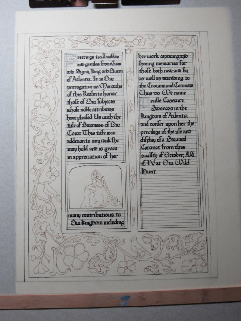
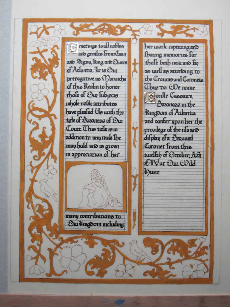
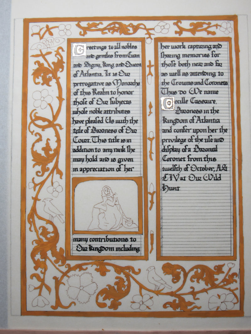
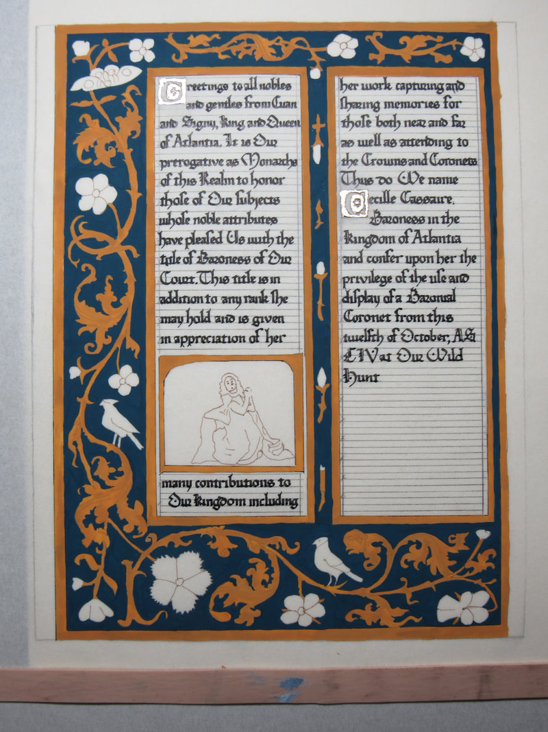
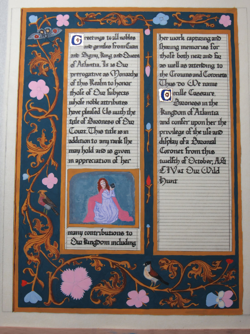
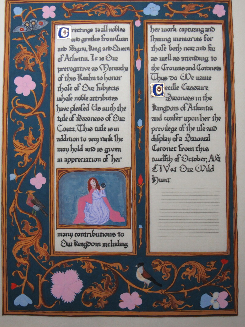
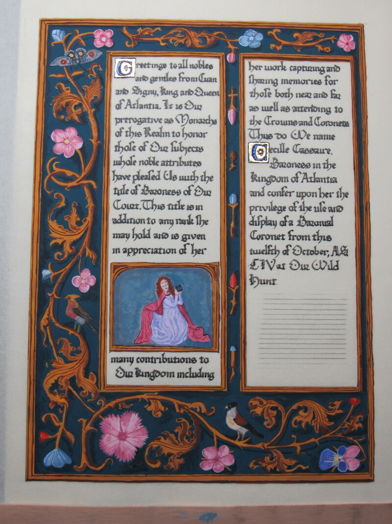
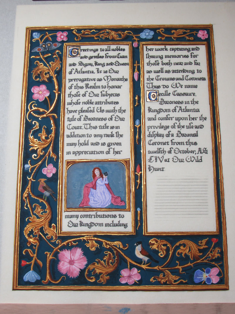
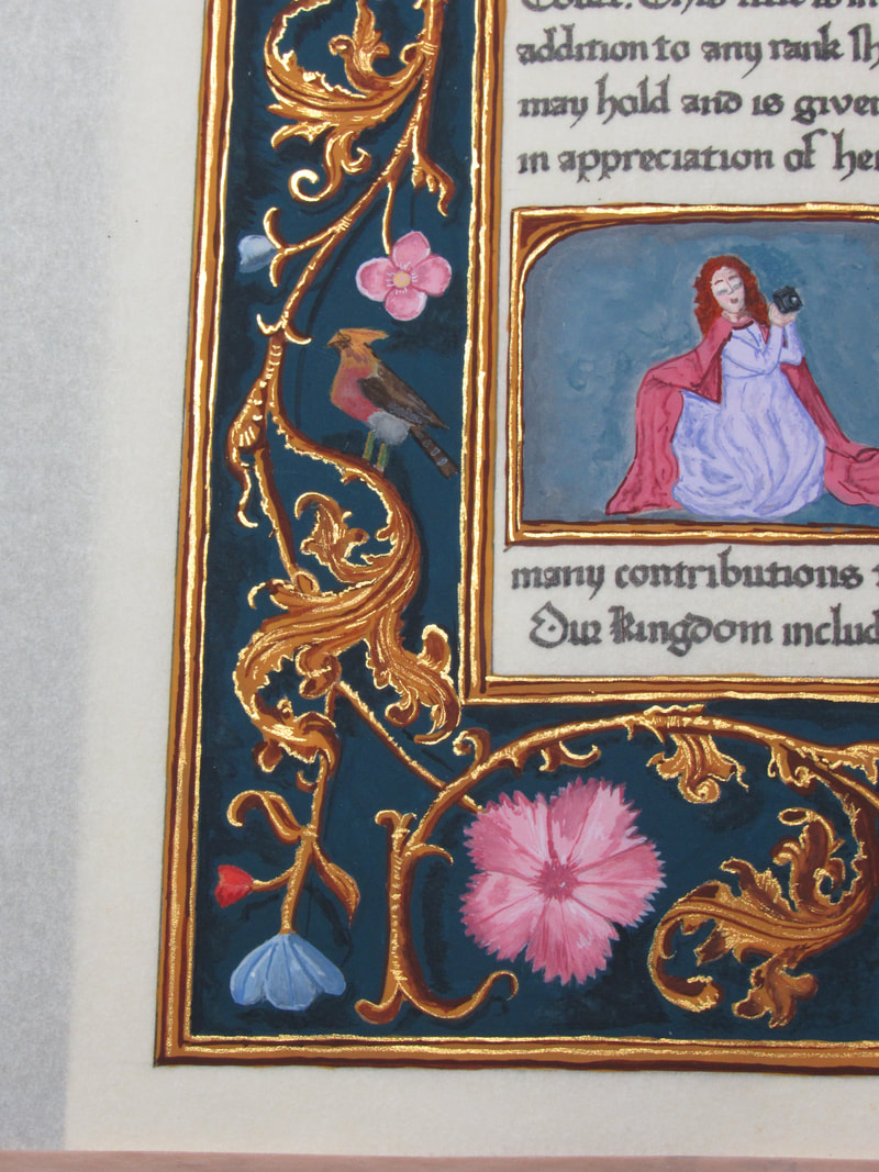
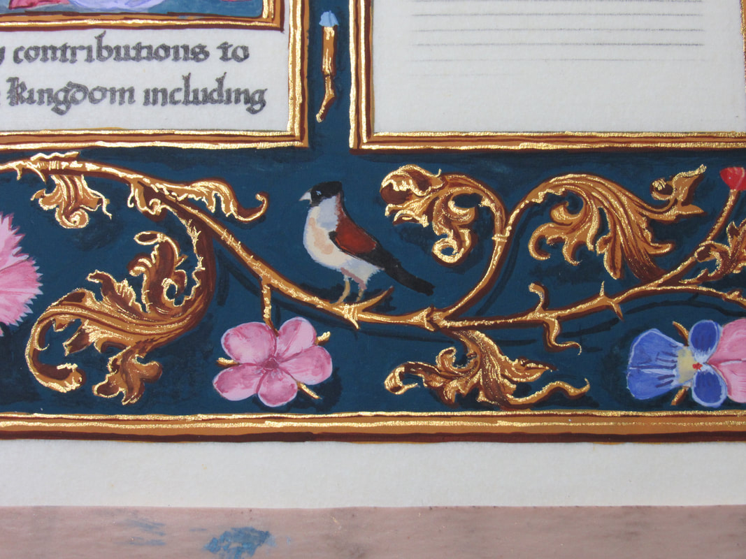
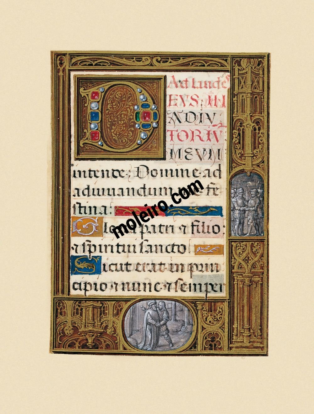
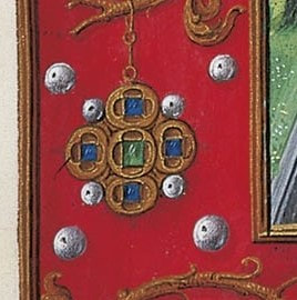
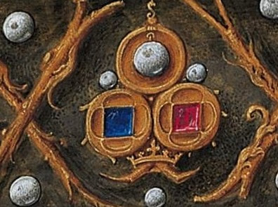
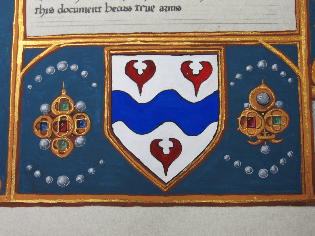
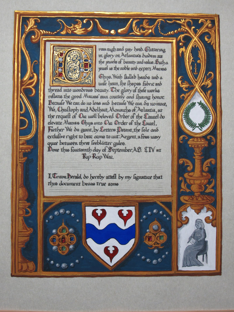
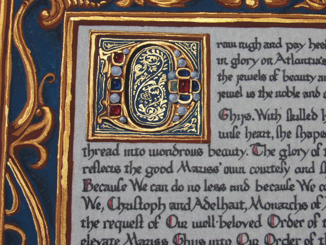
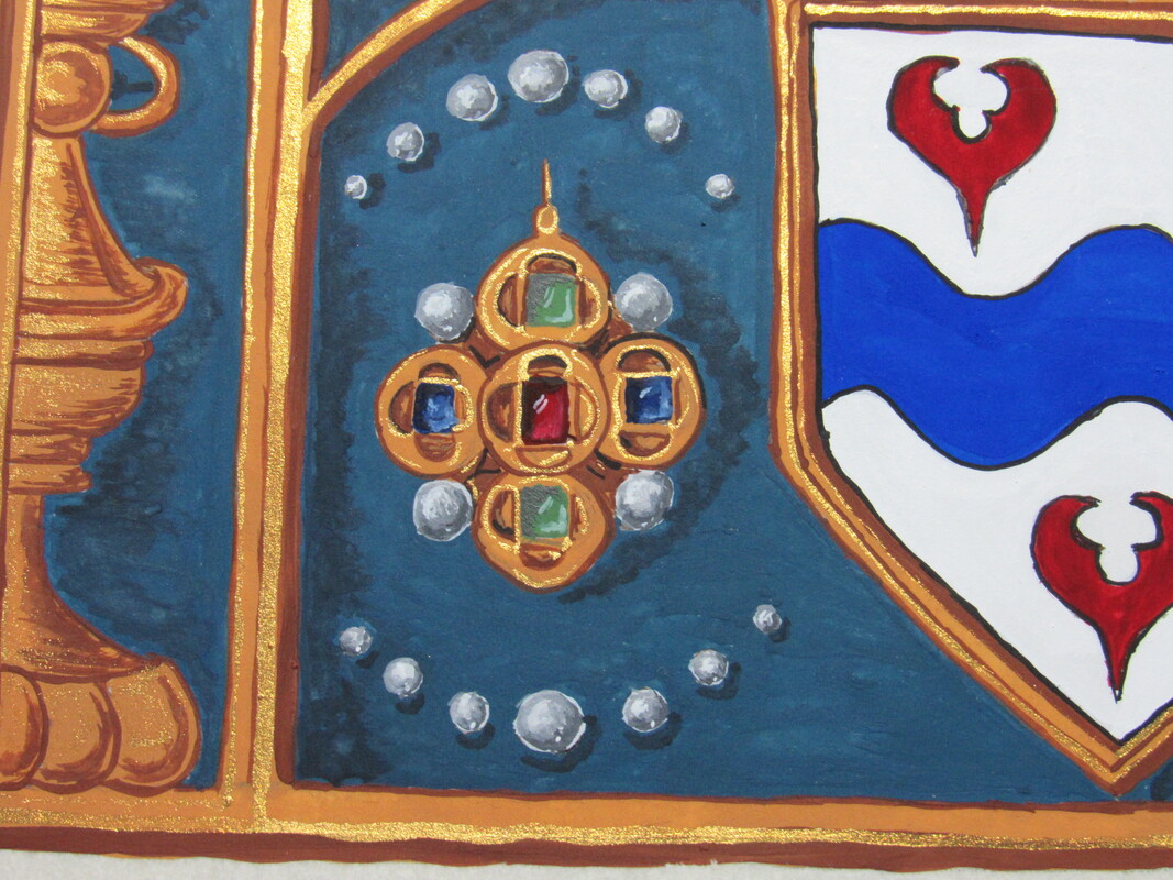
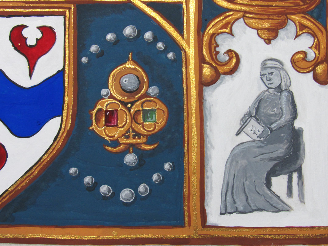
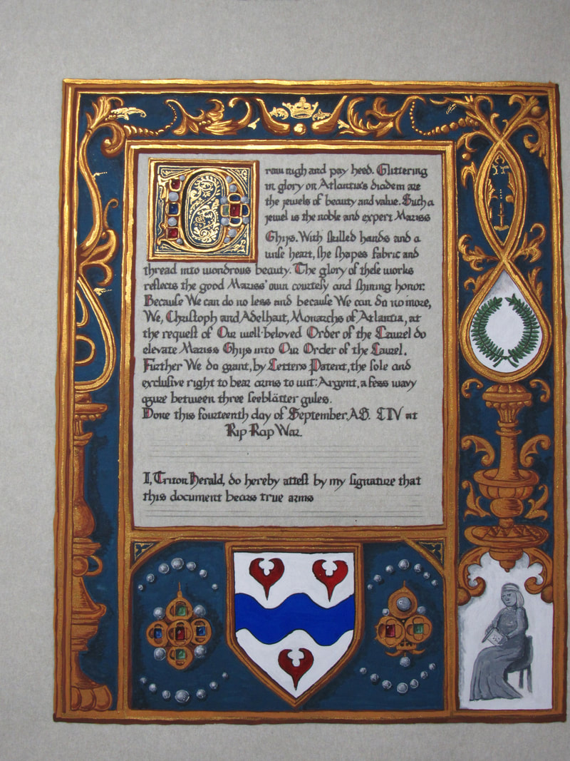
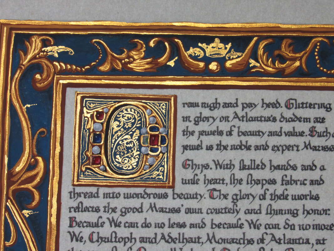
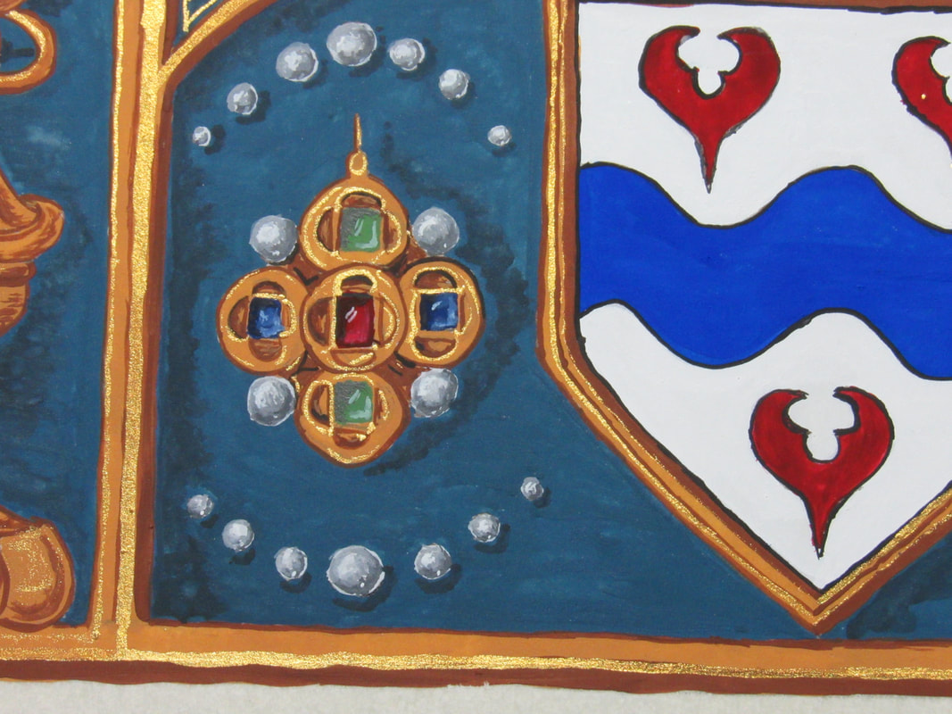
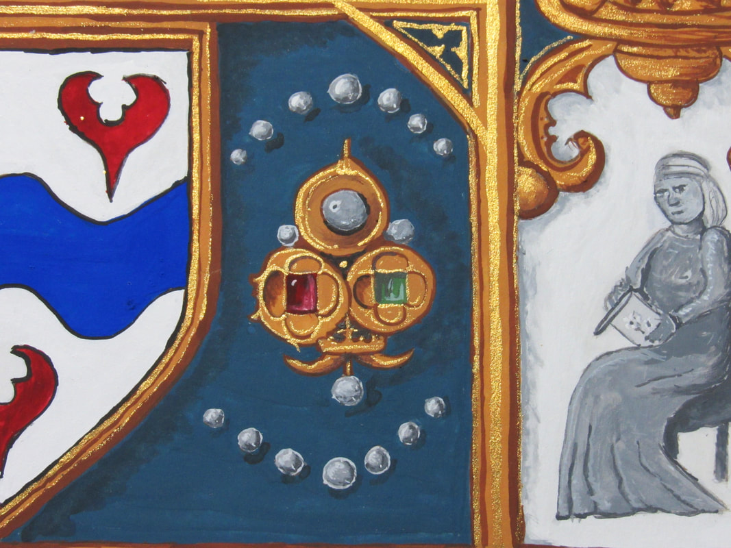
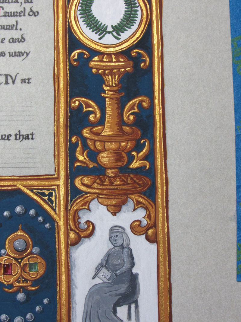
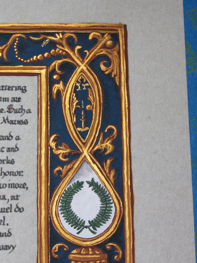
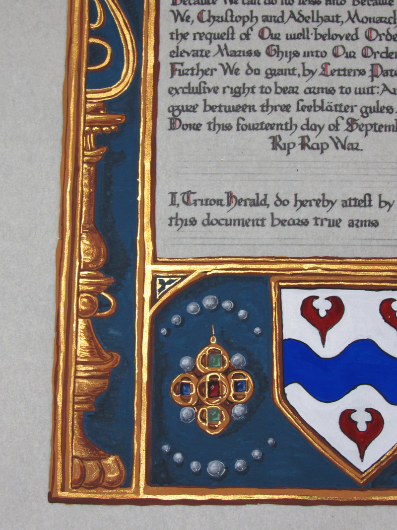
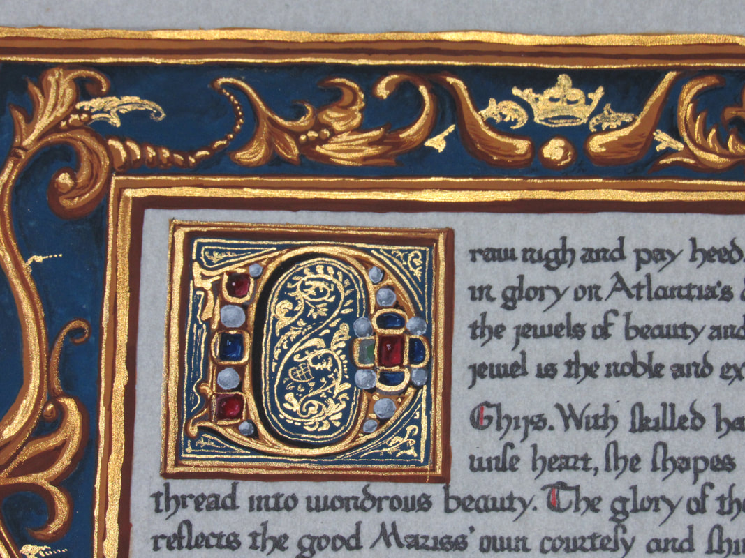
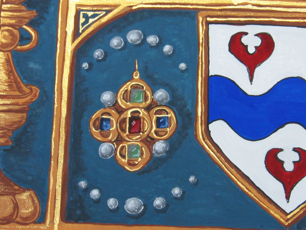
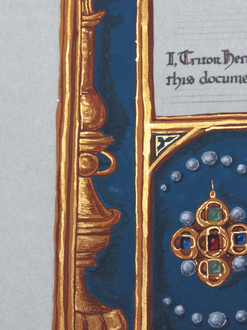
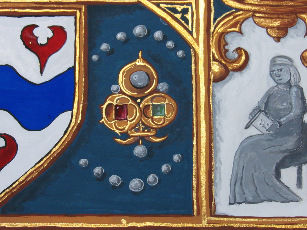
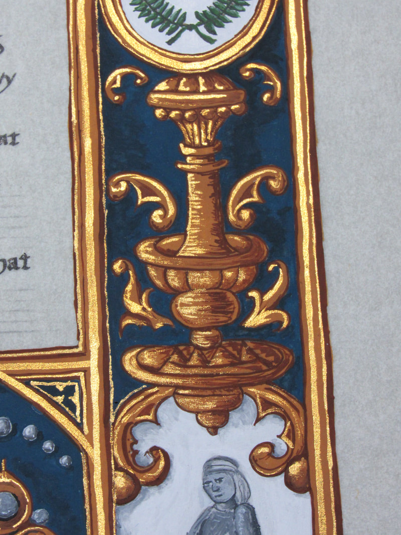
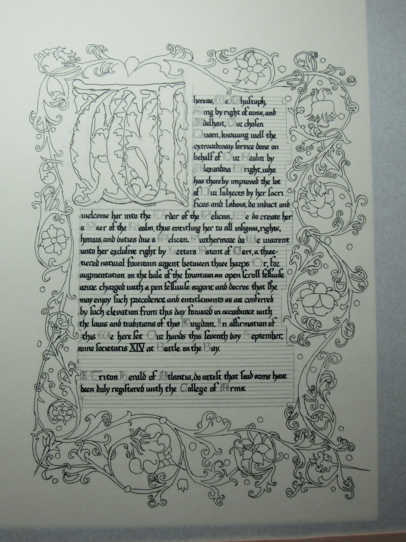
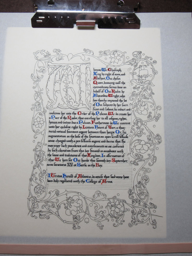
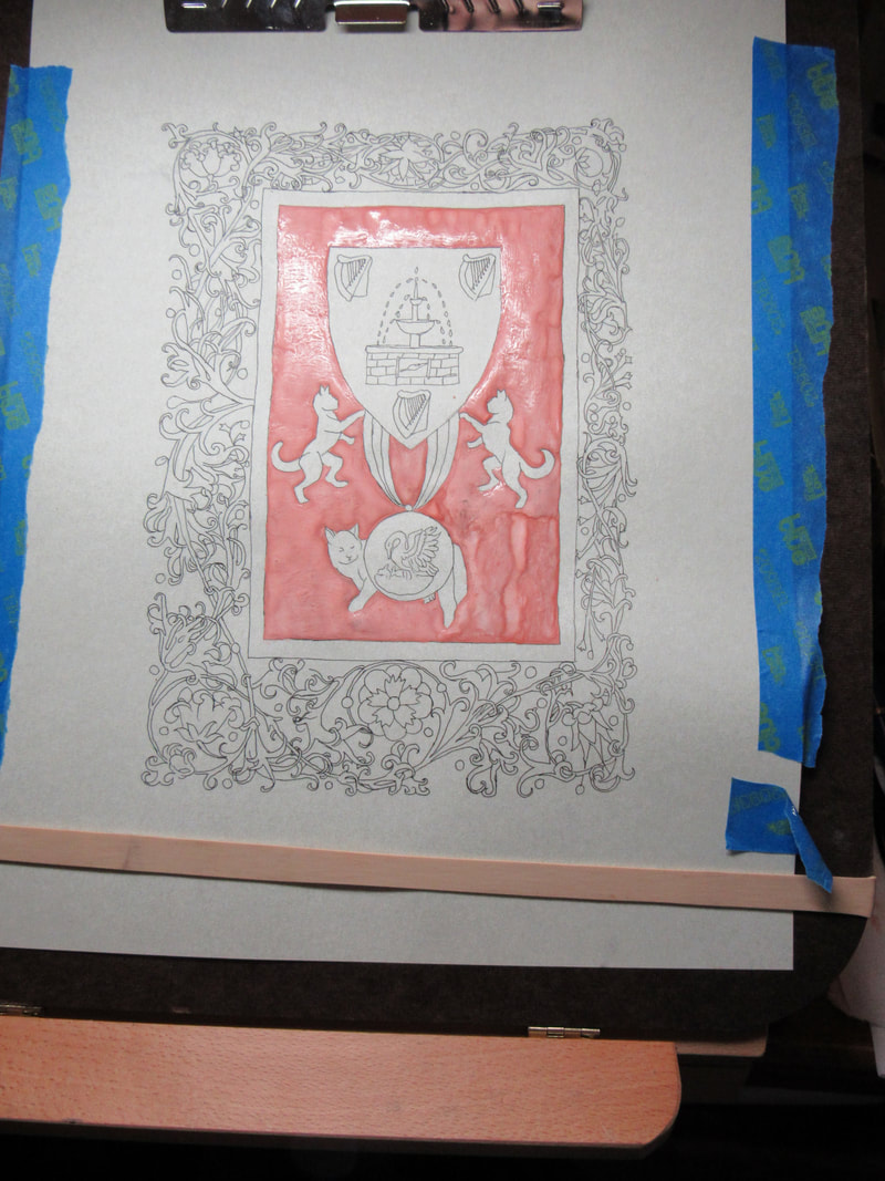
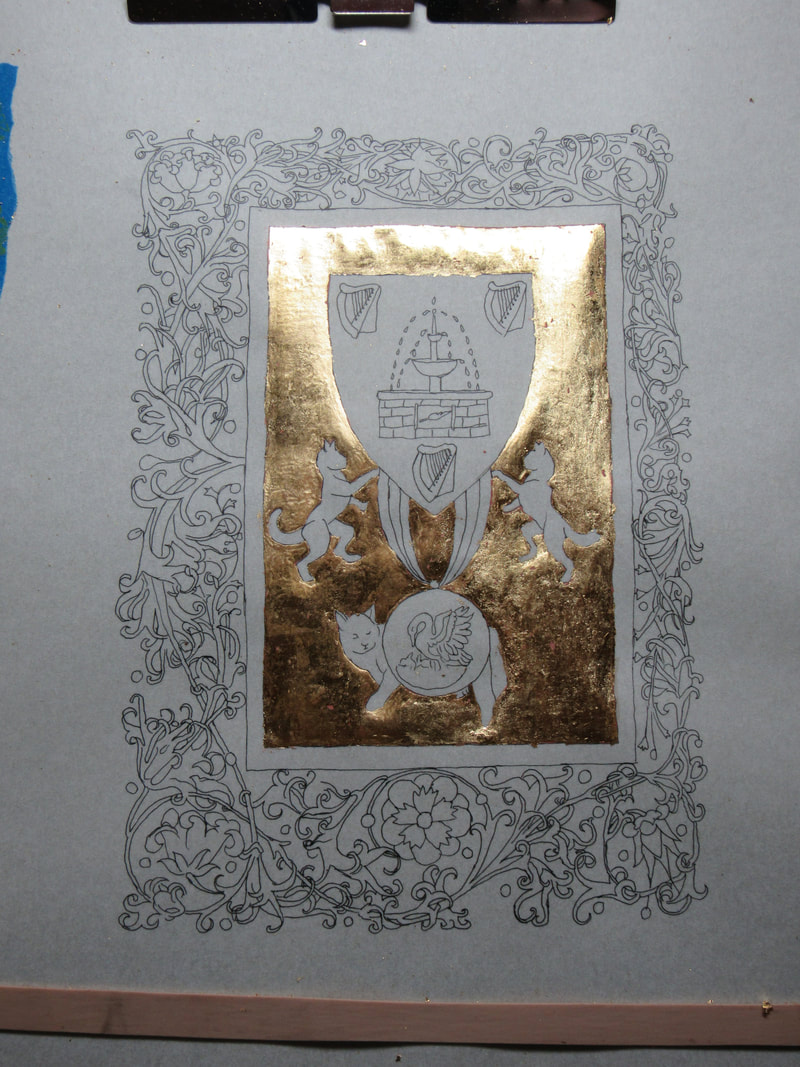
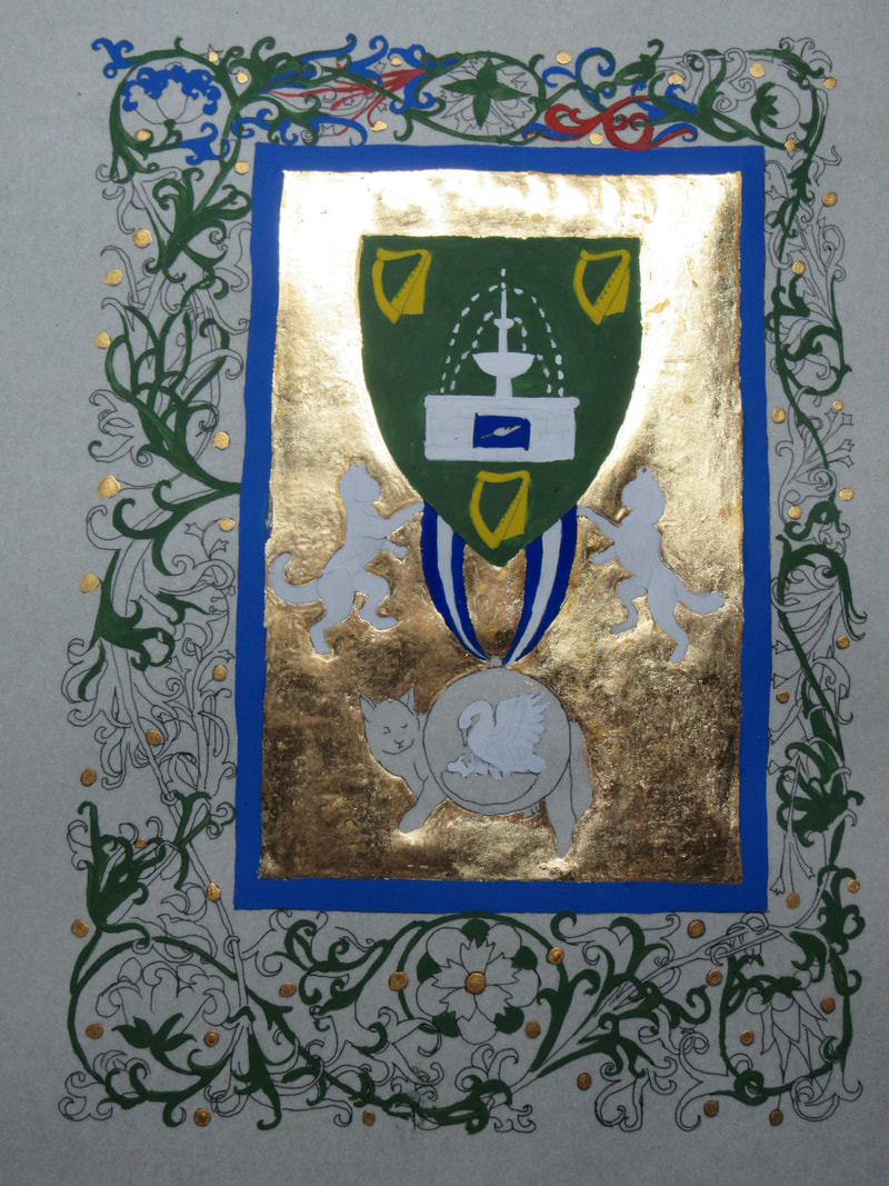
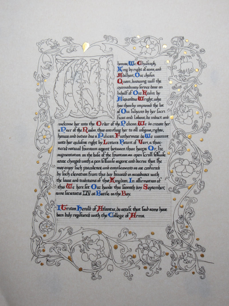
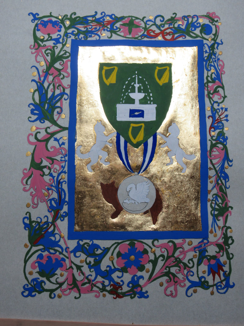
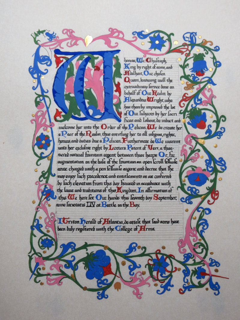
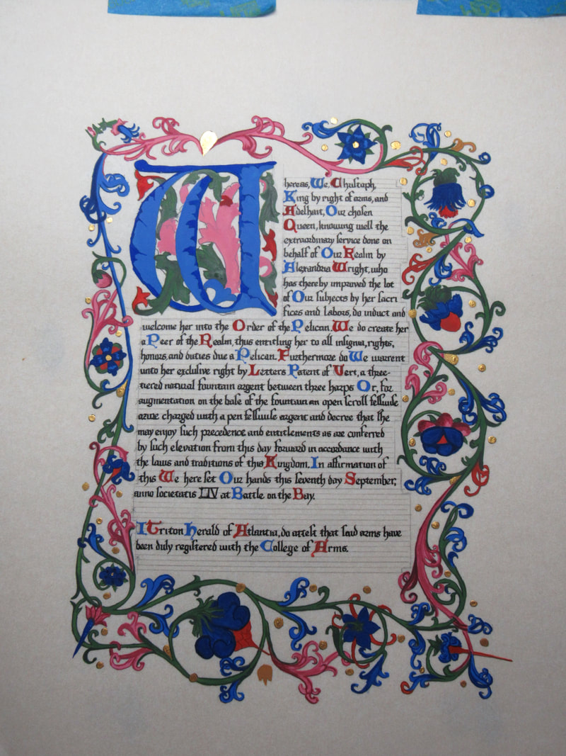
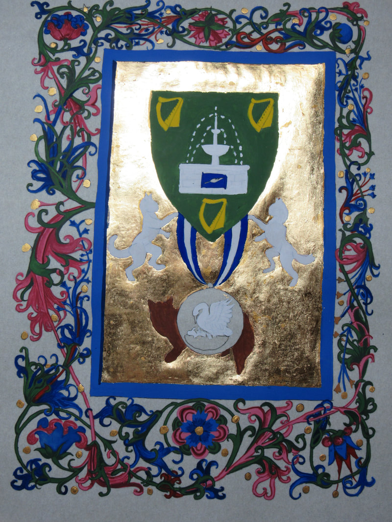
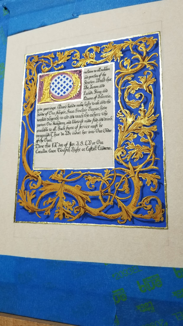 An Opal for Sara. She more than deserved it for all of the work she's done not only with the archery community, but also on a grander scale for the Kingdom and Barony with her hospitality and her teaching. I wanted to do something special, and I love the Bruge style, so I found a page which used the colors of her heraldry, blue and gold, in the Hours of Boussu.  For her Opal, I used a piece of 8x10" pergamenata with an image space of 5x7". The materials I used where instacoll with 23k loose leaf gold for the borders, gouache and finetec gold for the rest of the illumination. The ink used was Noodler's Bulletproof Eel black. Gold is very finicky to photograph. If you take pictures dead on, most of the gold accents will disappear and the image looks blah. For the magic of these scrolls you have to take the picture from a slight angle as I have done in many of the progress and closeups below, or have a special set up of lights. Please click to make them bigger. I was approached to make another scroll for a woman I greatly admire and adore, Mistress Tatiana Ivanovna. She was being awarded the Gold Dolphin for her years of service with ranging from her largesse (many, many scroll cases so our scrolls aren't damaged in transport), autocratting, MoAS, and helping with youth events. I wanted it to be special, so I might have gone a little off the deep end, but for her it was worth it. Her persona is Russian, so I picked the Gospels of Tsar Alexander (c. 1355 0 1356) for my exemplar. 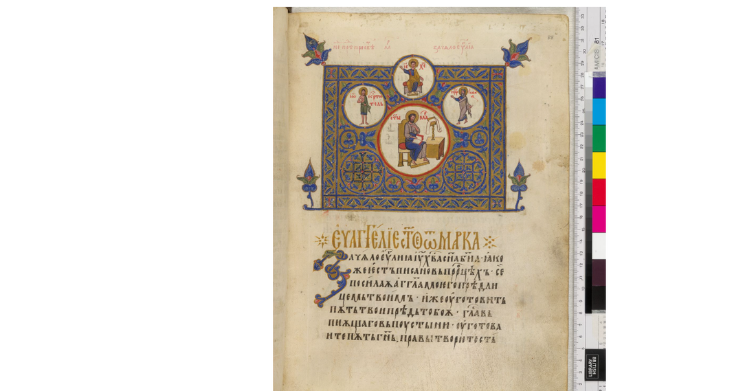 I made the decision that I was going to have the scroll text translated first into Russian, and then into Cyrillic. That's when I realized that modern Cyrillic was a bit different in many places from the Cyrillic of the 1350's. I turned to a couple groups online asking for any help I could get as I was on a tight deadline, and two Laurels I also greatly admire rose to the task and helped me find a key that helped me find the correlating old Cyrillic for the modern translation I had. So began the painstaking task of going through and matching each symbol. It was then I learned that in this particular book, a couple of the letters that resemble the Western N (only backwards) was not in this book... at all. I looked through the entire book and found only things that looked like the N's and H's we're used to in Western culture (even though they are not N or H sounds in Russian.). So I did the best I could. I found several pictures of her online and picked the ones I liked to use in the medallions on the scroll. I made the decision to use the badge for the topmost circle, and the large one to put a picture of her in the clothes she wore for her elevation to the Order of the Laurel. I took a couple of the pics that had her with what I believe are two of her grandchildren and photo manipulated the pics to put both children in one image for another medallion. I had been practicing doing three dimensional people lately so going back to the flat, more two dimensional people was a bit hard, but I kept looking at examples from the book. I used a 11 x 14" piece of pergamenata with an image size of 8x10", with gouache, and sumi gold and Noodler's Bulletproof Eel black ink. 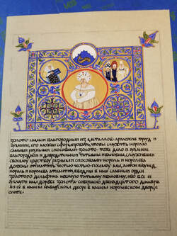 Below are progress pics and close ups. Click to enlarge. 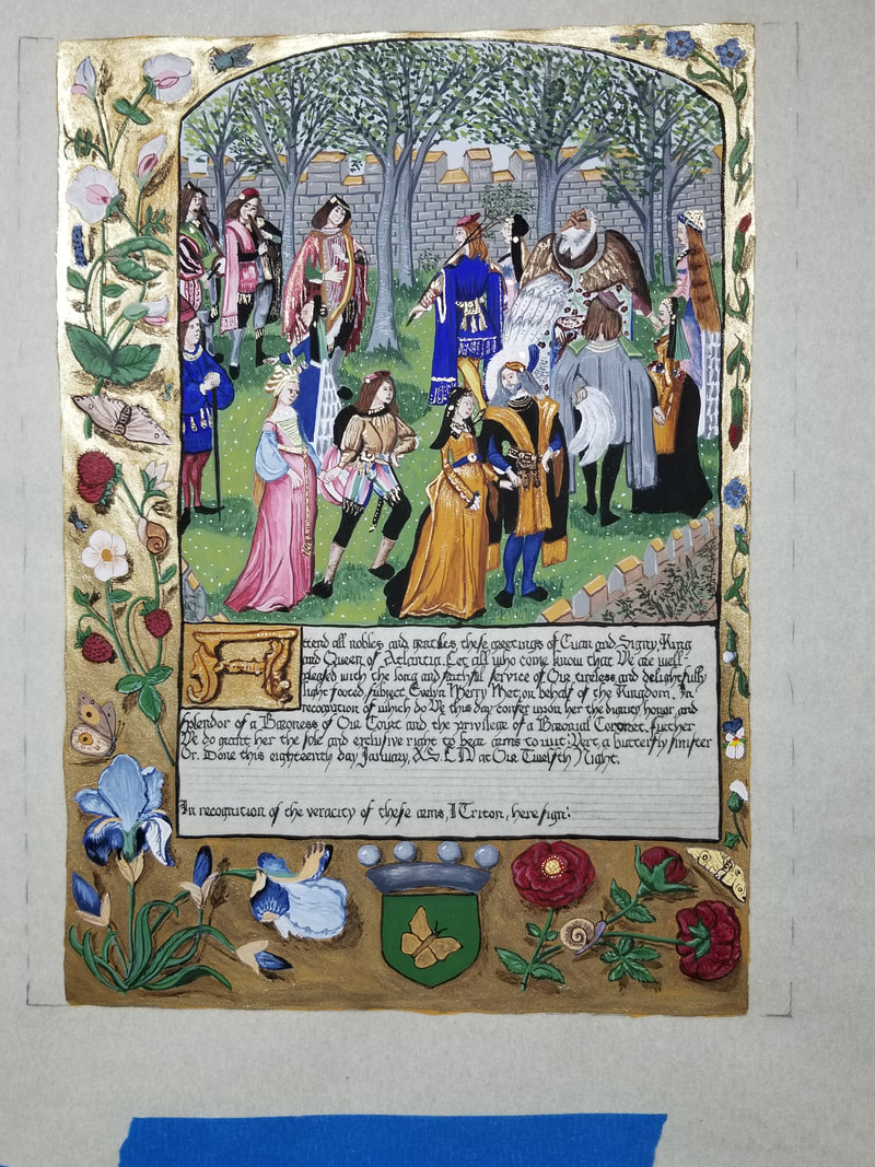 This one truly took me out of my element a bit. A lot of people (I'm fine with the clothing, but faces and hands are a bit tricky for me), a new technique using an unfamiliar material.. but I really enjoyed doing this one. Before Twelfth Night, I was approached to do a Court Barony scroll for Her Excellency, Baroness Evelyn Merry Met. She has done so much for the Kingdom and her Barony, that I wanted to make her scroll as perfect as I could. I knew that she and her husband both love to dance, so I wanted something with dancing in it. The exemplar I found, Roman de la Rose (Harley 4425) contained a scene of the Carolle (round dance with music) in the garden of Sir Mirth. I fell in love with it and determined that was the one I wanted to use. Contacting a photographer I knew might have pictures or know someone who did, I asked for pictures of the two of them so I could tweak the two center figures to resemble the Baron and Baroness. 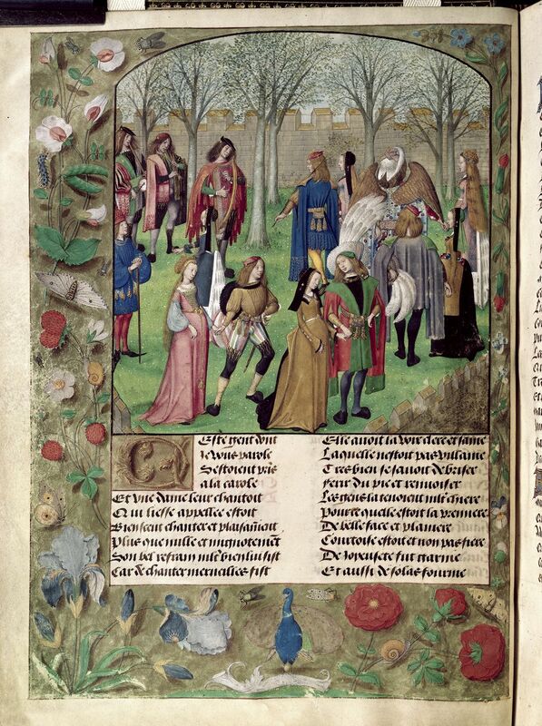 The original is part of the Roman de la Rose (Harley 4425), a manuscript made for Engelbert II, count of Nassau and Vianden in Bruges (now known as the Netherlands) by Guillaume de Lorris and Jean de Meun with the illuminations being done by the Master of the Prayer Books of around 1500 (British Library). The manuscript is about 11.41 inches by 15.55 inches. Materials used to make the original would likely include parchment for the substrate with the following pigments in a mix of egg glair and water or gum arabic and water: yellow ochre (earth), sap green (plant), lamp black (soot), rose madder (plant), lapis (stone), lead red (lead), lead white (lead), burnt umber (hematite, stone), and burnt sienna (earth) (Cennini & Thompson, 1960; Clark, 1995). A point of interest was the auripigmentum also known as orpiment (arsenic and sulfur) which was used over the yellow ochre on the outside frame. The hand used in the original is listed as gothic cursive by the British Library with ink made of oak galls, iron shavings, gum arabic, soured wine (vinegar), and water (Cennini & Thompson, 1960). When recreating the pages of a manuscript I try to capture what I see using modern paints and modern substrates due to cost and safety reasons. Many period pigments were poisonous, using such ingredients as lead or mercury. While most might be framed, I prefer not to risk the chance of poisoning someone or their pets, so I use commercially produced gouache and mix my own colors. The scroll was done on 11x14 inch pergamenata with a border that left the illumination to an 8x10 inch window. This is slightly smaller than the original but it is in keeping with a standard size for SCA scrolls so that it is easier for a recipient to have it framed. First, I create what I call a pattern or a cartoon. This is often done by drawing a rough sketch on paper until I get it where I want it, then inking the lines I want to keep and erasing the ones I don’t. Then using a lightbox, I trace that to transfer paper for ease of transferring to the pergamenata. This means less chance of gouges in the substrate for paint to catch in. Once the basic design is on the paper, I practice the hand and the script I will be using. I try to use the hand from the exemplar or as close as I can come. When I am certain I have it to the right size for the scroll, I will line the scroll and add the calligraphy. For this scroll, I used Noodler’s Bullet Proof black with a size 5 nib in a dip pen. Normally at this point, if I were gilding, this is when I would do so. However, this scroll did not require actual gold, so I began painting. I used yellow ochre, ultramarine blue, alizarin crimson, chromium oxide, light purple, zinc white, lamp black, cadmium yellow pale, burnt umber, and burnt sienna by M.Graham and Winsor Newton. Using those colors I mixed everything to get as close to the original as I could get, though there is some margin for error as I do not have access to the original and had to work from digital uploads. After the yellow ochre was dry, I burnished it with a piece of hematite, taking care to only burnish the ochre. Next I started to fill in the base colors for some of the background while I waited for the auripigmentum substitute to arrive. I mixed the auripigmentum substitute according to the instructions from Mistress Livia and brushed it on. I used two layers to get good coverage and then continued the rest of the base colors, shading, and highlights. I did not get this project done in time for it to be handed out at Twelfth Night due to illness. This taught me that it is better to apologize for being late than to rush and ruin what I was working on. This scroll also reinforced the realization that the smaller the people the harder the face and hands. It was also the first time I had used any form of the auripigmentum, substitute or real, and it most definitely was a learning experience. The first thing I learned is that the powder goes everywhere so care is needed when opening and measuring and mixing and painting. I think in the future I might use a little more binder and do the ochre and auripigmentum before adding any other colors to the substrate as it does flake a little. In progress pics below. 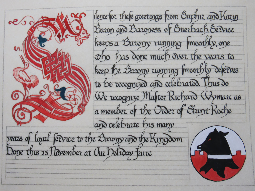 One of the two scrolls I was asked to do was for a dear friend, Master Richard Wymarc. He already had a Saint Roche, and a Silver Heart of Stierbach, but as he has done so much for the Barony, our Baron and Baroness decided to award him a second Saint Roche. For him, as I know he is much the man of science, I selected a cadel from The Works of Jacques Devaulx which I used also for the cadel in the contract. It was actually this scroll that led me to the cadels for the contract in fact. One problem with doing cadels is that there are no progress pics of this one, which is done on an 8" x 10" piece of pergamenta with at least 1 1/2" border around. I used a hand-mixed vermillion red made from modern gouche for the cadel with a dark blue green for the flowers. The ink was Noodler's Bullet Proof black and the hand was done from the exemplar. 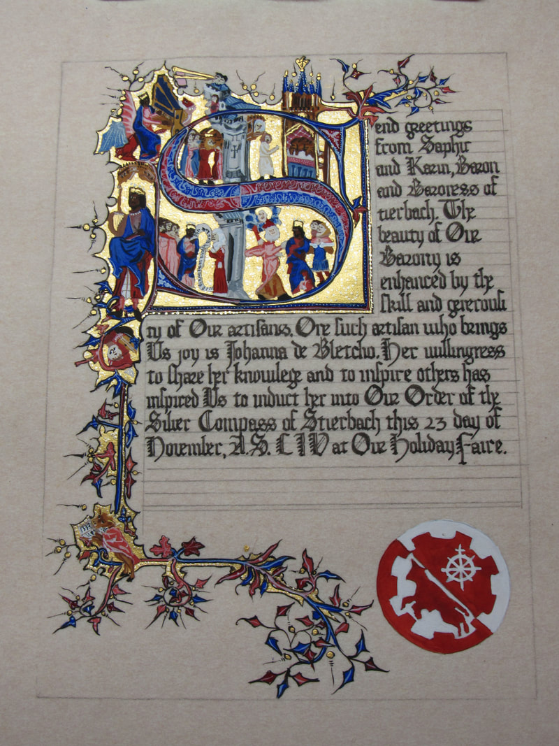 So for this one, I conspired a little with the recipient's offspring who is also a scribe. I had Elliot help me pick the exemplar for their mother, Johanna. We selected Egerton MS 3277, the Bohun Psalter.  The original was 13.3" x 9.25" parchment, mine was 8" x 10" with at least 1 1/2" borders. The original has leaded gesso most likely with lapis lazuli for the blue, cinnabar and cochineal for the reds, most likely mixed with leaded white to create many of the other colors. The ink would likely have been crushed oak galls with ferrous oxide and vinegar mixed with water. Due to safety and time constraints, I used more modern materials such as store bought gouache, finetec gold, and Noodler's Bulletproof black ink. One of the little tweaks I made was I turned King David from the original into our Baron, Saphir. In progress pics below. At Holiday Fair I only took two Baronial awards to do, and then was approached by two Laurels I respect and admire who have also been my mentors on a few things (one on scribal and approach to subjects, the other on wax carving and approach to subjects). One was taking his first apprentice and a contract was needed. He gave me a rough outline of what he wanted, the words, and a few period examples, then turned me loose. Unfortunately there are not a lot of pictures for this one, but I was happy with how it came out. 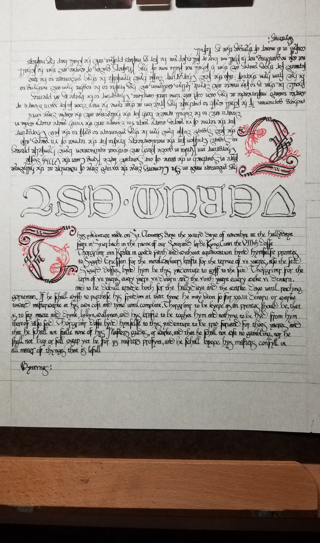 Taking the medieval exemplars and comparing them with a typed copy of the wording, I found the hand appropriate to the time period that Master Sigurd wanted. One is: Charter of William de Hoo, knight, and Alice, his wife, granting to Roger de Pedewardyne, knight, their lands and tenements in South Warnborough in the county of Hampshire, which were formerly of Nicholas Malmayenes. The lands were to be held successively for their lives by Roger, by Hugh de Thorp, chaplain, and by Richard, son of William de Burton, citizen and goldsmith of London, and then to remain to the right heirs of Roger. South Warnborough, 23 October 1366. The other is: Charter of Thomas de Broughton, knight, granting to Roger de Newynton, the rector of the church of Hanwell, and John Gerad, the rector of the church of Shenington, and their heirs, lands and tenements in the in vill of Tanworth which is called Cheswick. Broughton, 12 July 1365. These were typically only one half of the charter, or contract, as one was kept with each person. We did a cipher in the middle so that it could be put together to prove it was the same contract. The cadel was not quite the right period, but I had shown Master Sigurd the red and black cadels from The Works of Jacques Devaulx, Pilot and Mariner and he had seemed to like them, so I drafted one using two other letters to make the missing letter T. 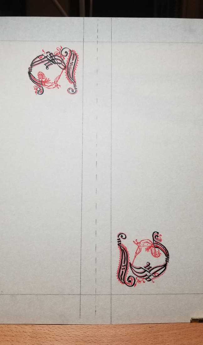 As time was short, I only took a couple days of practicing the hand to get the feel and the right size. The materials used were: 11" x 14" pergamenta for my substrate, black Noodler's ink, red ink, and a couple hand cut quills. Below are in progress pictures. 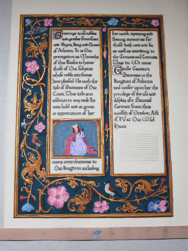 I love to do scrolls for people, but I especially love when I can do them for the people I know and love. Before the Wild Hunt in 2019 I was approached to do a Court Barony for Cecille Cassaire (AKA Cassaire). It took me a while to settle on an exemplar but I chose one of my favorites that I thought she might like, The Breviary of Isabella of Castille. I love what I call the "Bruges" style with gold accents and drop shadows. Original below 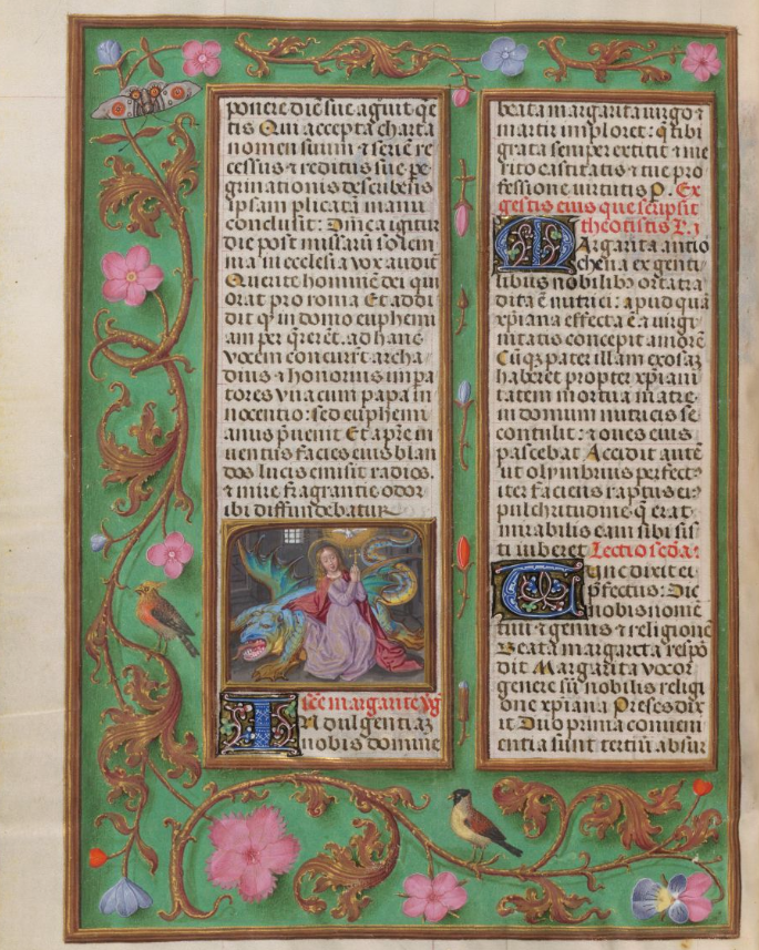 I had recently done a Laurel scroll from a similar style and mixed a teal that was gorgeous. I had heard that Cassaire had liked the color combination so I changed the green from the original to that teal. The original was 9" x 6.2" of parchment whereas mine was on an 11" x 14" piece of pergamenta with roughly a 2" border on all sides. Many of the pigments that were used at the time were either potentially poisonous or poisonous. Some, such as the yellow ocher, burnt sienna, and burnt umber were from dirt, iron ore, or hematite and fairly safe. The green may be either a malachite based paint with a lead yellow (poisonous) or lead white (poisonous) added, or possibly a verdigris based green with lead yellow (poisonous) added. The pinks may be from a lac made of madder root, and the bright vermillion red would be from cinnabar (poisonous). Blues can come from either of two stones, azurite or lapis lazuli, finely ground. The ink would have come from oak galls crushed and steeped with ferrous oxide and vinegar. My materials were more modern, gouache paints, finetec gold for the accents instead of shell gold, and modern ink. I did do gilding around two initials using a modern gesso and 24k gold. Below are the in progress pics and a close up or two. One of my favorite Peers came to me and asked me if I could and would do a Peerage scroll for an upcoming Laurel. Of course I said yes! I wanted something that would go with roughly the time period and place of the recipient's persona as well as the dress she was making. The fabric was gorgeous in all the pictures. So I went with the Golf Book of Hours for the outline, and took a couple pieces from the Rothschild Book of Hours as well. The exemplars: I used a 14x11" piece of perg with roughly 2" borders all around for framing. Matched the color of her dress for the background as best I could from pictures of the fabric, and used gouache and finetec to get the look. For ink, I used Noodler's. 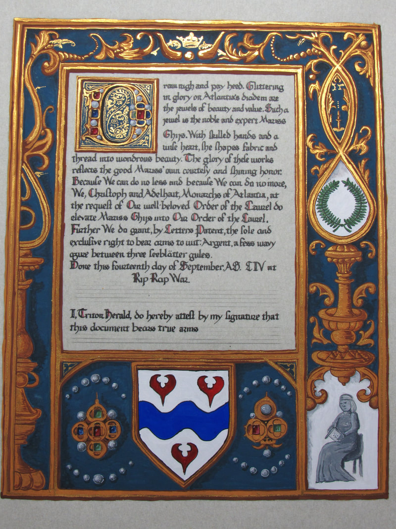 In progress and close ups below. So one of my mentors asks me "Can you do a Peerage scroll with this turn around?" I reply, depends on what design we're talking... She couldn't give me more details because she was waiting to see if the writ was happening. A few days back and forth, the writ is confirmed, she's doing it, it's being given, so she can tell me in confidence who it was for: Her sister. She gives me a few key points she knows her sister will want, what she won't want, and then tells me that after that Saturday I can ask Alexandria what she wants. Alexandria picks the Saltzburg Missive. Two specific pages. Ok, so I'll use the one for her heraldry and the other for the writing. A little alterations and I also add her three cats which was one of the requests her sister, Dame Daniella requested. 2 sheets of 11x14" perg with about a 2" border all around. Leaded gesso, 23k double gold, finetec, and gouache with Noodler's Bulletproof black. 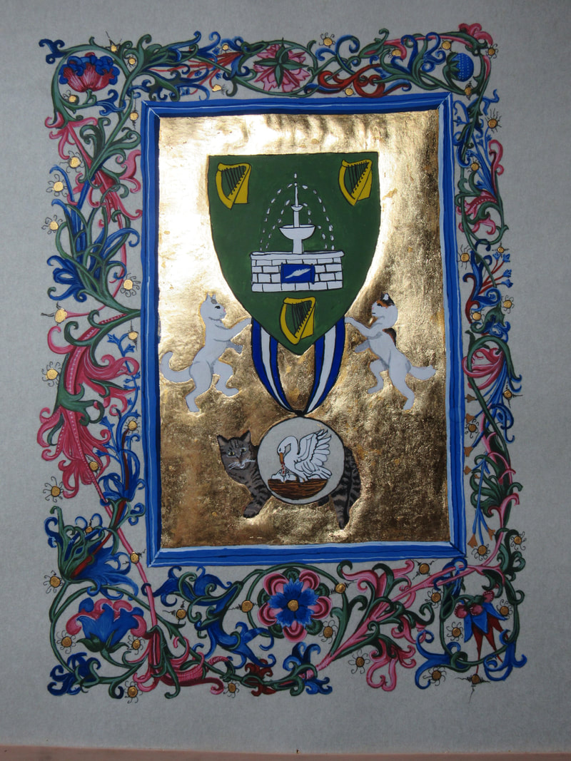  In progress below. |
AuthorMe, Faílenn Chu ingen ui Fháeláin. Archives
February 2021
Categories |


 RSS Feed
