|
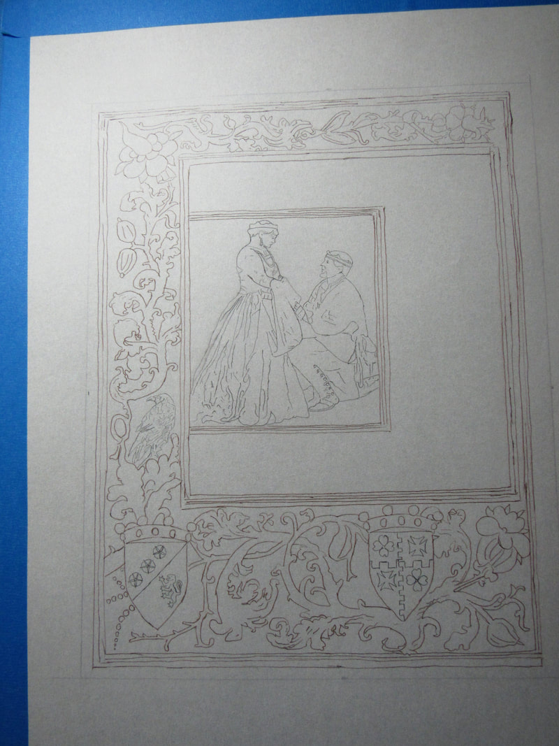
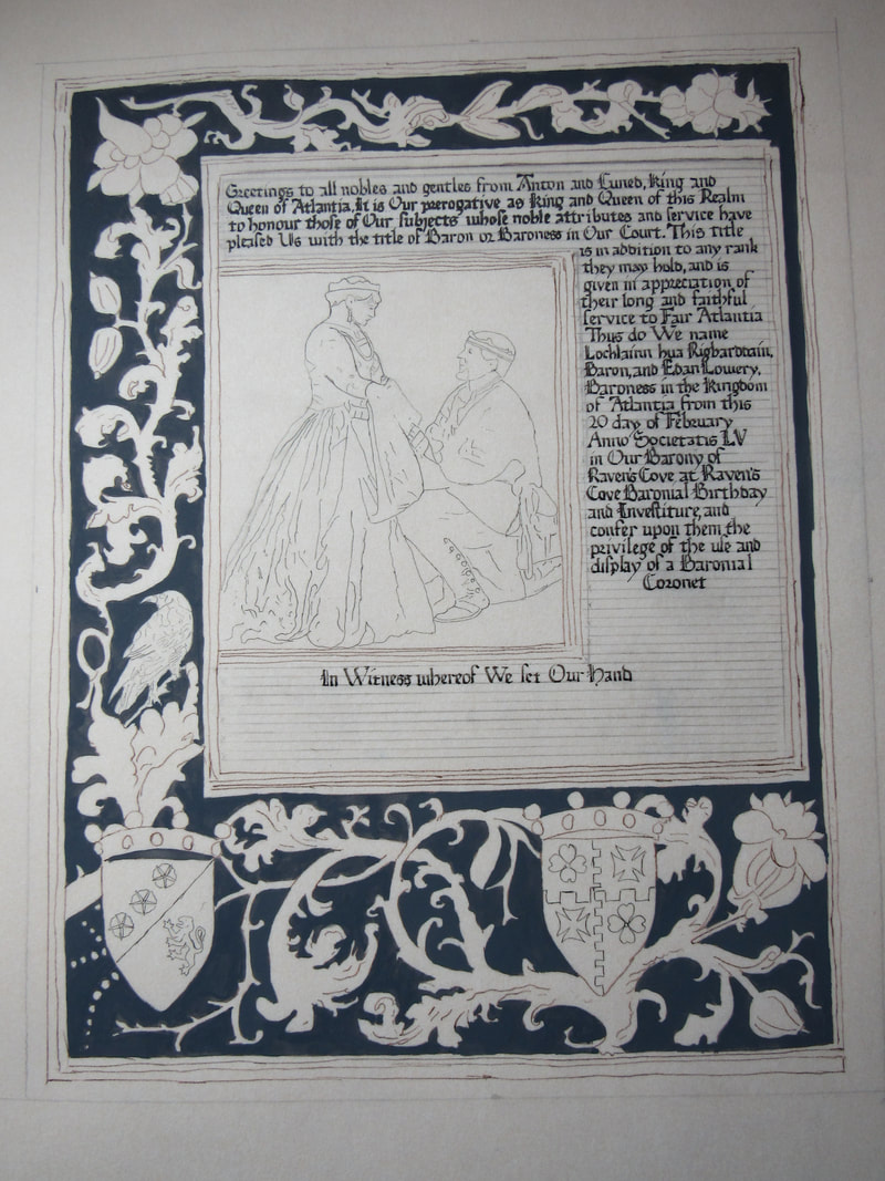
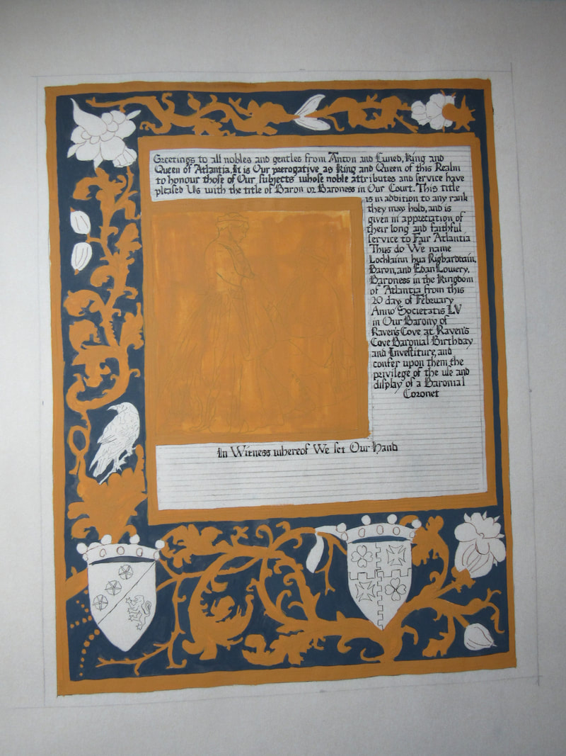
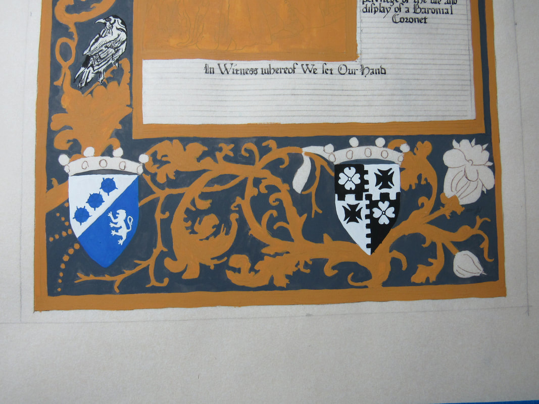
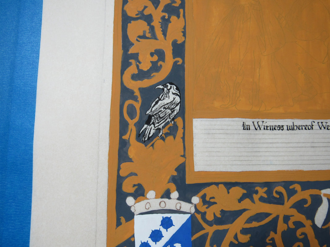
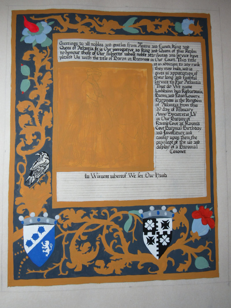
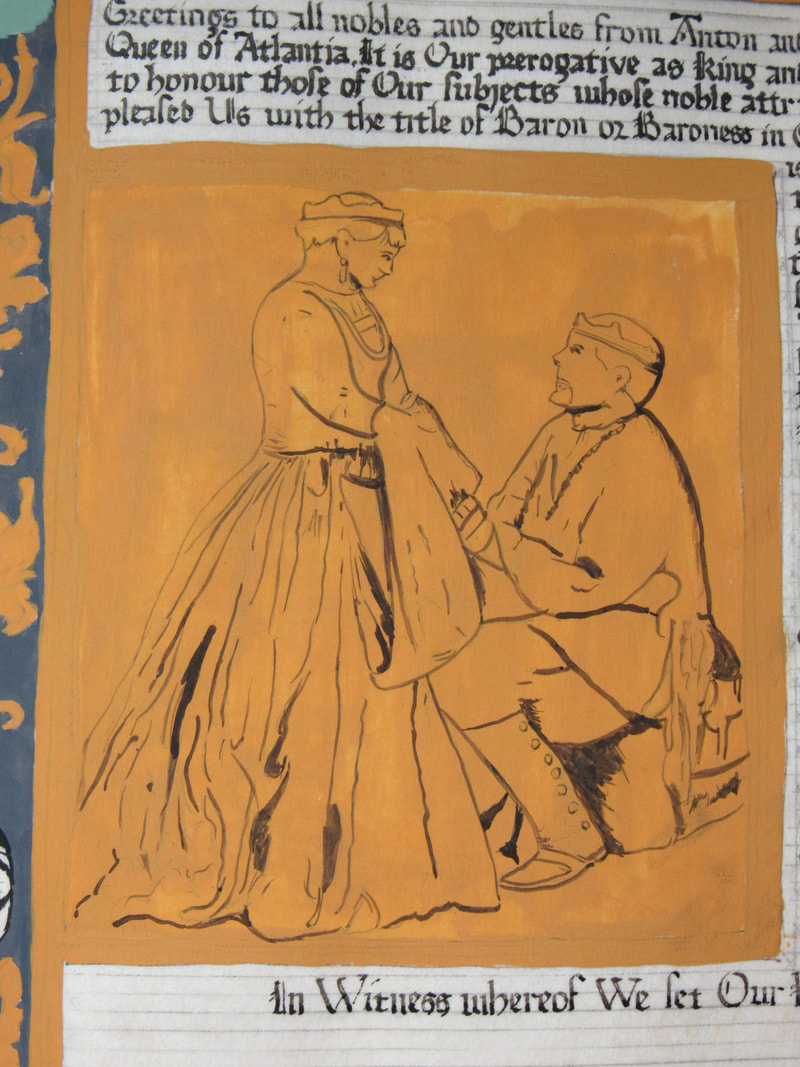
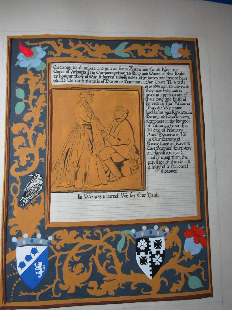
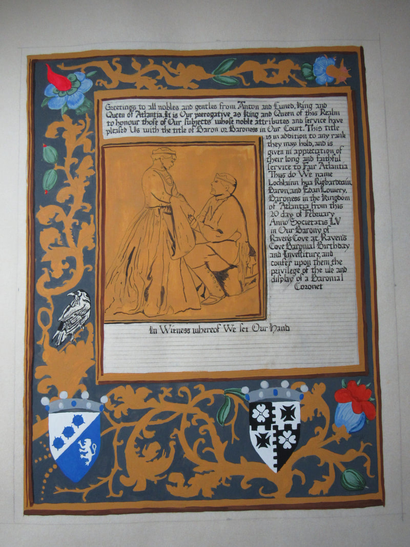
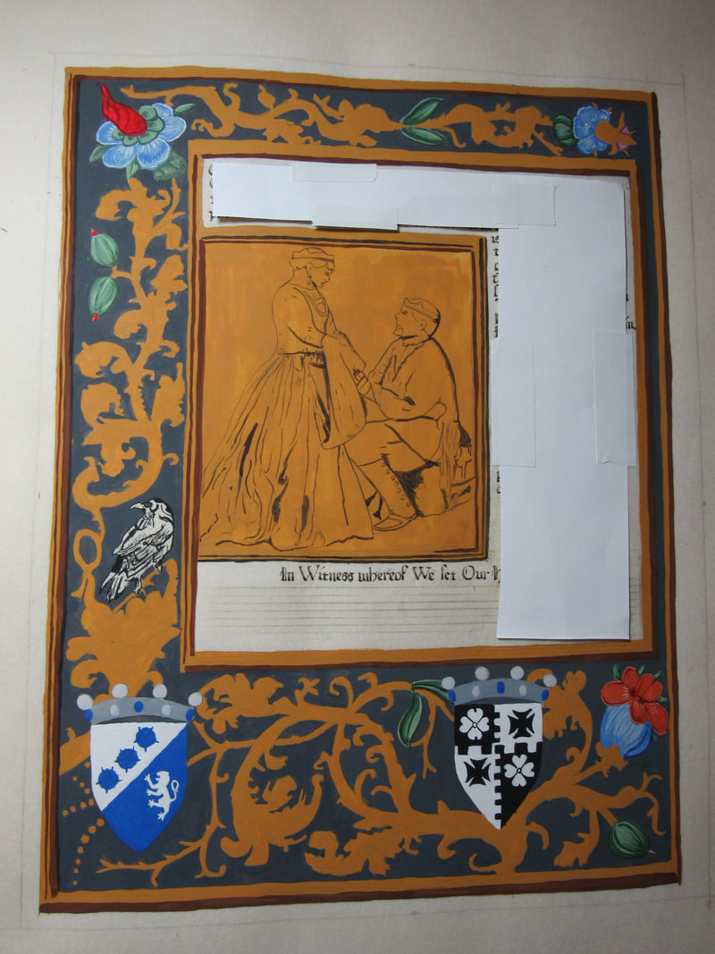
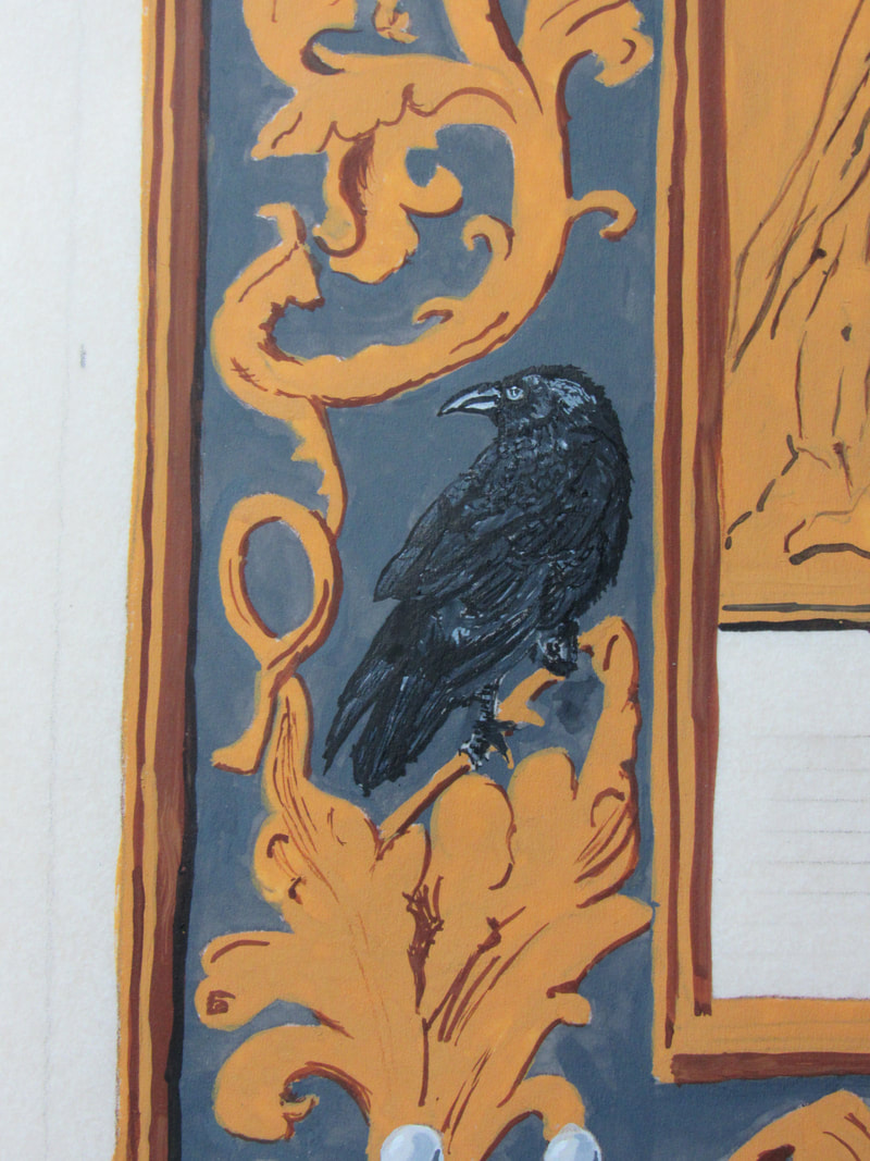
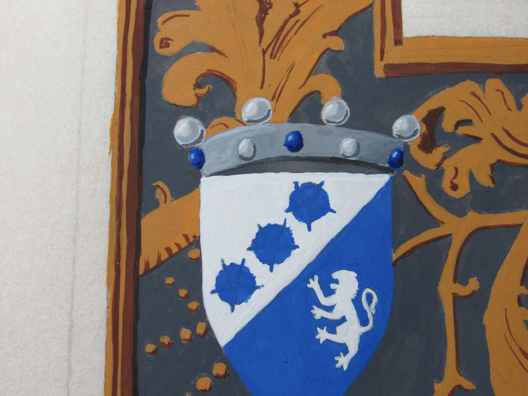
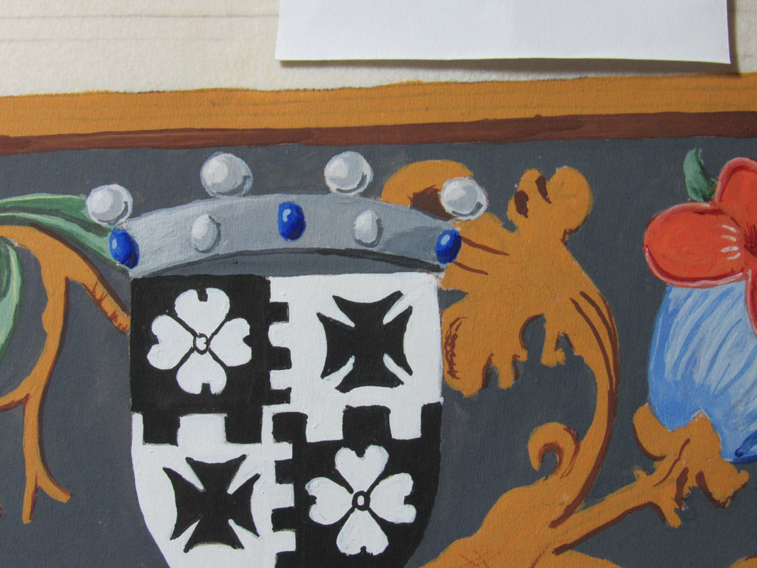
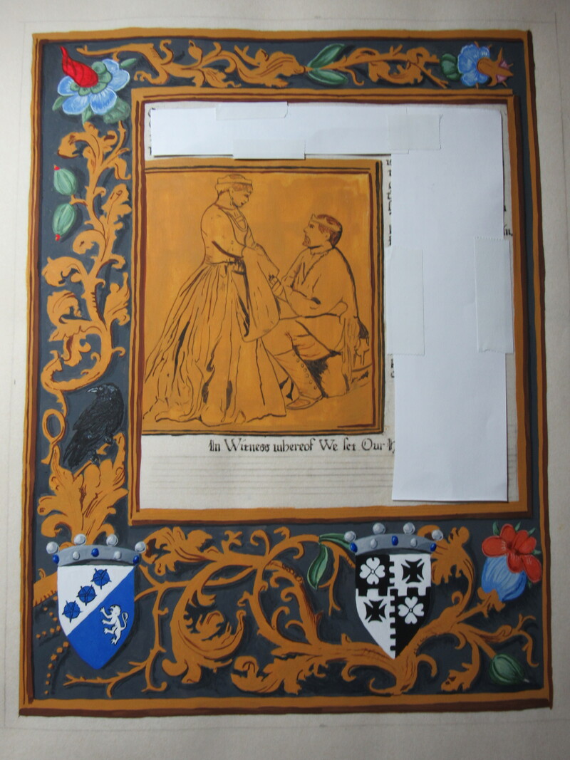
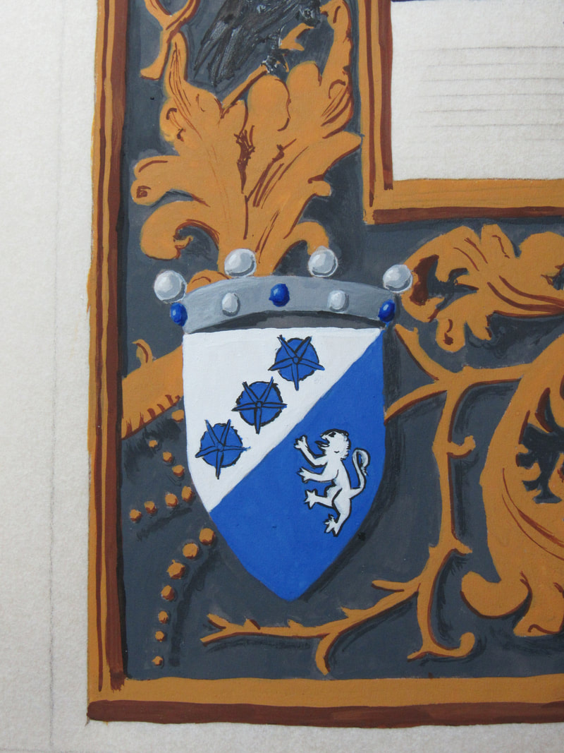
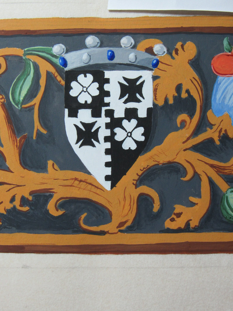
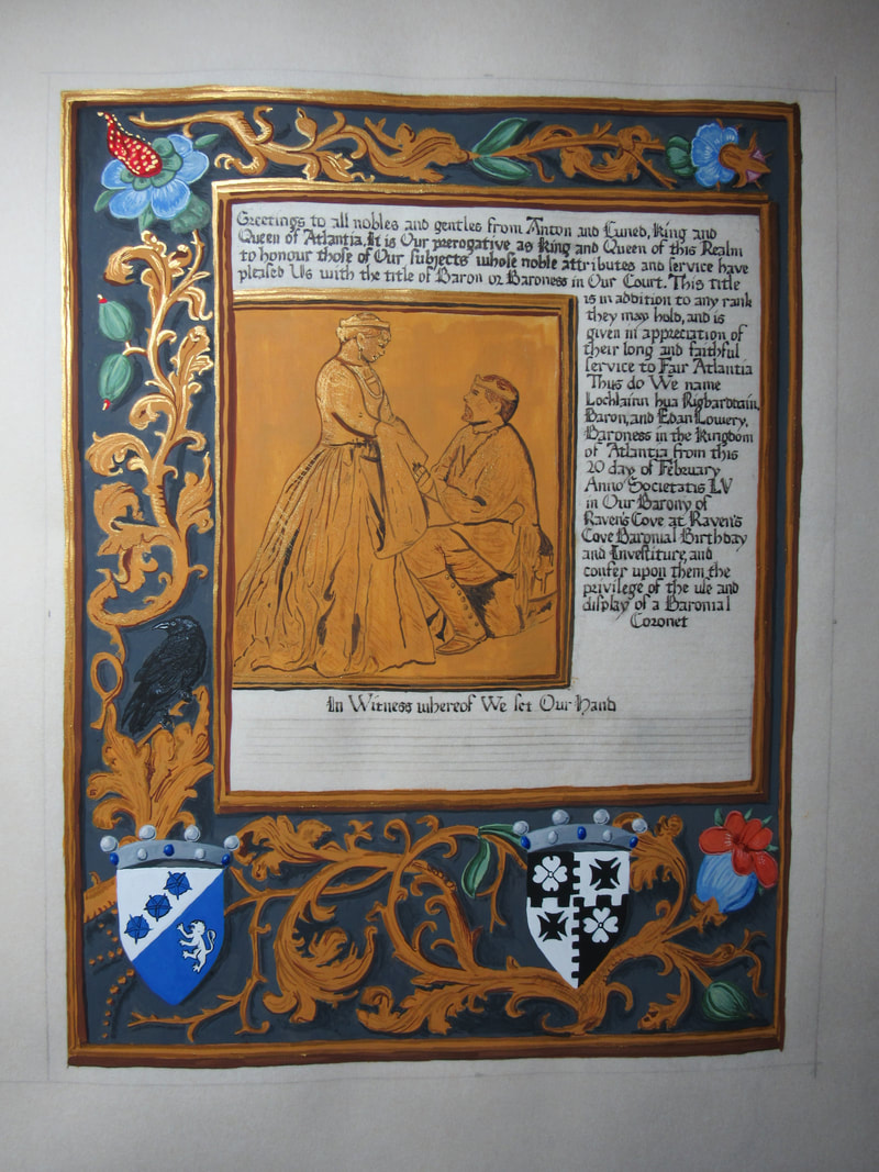
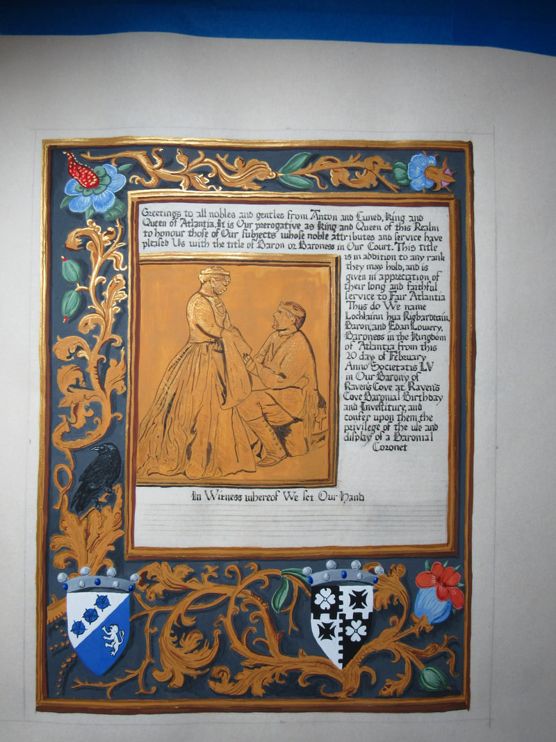
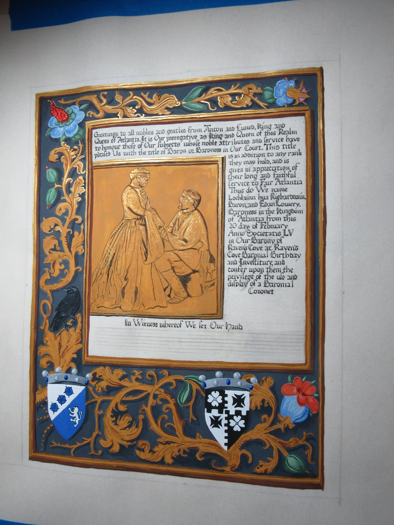
It's not every day you get asked to do a scroll for two people. Especially two people you adore and respect. I was given the great honor and privilege to do the Court Barony scroll for Baroness Edan Lowery and Baron Lochlainn hua Rigbarddain. I wanted something that would capture the two of them perfectly and I found a picture of the two of them from 12th night 2020, that was posted one year earlier to the day that I received the assignment. It was perfect. It showed the two of them, together, and you could just see how much they love one another in it. I turned it into a grayscale so that I could more easily see the lines I needed to follow. 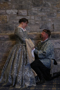 The next task was finding an exemplar that would frame that image and make it front and center. I found what I was looking for in the Da Costa Hours which were illuminated by Simon Bening (1483/84-1561) about 1515 in Ghent, Belgium. 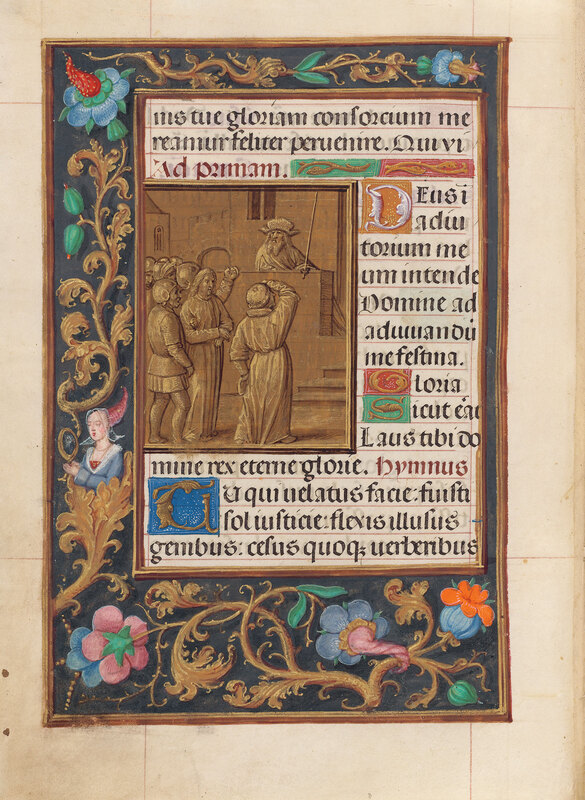 There were some elements I wanted to take out and/or replace because they did not seem to fit my purpose. So the lady was replaced with a raven to signify Raven's Cove, and two of the flowers were replace with their heraldry topped with coronets to signify Court Baronies. The final piece was on a 16x20" piece of pergamenata, with a 12x16" area for the scroll. the original was 172 x 125 mm so I enlarged quite a bit. I used gouache, finetec gold, and Noodler's Bulletproof Eel black ink. Close ups and in progress pics below, please click to enlarge. Again, remember that gold is finicky to photo without the proper light set up so it tends to look dead flat when you shoot it straight on, so many of my photos are at angles to get the magic of the gold.
0 Comments
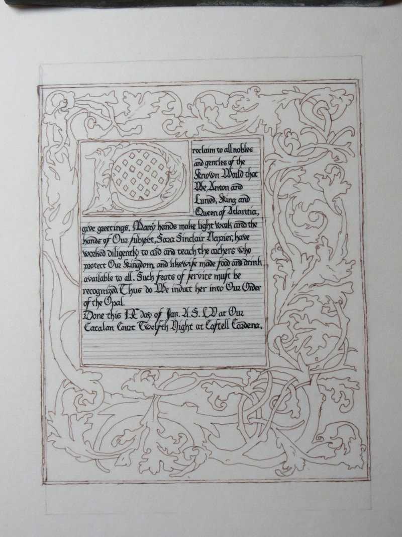
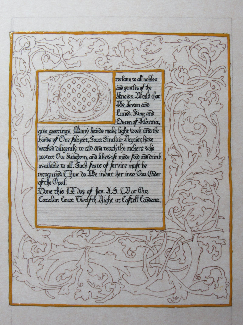
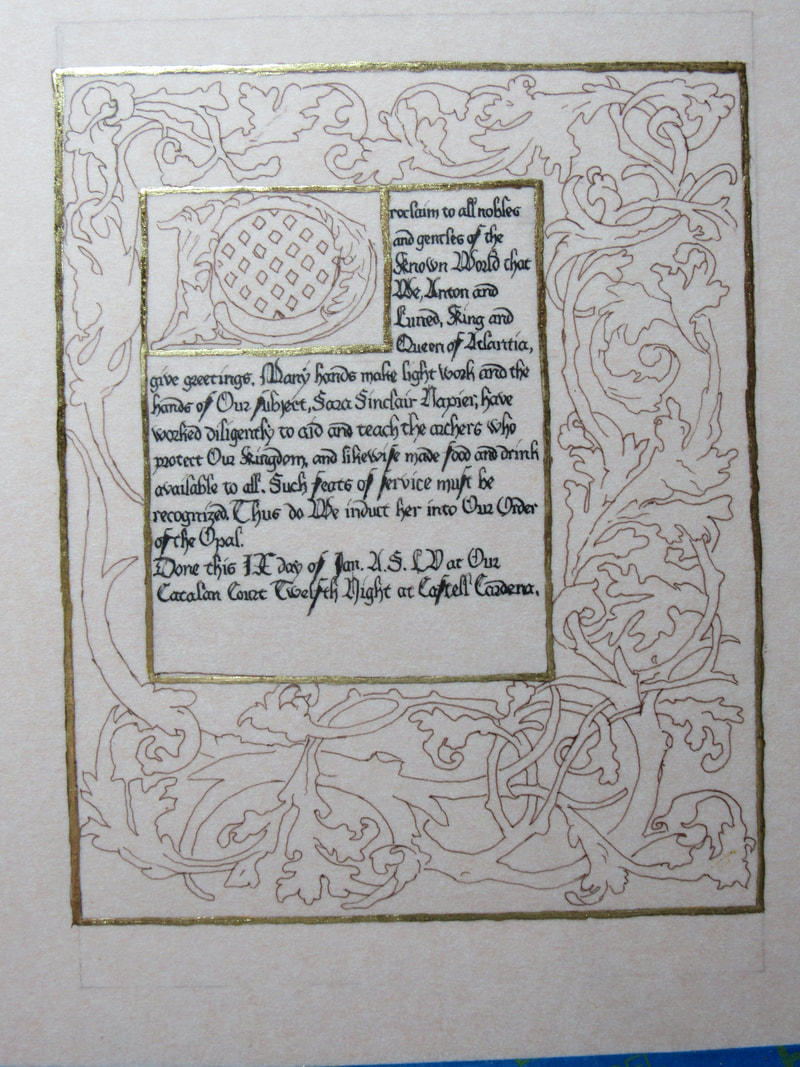
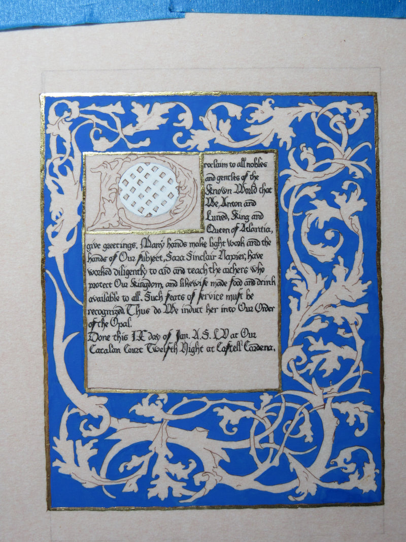
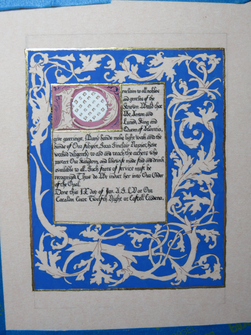
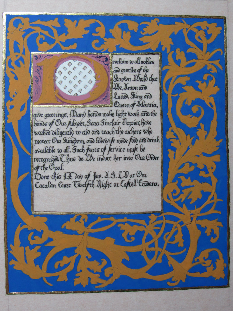
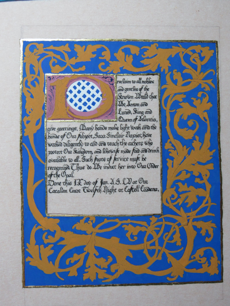
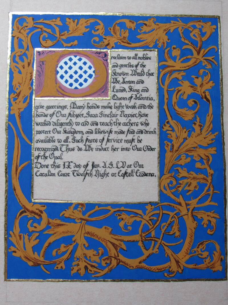
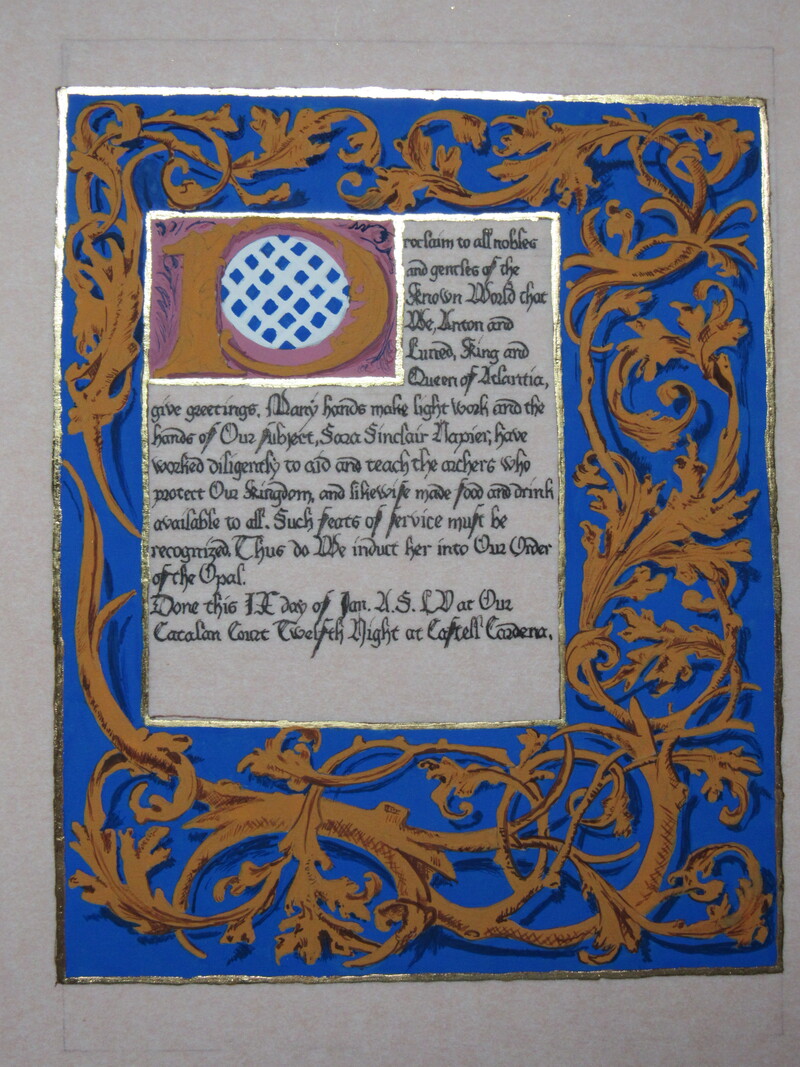
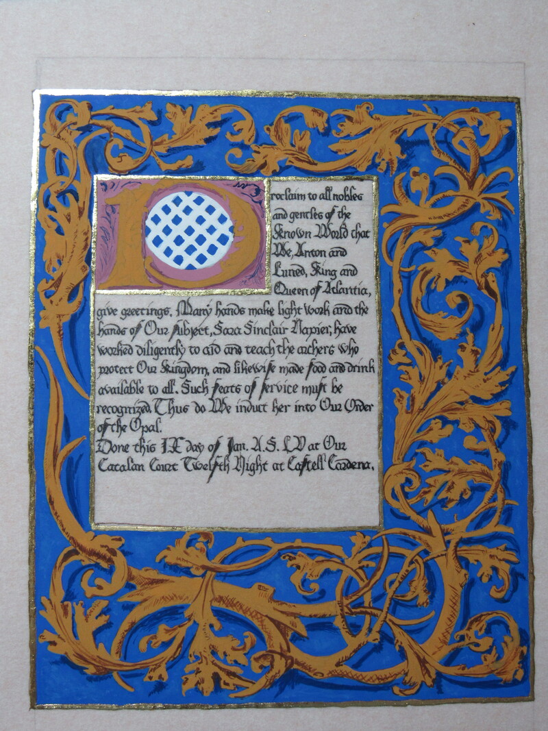
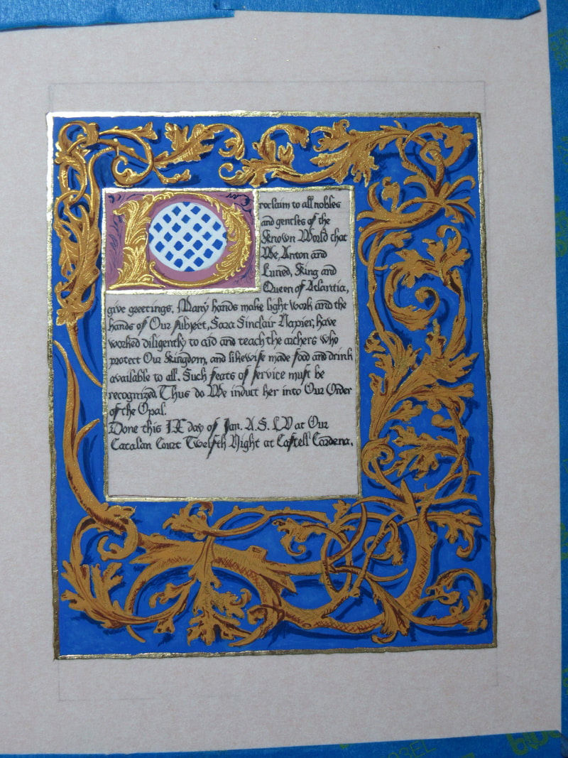
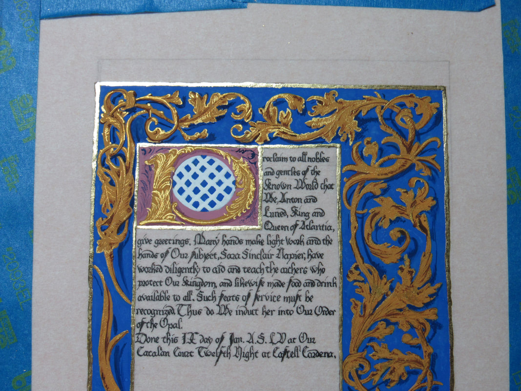
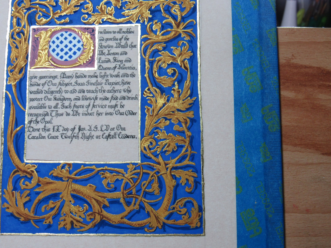
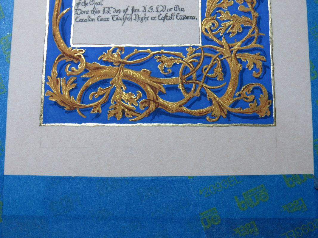
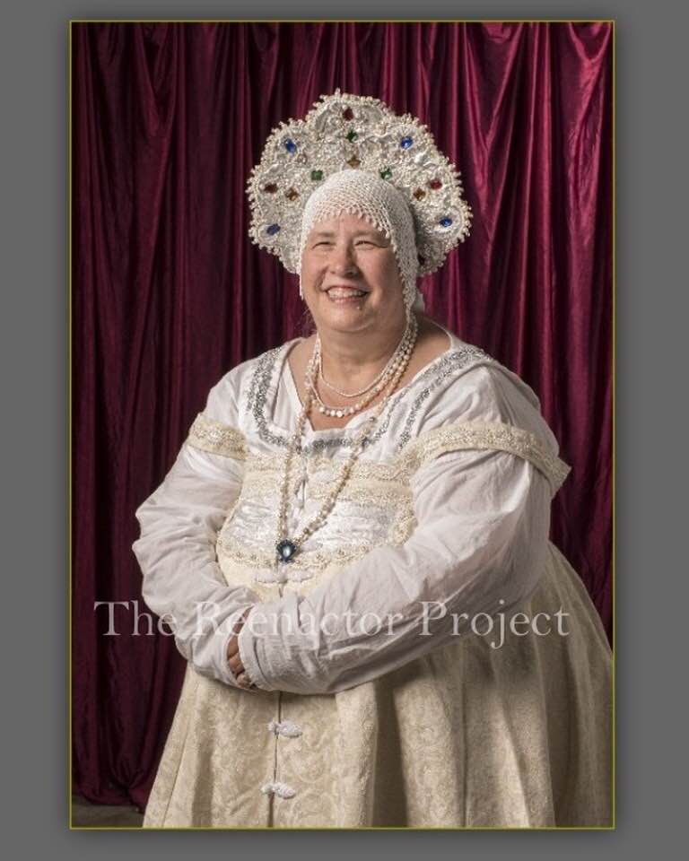
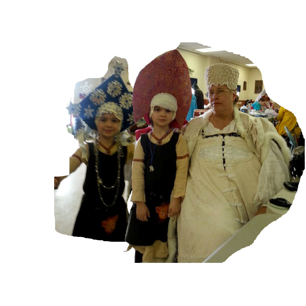
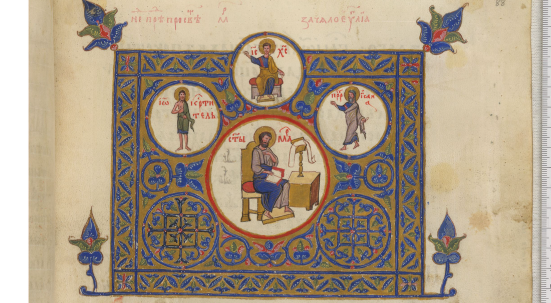
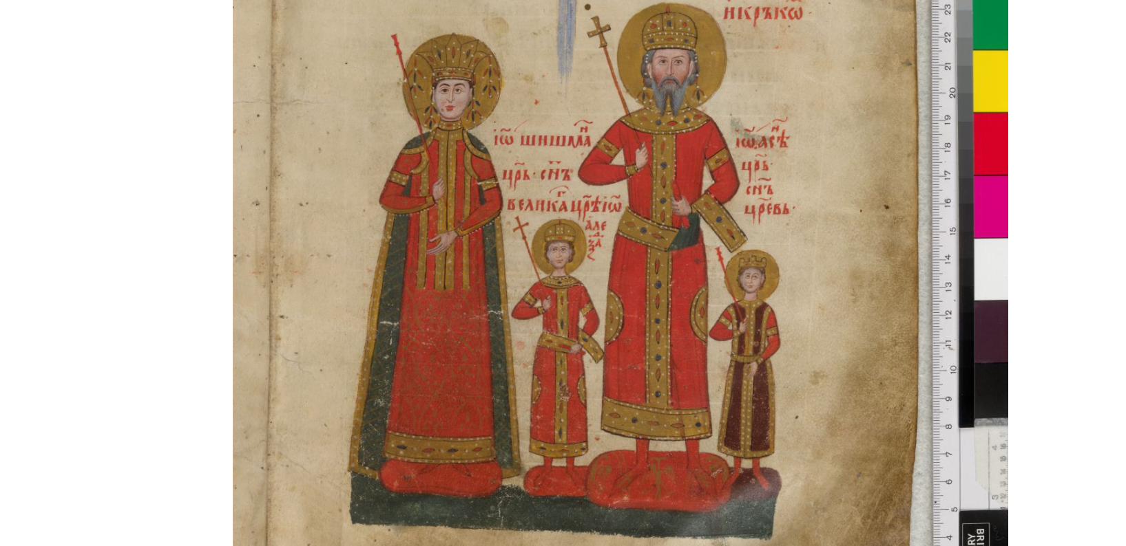
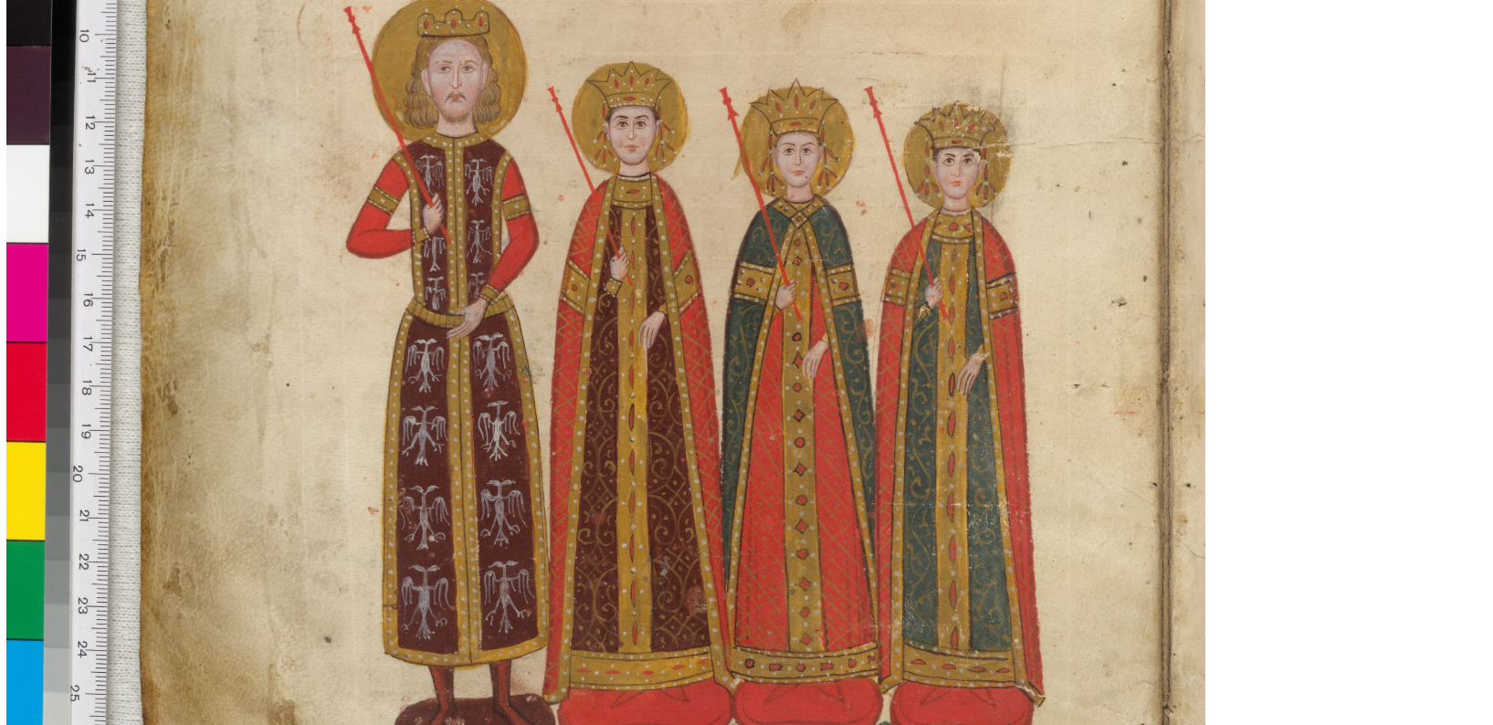
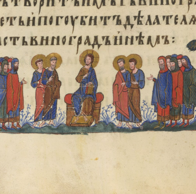
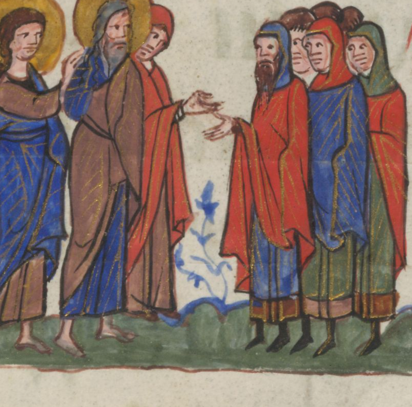
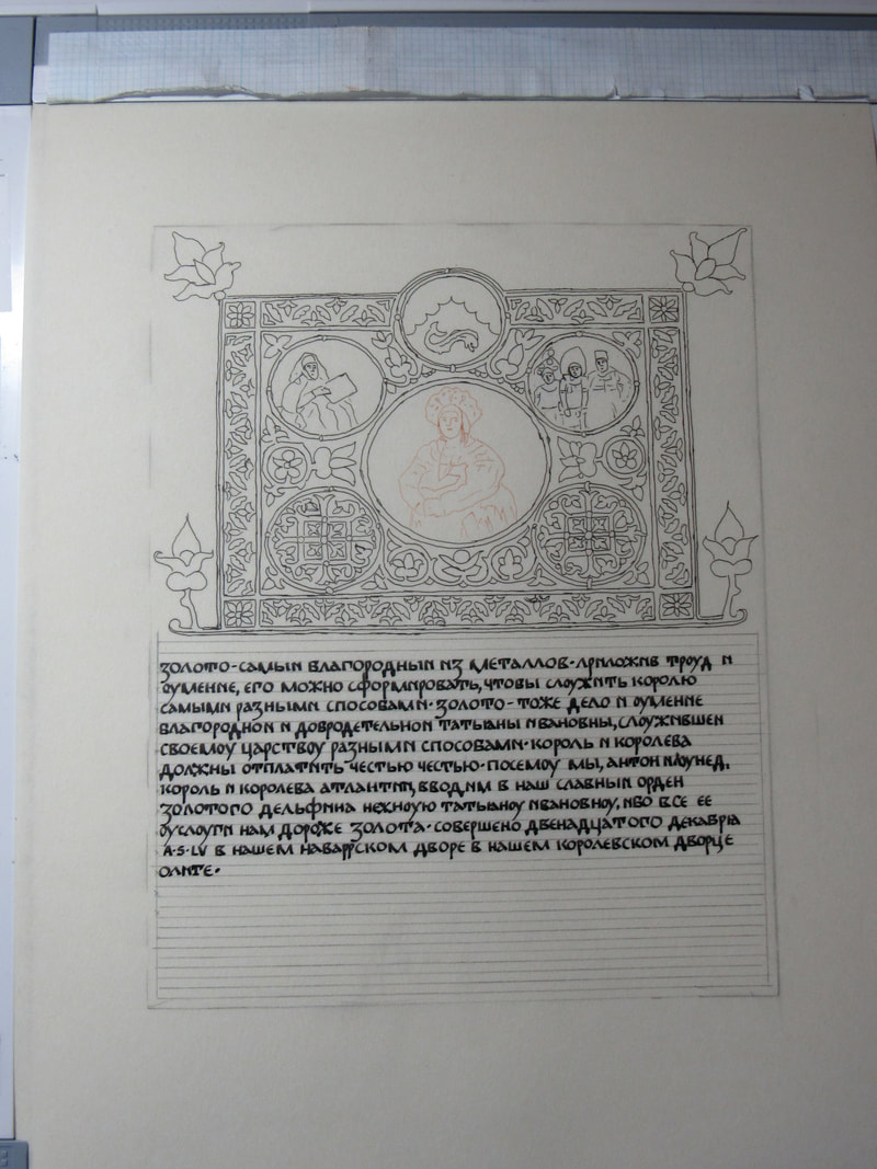
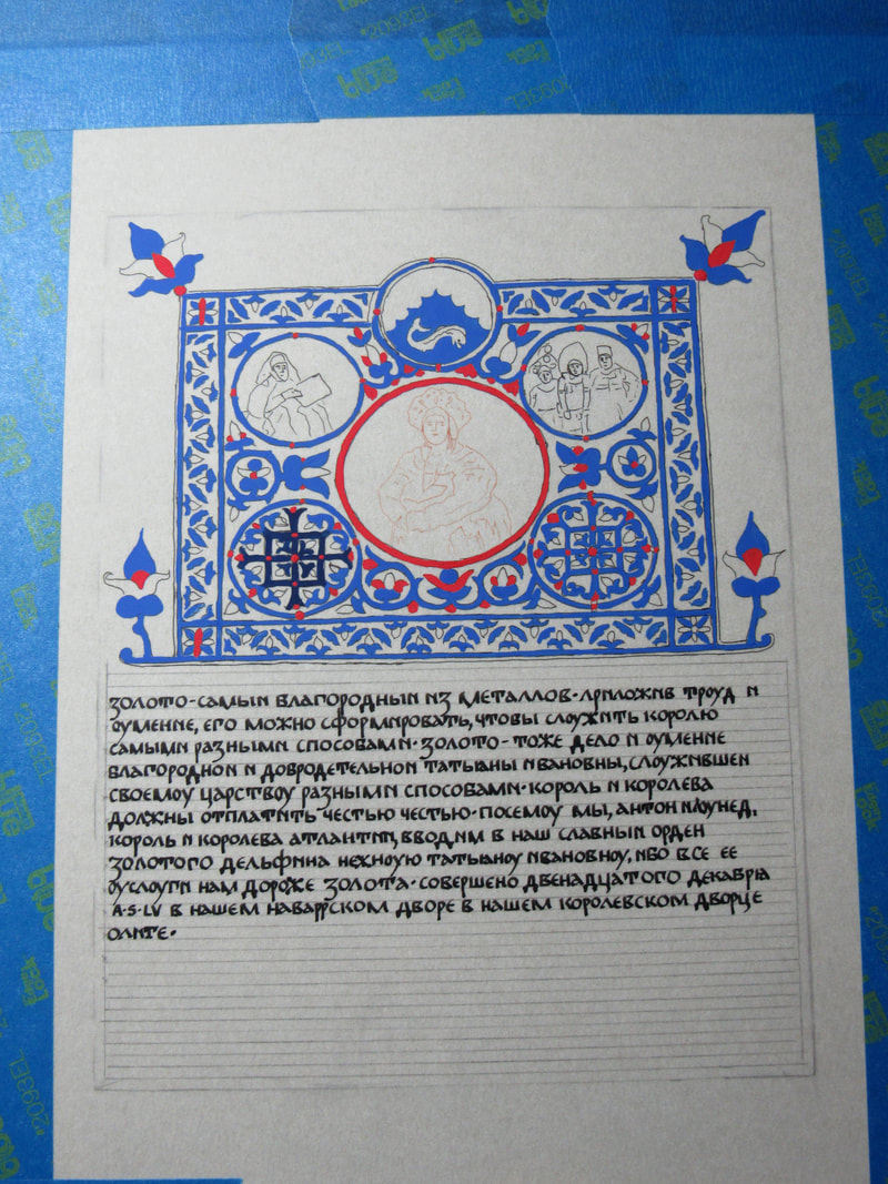
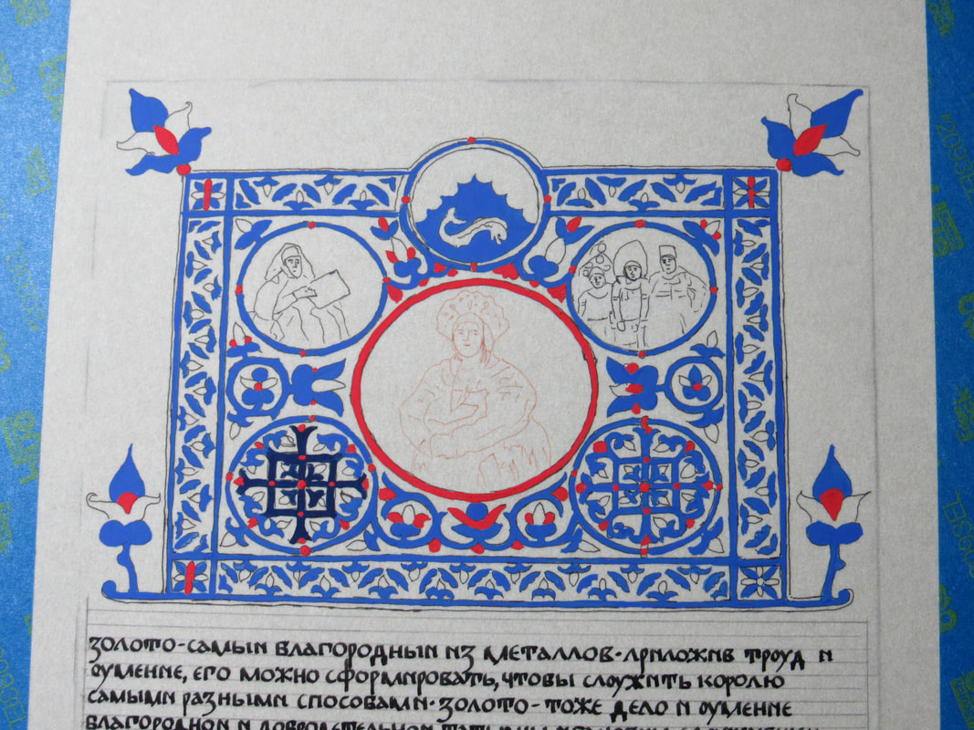
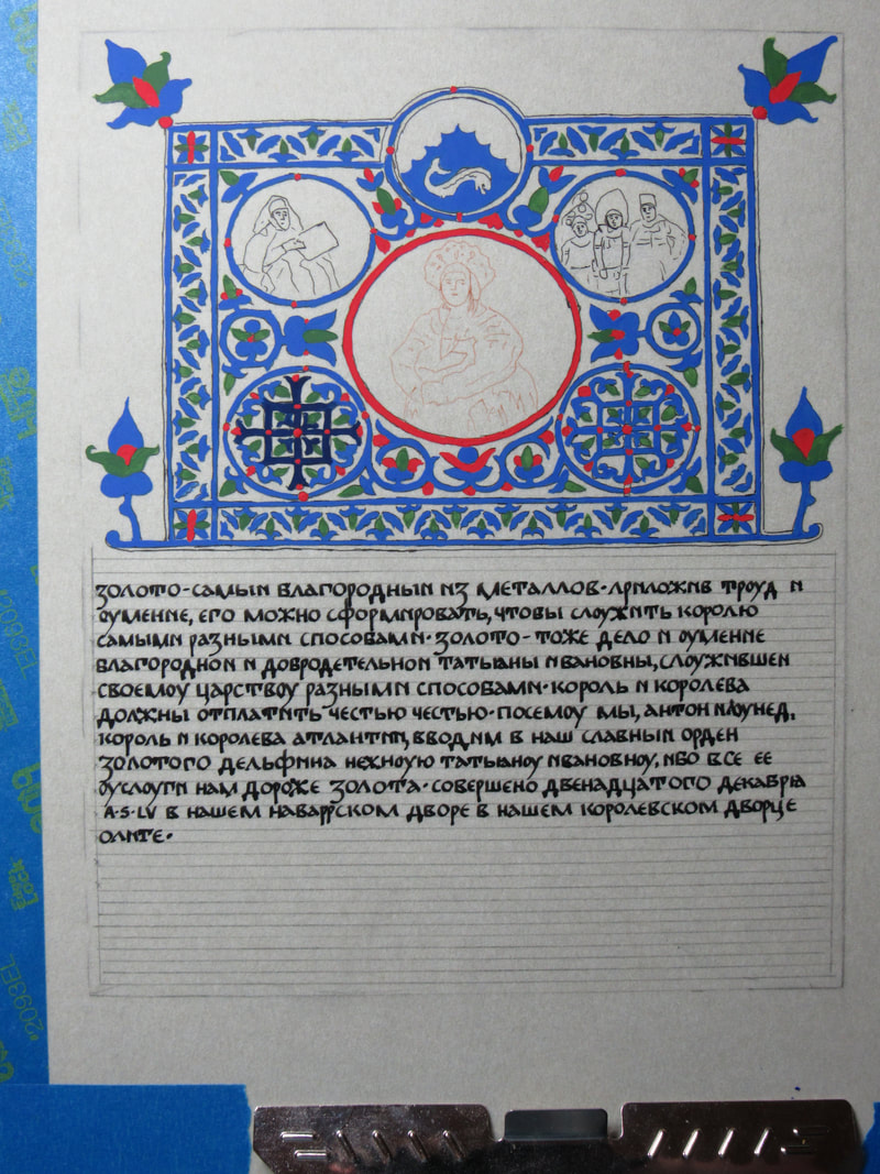
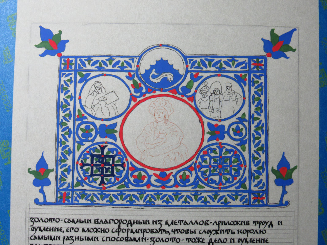
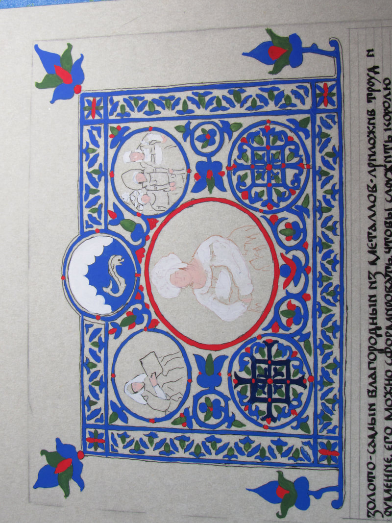
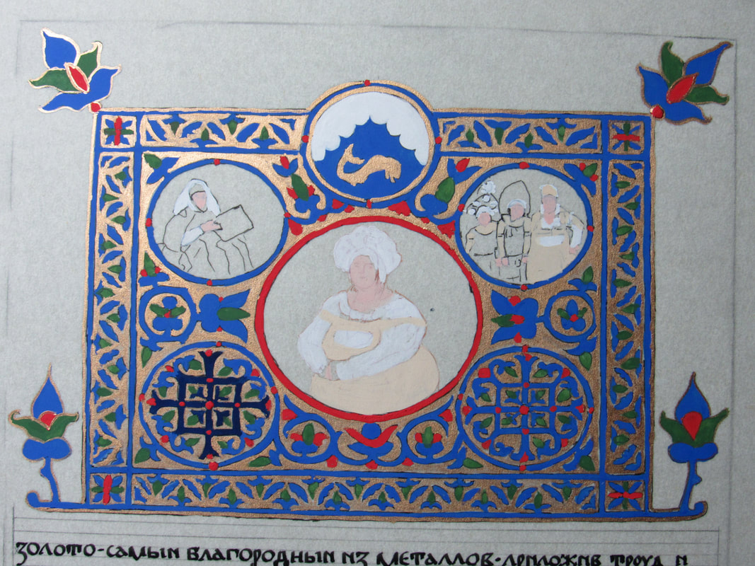
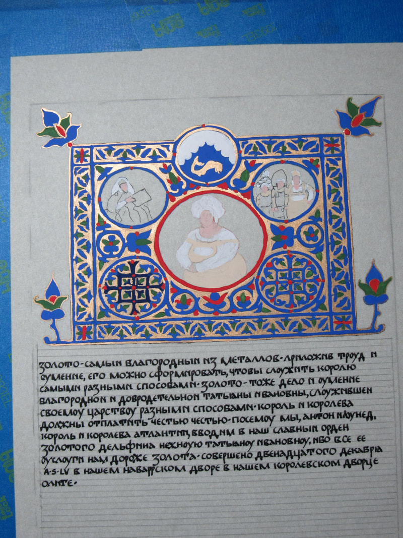
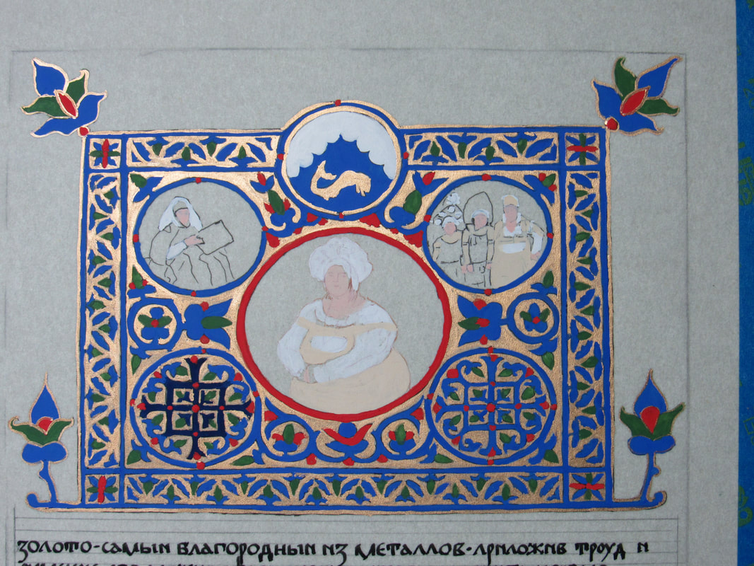
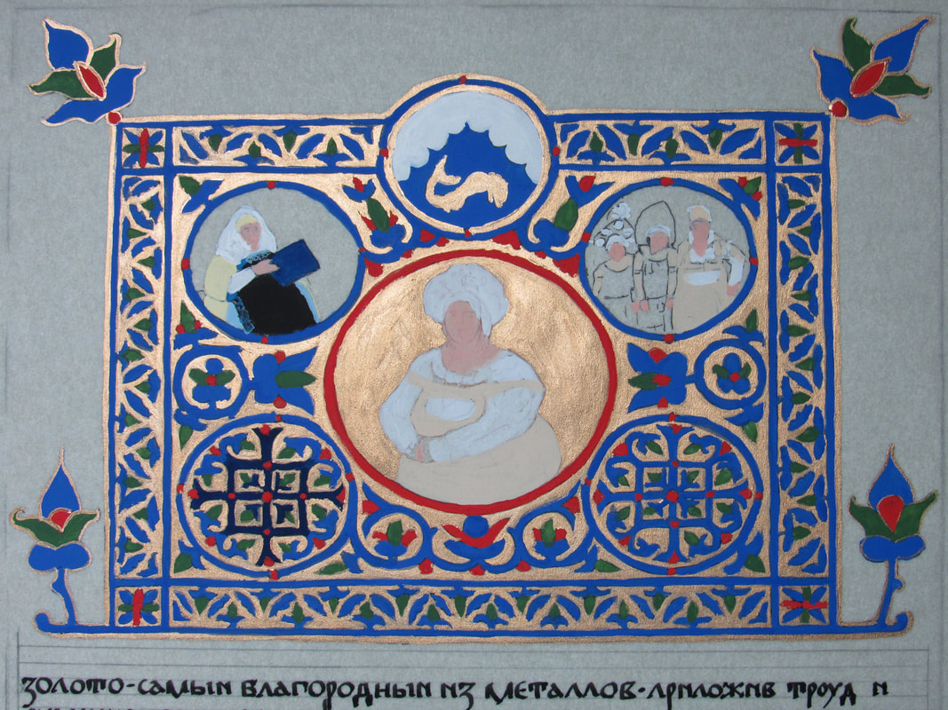
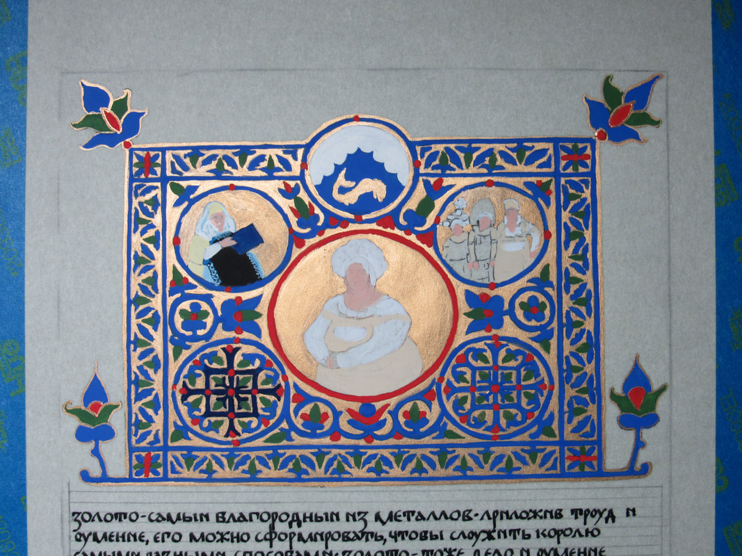
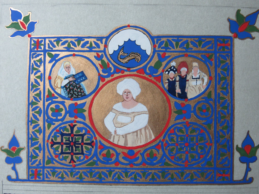
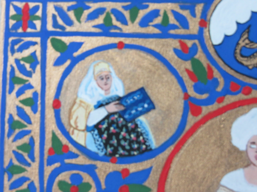
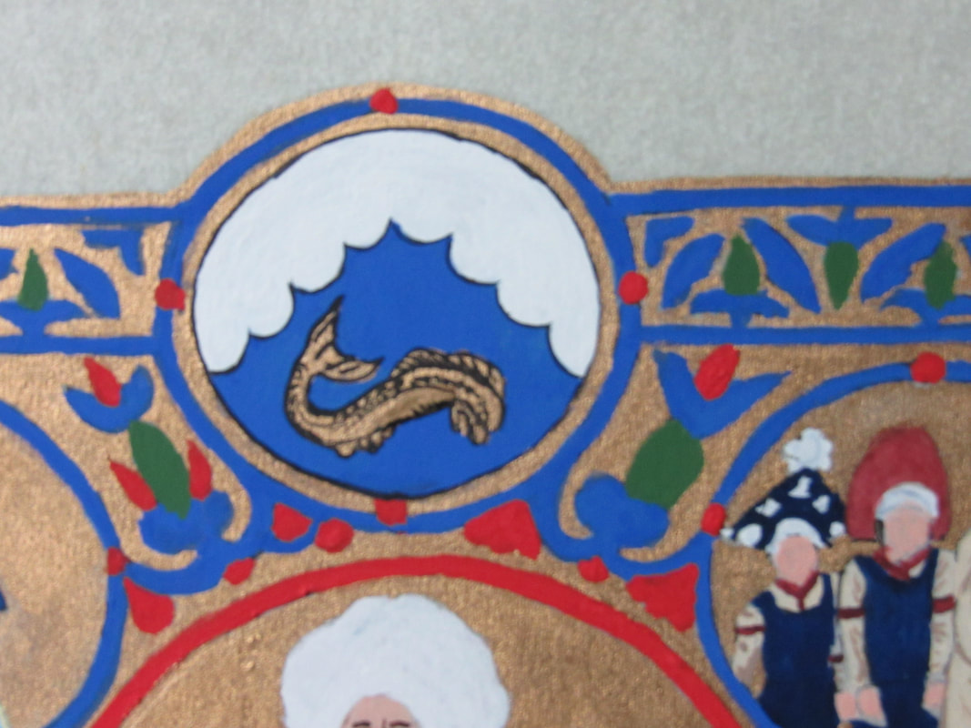
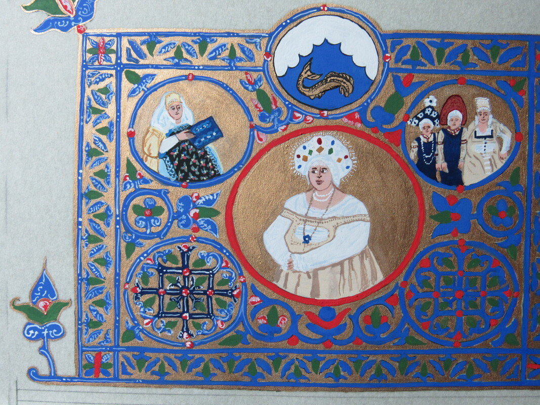
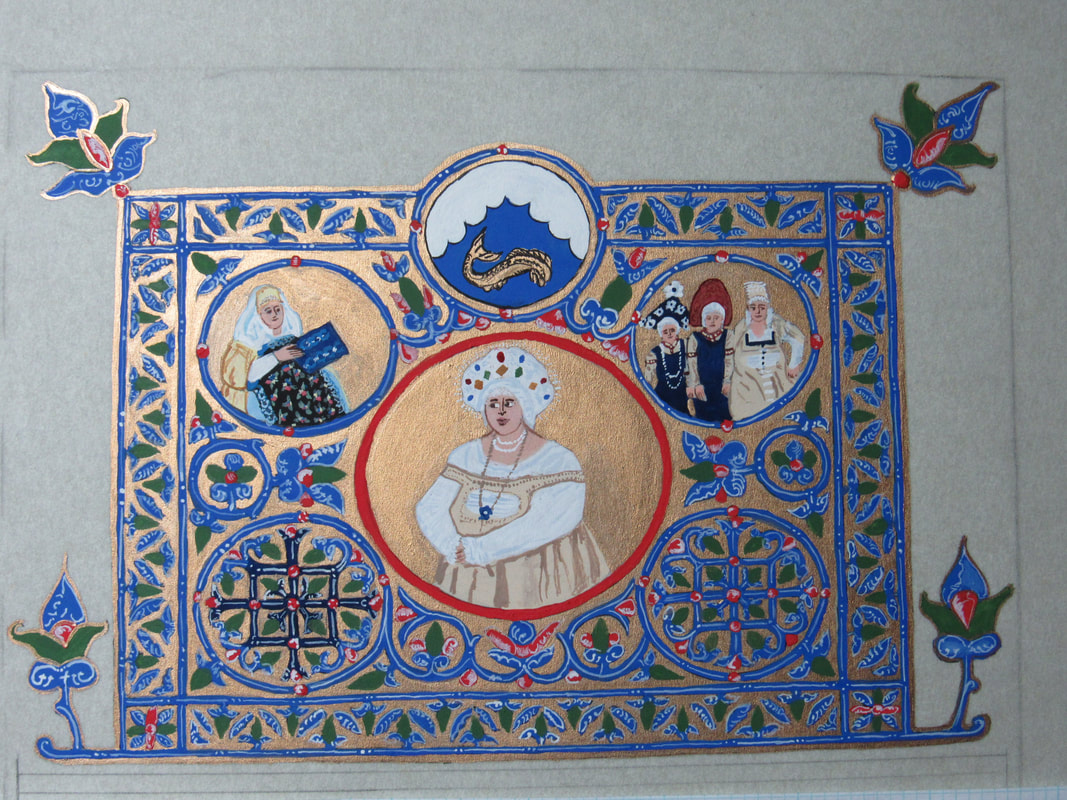
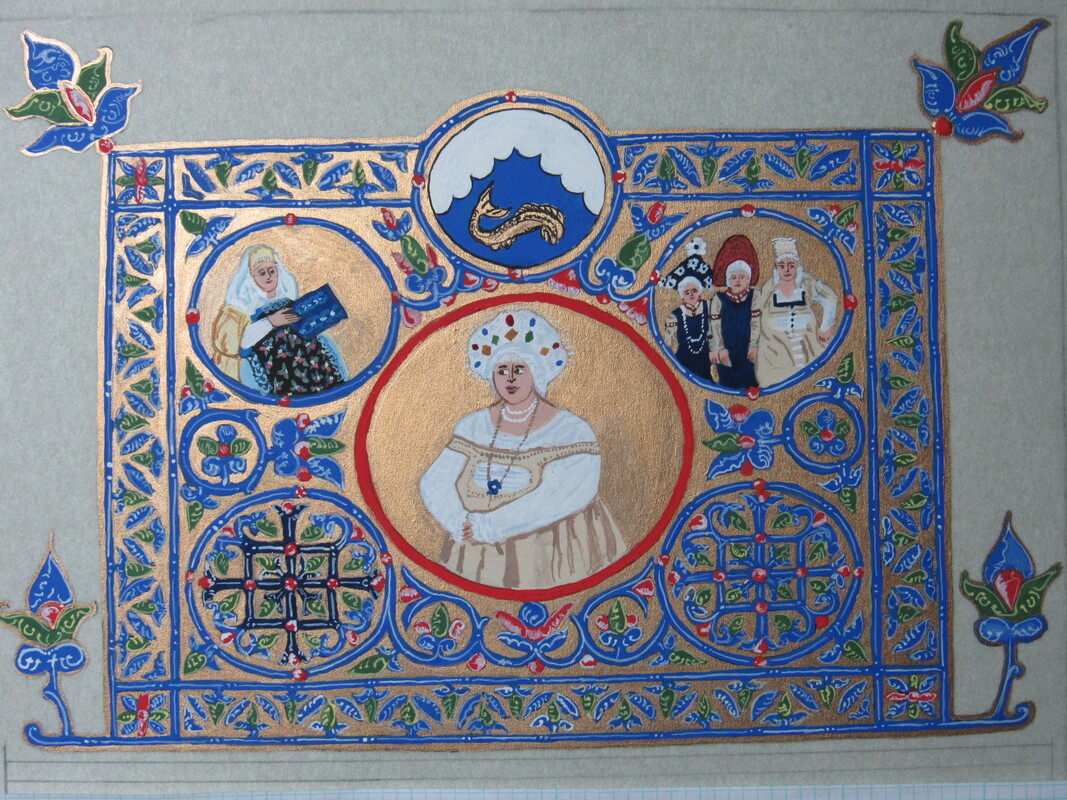
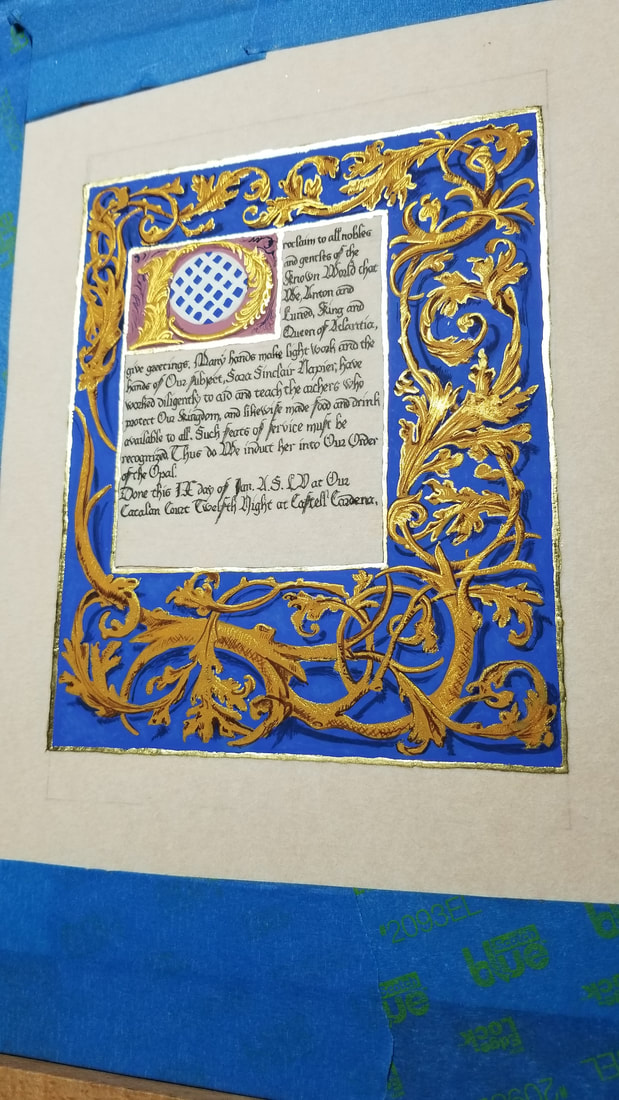 An Opal for Sara. She more than deserved it for all of the work she's done not only with the archery community, but also on a grander scale for the Kingdom and Barony with her hospitality and her teaching. I wanted to do something special, and I love the Bruge style, so I found a page which used the colors of her heraldry, blue and gold, in the Hours of Boussu. 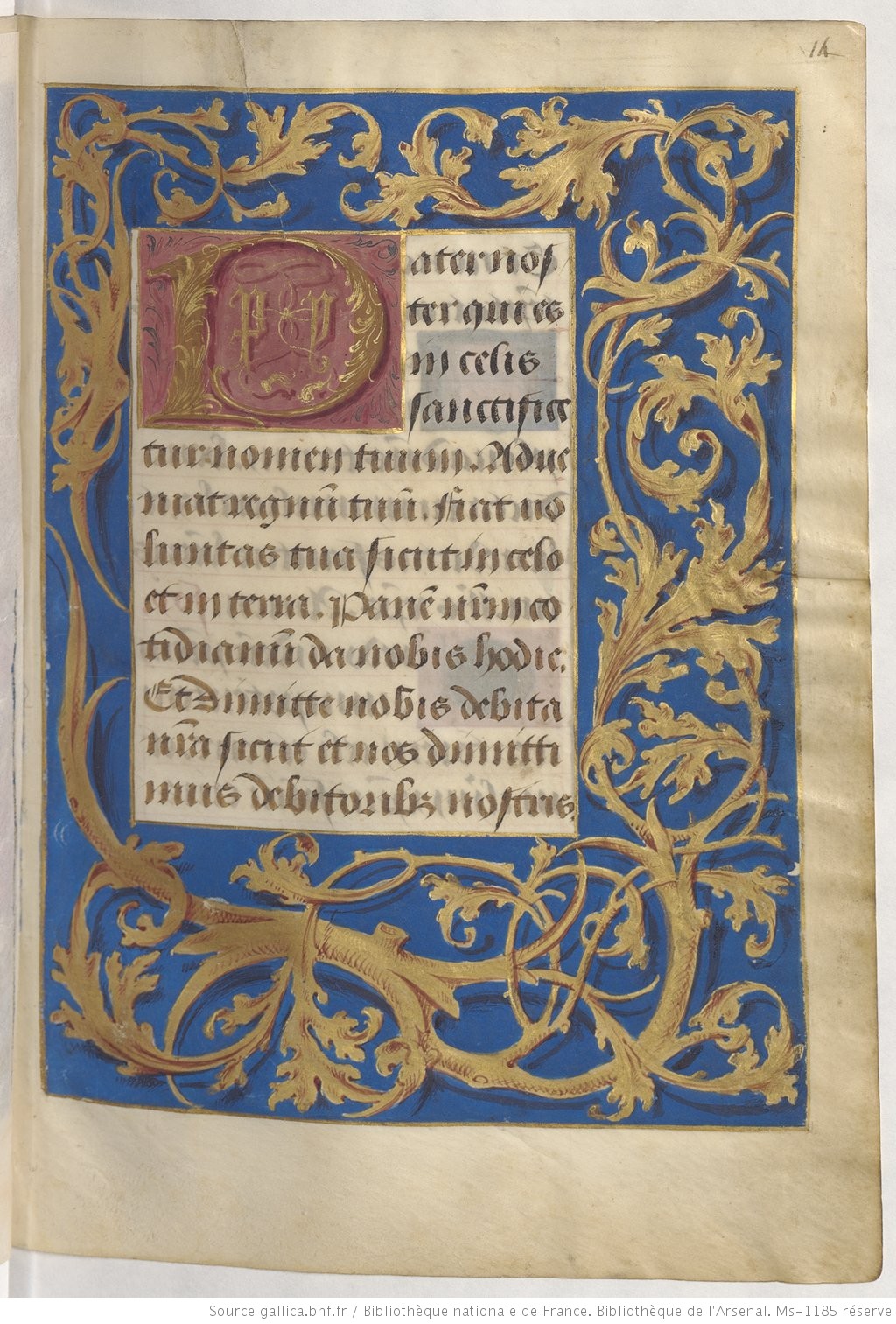 For her Opal, I used a piece of 8x10" pergamenata with an image space of 5x7". The materials I used where instacoll with 23k loose leaf gold for the borders, gouache and finetec gold for the rest of the illumination. The ink used was Noodler's Bulletproof Eel black. Gold is very finicky to photograph. If you take pictures dead on, most of the gold accents will disappear and the image looks blah. For the magic of these scrolls you have to take the picture from a slight angle as I have done in many of the progress and closeups below, or have a special set up of lights. Please click to make them bigger. I was approached to make another scroll for a woman I greatly admire and adore, Mistress Tatiana Ivanovna. She was being awarded the Gold Dolphin for her years of service with ranging from her largesse (many, many scroll cases so our scrolls aren't damaged in transport), autocratting, MoAS, and helping with youth events. I wanted it to be special, so I might have gone a little off the deep end, but for her it was worth it. Her persona is Russian, so I picked the Gospels of Tsar Alexander (c. 1355 0 1356) for my exemplar. 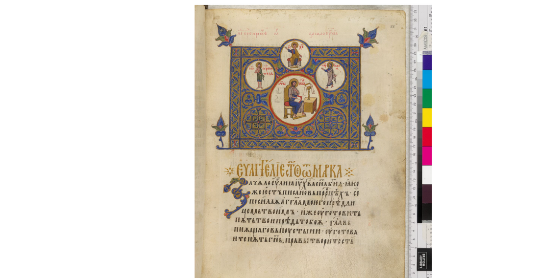 I made the decision that I was going to have the scroll text translated first into Russian, and then into Cyrillic. That's when I realized that modern Cyrillic was a bit different in many places from the Cyrillic of the 1350's. I turned to a couple groups online asking for any help I could get as I was on a tight deadline, and two Laurels I also greatly admire rose to the task and helped me find a key that helped me find the correlating old Cyrillic for the modern translation I had. So began the painstaking task of going through and matching each symbol. It was then I learned that in this particular book, a couple of the letters that resemble the Western N (only backwards) was not in this book... at all. I looked through the entire book and found only things that looked like the N's and H's we're used to in Western culture (even though they are not N or H sounds in Russian.). So I did the best I could. I found several pictures of her online and picked the ones I liked to use in the medallions on the scroll. I made the decision to use the badge for the topmost circle, and the large one to put a picture of her in the clothes she wore for her elevation to the Order of the Laurel. I took a couple of the pics that had her with what I believe are two of her grandchildren and photo manipulated the pics to put both children in one image for another medallion. I had been practicing doing three dimensional people lately so going back to the flat, more two dimensional people was a bit hard, but I kept looking at examples from the book. I used a 11 x 14" piece of pergamenata with an image size of 8x10", with gouache, and sumi gold and Noodler's Bulletproof Eel black ink. 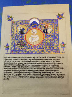 Below are progress pics and close ups. Click to enlarge. |
AuthorMe, Faílenn Chu ingen ui Fháeláin. Archives
February 2021
Categories |

 RSS Feed
